In this document, we provide all steps and R codes to evaluate if days with heat wave are similar to days without heat wave for a set of confounding factors. Should you have any questions, need help to reproduce the analysis or find coding errors, please do not hesitate to contact us at leo.zabrocki@psemail.eu.
Required Packages
To reproduce exactly the eda_covariates_balance.html
document, we first need to have installed:
- the R programming language
- RStudio, an integrated
development environment for R, which will allow you to knit the
eda_covariates_balance.Rmdfile and interact with the R code chunks - the R Markdown package
- and the Distill package which provides the template for this document.
Once everything is set up, we load the following packages:
# load required packages
library(knitr) # for creating the R Markdown document
library(here) # for files paths organization
library(tidyverse) # for data manipulation and visualization
library(broom) # for cleaning regression outputs
library(Cairo) # for printing custom police of graphs
library(DT) # for displaying the data as tables
We finally load our custom ggplot2 theme for graphs:
Checking Covariates Balance
We load the environmental data:
Continuous Covariates
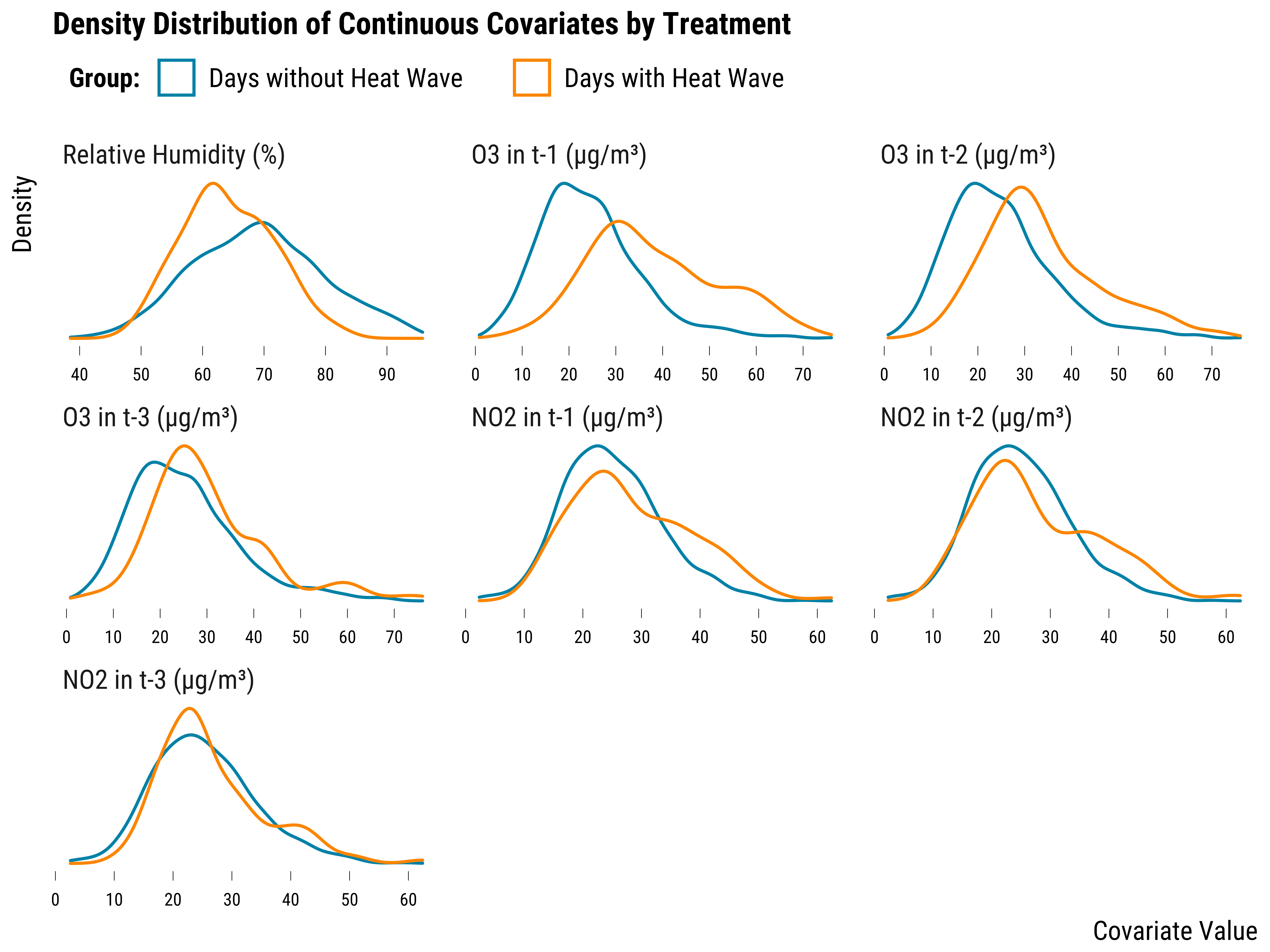
We first explore whether the relative humidity measured in \(t\) and the lags of O\(_{3}\) and NO\(_{2}\) concentrations are balanced. We plot below the density distribution of each covariate by treatment group:
Please show me the code!
# make the graph
graph_continuous_cov_densities <- data %>%
  # pivot covariates to long format
  pivot_longer(
    cols = c(humidity_relative, o3_lag_1:o3_lag_3, no2_lag_1:no2_lag_3),
    names_to = "covariate",
    values_to = "value"
  ) %>%
  # change covariate names
  mutate(
    covariate = case_when(
      covariate == "humidity_relative" ~ "Relative Humidity (%)",
      covariate == "o3_lag_1" ~ "O3 in t-1 (µg/m³)",
      covariate == "o3_lag_2" ~ "O3 in t-2 (µg/m³)",
      covariate == "o3_lag_3" ~ "O3 in t-3 (µg/m³)",
      covariate == "no2_lag_1" ~ "NO2 in t-1 (µg/m³)",
      covariate == "no2_lag_2" ~ "NO2 in t-2 (µg/m³)",
      covariate == "no2_lag_3" ~ "NO2 in t-3 (µg/m³)"
    )
  ) %>%
  # reorder covariates
  mutate(
    covariate = fct_relevel(
      covariate,
      "Relative Humidity (%)",
      "O3 in t-1 (µg/m³)",
      "O3 in t-2 (µg/m³)",
      "O3 in t-3 (µg/m³)",
      "NO2 in t-1 (µg/m³)",
      "NO2 in t-2 (µg/m³)",
      "NO2 in t-3 (µg/m³)"
    )
  ) %>%
  # make density graph
  ggplot(., aes(x = value,
                color = fct_rev(heat_wave))) +
  geom_density() +
  scale_color_manual(name = "Group:", values = c(my_blue, my_orange)) +
  scale_x_continuous(breaks = scales::pretty_breaks(n = 8)) +
  facet_wrap(~ covariate, scales = "free") +
  xlab("Covariate Value") + ylab("Density") +
  ggtitle("Density Distribution of Continuous Covariates by Treatment") +
  theme_tufte() +
  theme(axis.ticks.y = element_blank(),
        axis.text.y = element_blank())

# display the graph
graph_continuous_cov_densities
Please show me the code!
# save the graph
ggsave(
  graph_continuous_cov_densities + labs(title = NULL),
  filename = here::here("inputs", "3.outputs", "2.graphs", "graph_continuous_cov_densities.pdf"),
  width = 20,
  height = 15,
  units = "cm",
  device = cairo_pdf
)
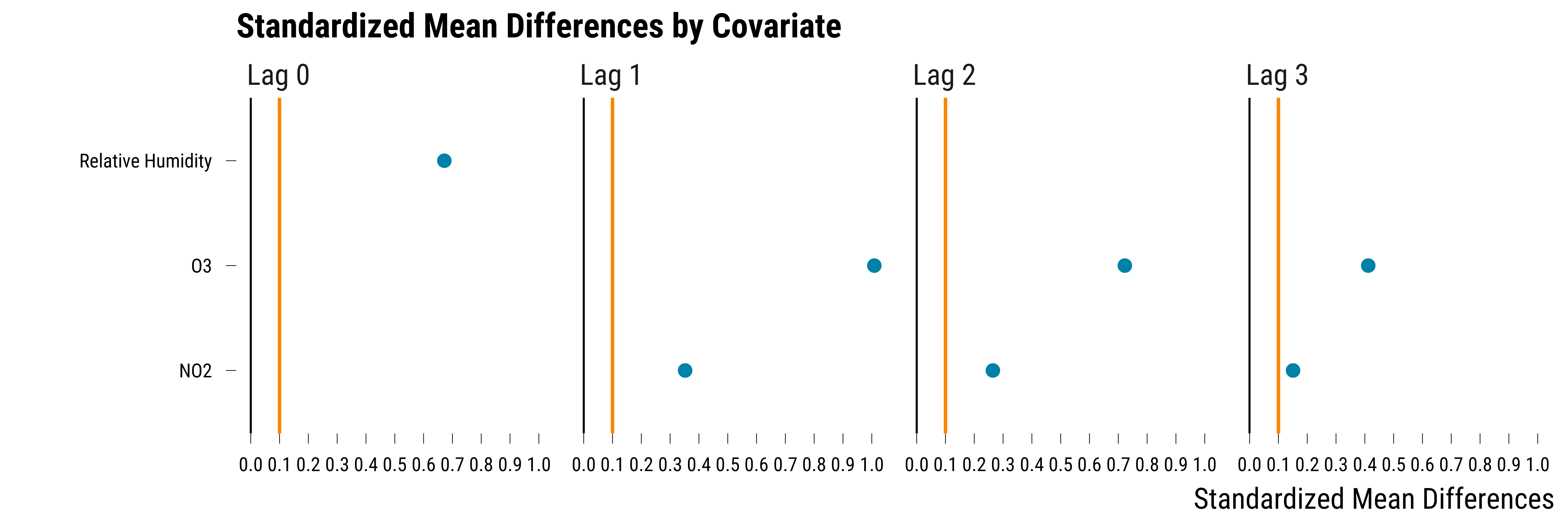
On this graph, we can see that the relative humidity and the lags of O\(_{3}\) are imbalanced across the treatment and control groups. It is less the case for NO\(_{2}\). As an alternative to density distributions, we can summarize the imbalance by computing, for each covariate, the absolute standardized mean difference between treatment and control groups. The absolute standardized mean difference of a covariate is just the absolute value of the difference in means between treated and control units divided by the standard deviation of the treatment group. We can simply compute and plot this metric using the following code:
Please show me the code!
# reshape the data into long
data_continuous_cov <- data %>%
  dplyr::select(heat_wave, humidity_relative, o3_lag_1:o3_lag_3, no2_lag_1:no2_lag_3) %>%
  pivot_longer(cols = -c(heat_wave),
               names_to = "variable",
               values_to = "value") %>%
  mutate(
    covariate_name = NA %>%
      ifelse(str_detect(variable, "o3"), "O3", .) %>%
      ifelse(
        str_detect(variable, "humidity_relative"),
        "Relative Humidity",
        .
      ) %>%
      ifelse(str_detect(variable, "no2"), "NO2", .)
  ) %>%
  mutate(
    time = "Lag 0" %>%
      ifelse(str_detect(variable, "lag_1"), "Lag 1", .) %>%
      ifelse(str_detect(variable, "lag_2"), "Lag 2", .) %>%
      ifelse(str_detect(variable, "lag_3"), "Lag 3", .)
  ) %>%
  mutate(time = fct_relevel(time, "Lag 3", "Lag 2", "Lag 1", "Lag 0")) %>%
  dplyr::select(heat_wave, covariate_name, time, value)

# compute absolute difference in  means
data_abs_difference <- data_continuous_cov %>%
  group_by(covariate_name, time, heat_wave) %>%
  summarise(mean_value = mean(value, na.rm = TRUE)) %>%
  summarise(abs_difference = abs(mean_value[2] - mean_value[1]))

# compute treatment covariates standard deviation
data_sd <-  data_continuous_cov %>%
  filter(heat_wave == "Days with Heat Wave") %>%
  group_by(covariate_name, time, heat_wave) %>%
  summarise(sd_treatment = sd(value, na.rm = TRUE)) %>%
  ungroup() %>%
  dplyr::select(covariate_name, time, sd_treatment)

# compute standardized differences
data_standardized_difference <-
  left_join(data_abs_difference, data_sd, by = c("covariate_name", "time")) %>%
  mutate(standardized_difference = abs_difference / sd_treatment) %>%
  dplyr::select(-c(abs_difference, sd_treatment))

# make the graph
graph_std_diff_continuous_cov <- ggplot(data_standardized_difference, aes(y = covariate_name, x = standardized_difference)) +
  geom_vline(xintercept = 0, size = 0.3) +
  geom_vline(xintercept = 0.1, color = my_orange) +
  geom_point(size = 2, color = my_blue) +
  scale_x_continuous(breaks = scales::pretty_breaks(n = 8)) +
  facet_wrap(~ fct_rev(time), nrow = 1) +
  xlab("Standardized Mean Differences") +
  ylab("") +
  ggtitle("Standardized Mean Differences by Covariate") +
  theme_tufte()

# display the graph
graph_std_diff_continuous_cov
Please show me the code!
# save the graph
ggsave(
  graph_std_diff_continuous_cov + labs(title = NULL),
  filename = here::here("inputs", "3.outputs", "2.graphs", "graph_std_diff_continuous_cov.pdf"),
  width = 20,
  height = 6,
  units = "cm",
  device = cairo_pdf
)
On this graph, the black line represents standardized mean differences equal to 0 and the orange line is the 0.1 threshold often used in the matching literature to assess balance. Standardized mean differences below this threshold would indicate good balance. Here, for all covariates and lags, the treatment and control groups are imbalanced.
We display in the table below the values of the standardized mean differences by covariates and lags:
Please show me the code!
| Covariate | Time | Standardized Mean Difference |
|---|---|---|
| Relative Humidity | Lag 0 | 0.67 |
| NO2 | Lag 1 | 0.35 |
| O3 | Lag 1 | 1.01 |
| NO2 | Lag 2 | 0.26 |
| O3 | Lag 2 | 0.72 |
| NO2 | Lag 3 | 0.15 |
| O3 | Lag 3 | 0.41 |
Categorical Covariates
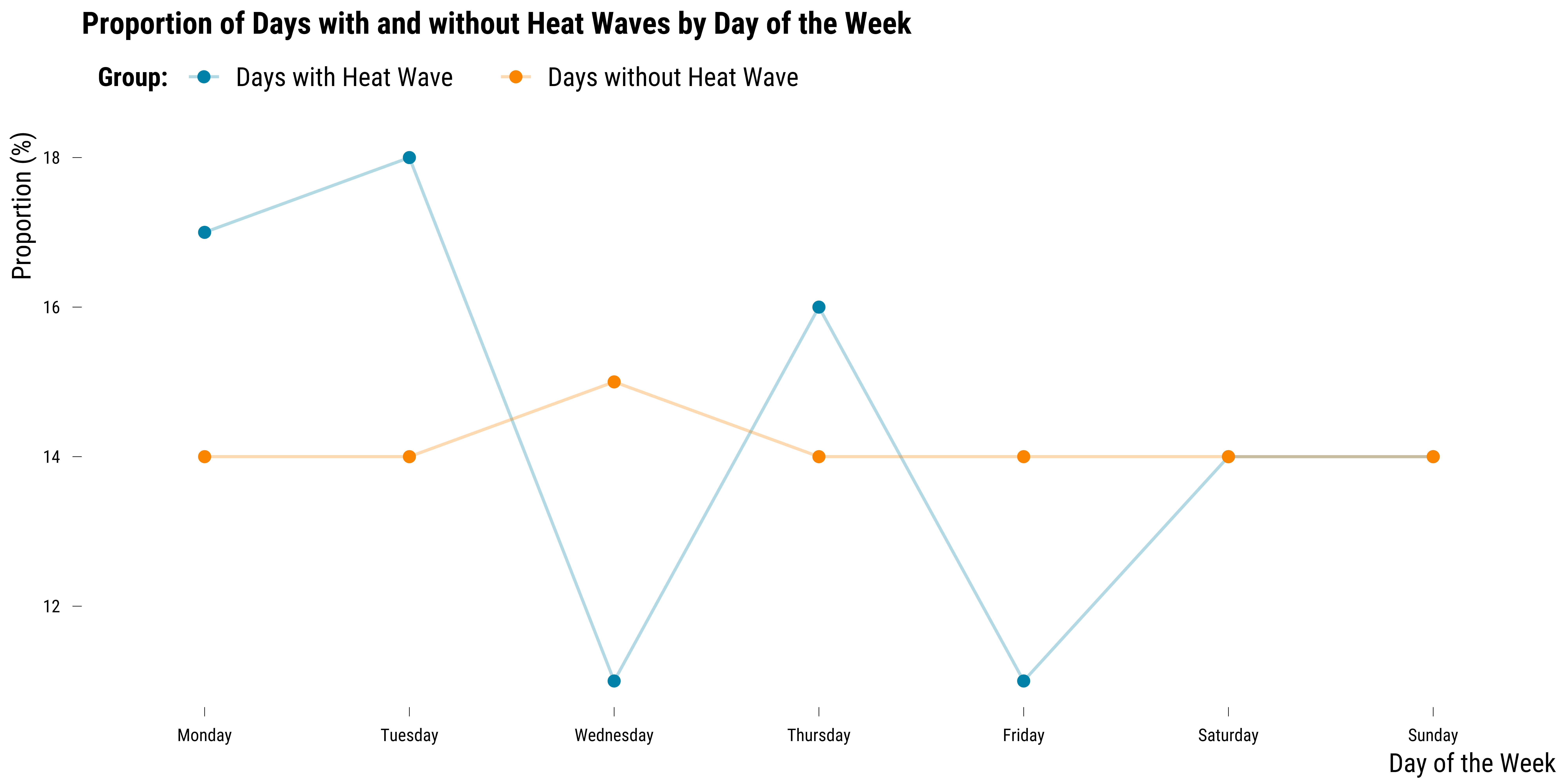
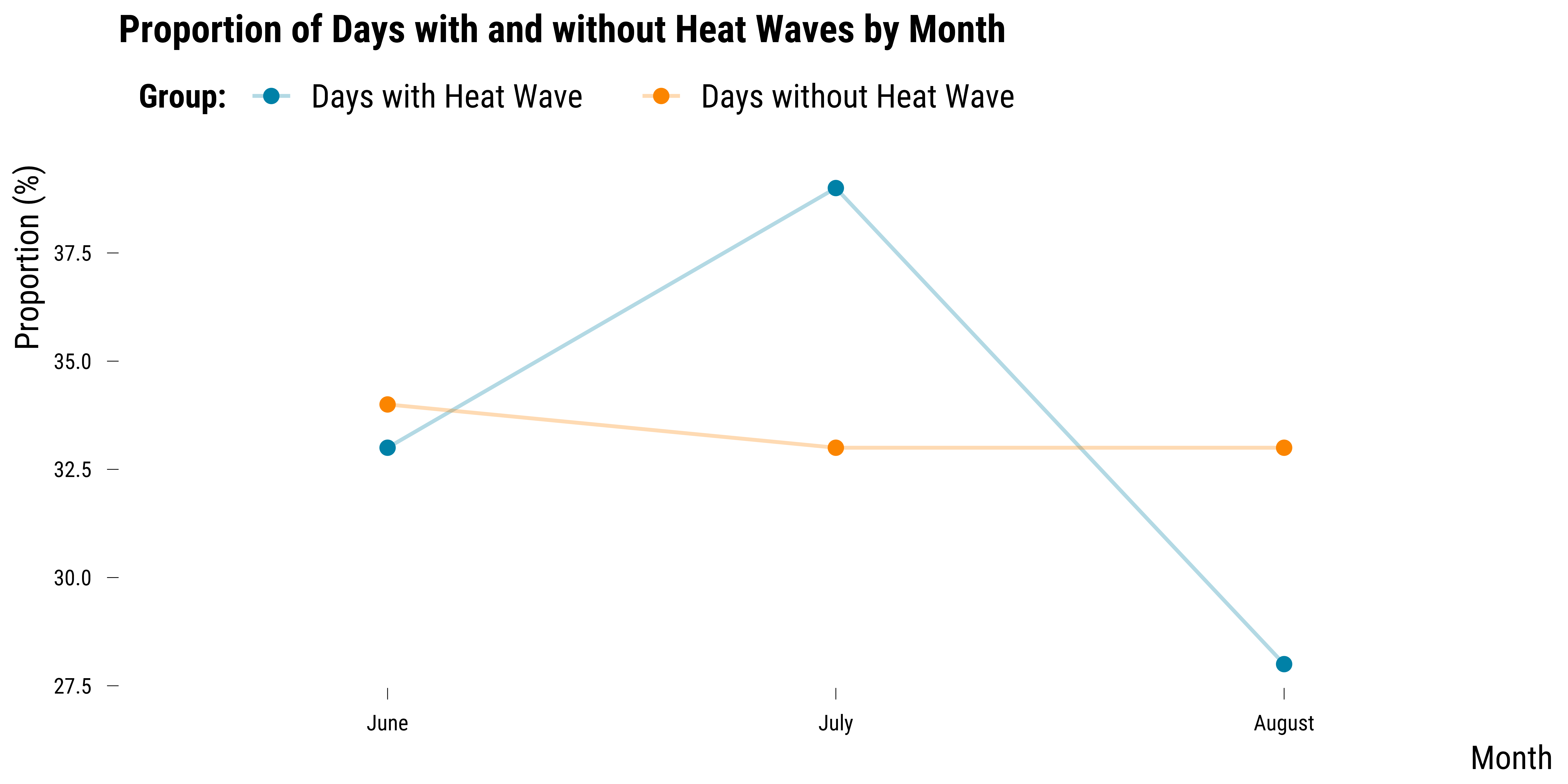
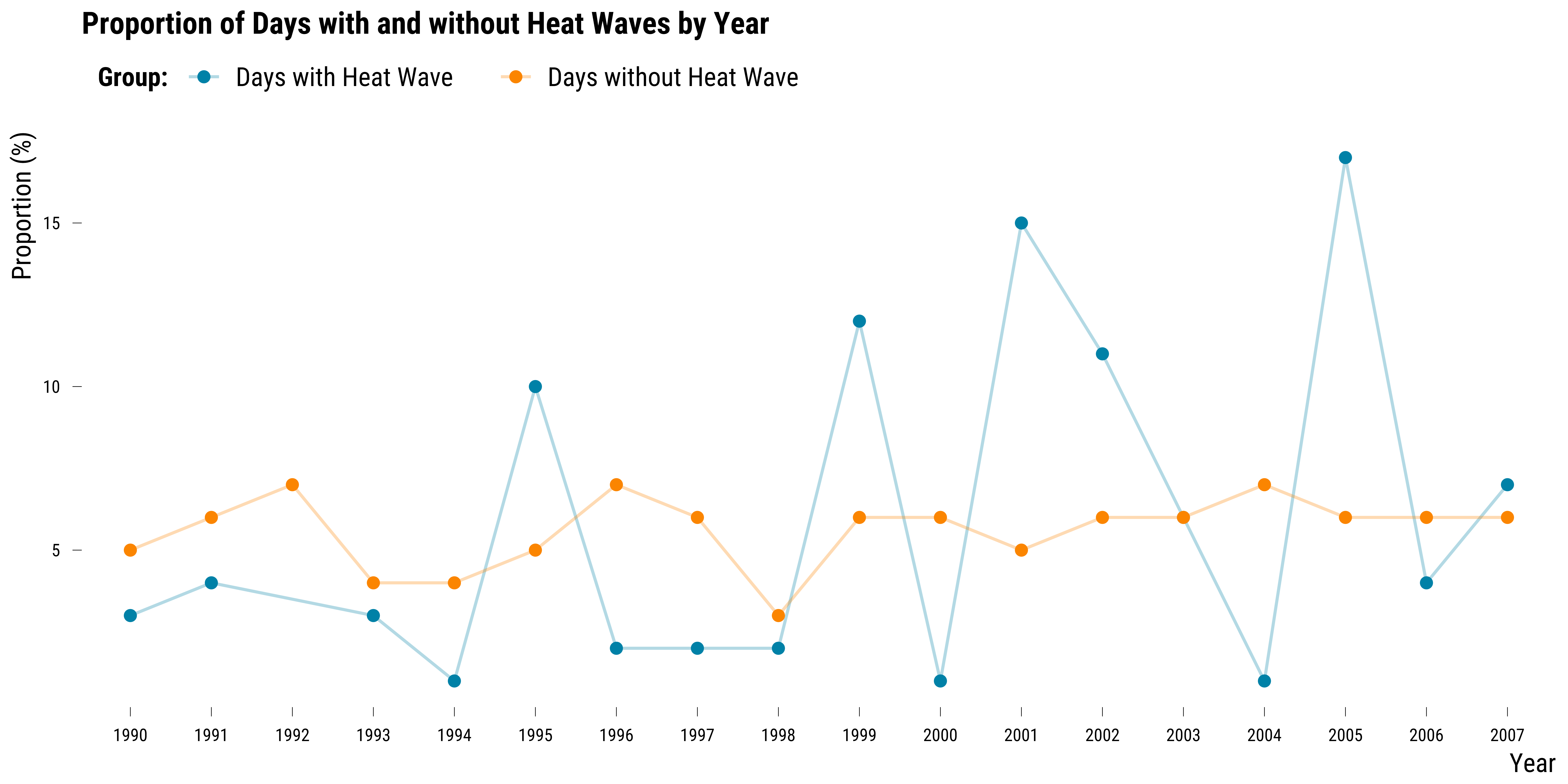
For calendar variables such as the day of the week, the month and the year, we evaluate balance by plotting the proportions of days with and without heat wave. If heat waves were randomly distributed, there should not be difference in the distribution of the proportions for the two groups. We first plot the distribution of proportions for the day of the week:
Please show me the code!
# compute the proportions of observations belonging to each wday by treatment status
data_weekday <- data %>%
  dplyr::select(weekday, heat_wave) %>%
  mutate(weekday = str_to_title(weekday)) %>%
  pivot_longer(.,-heat_wave) %>%
  group_by(name, heat_wave, value) %>%
  summarise(n = n()) %>%
  mutate(proportion = round(n / sum(n) * 100, 0)) %>%
  ungroup() %>%
  mutate(
    value = fct_relevel(
      value,
      "Monday",
      "Tuesday",
      "Wednesday",
      "Thursday",
      "Friday",
      "Saturday",
      "Sunday"
    )
  )

# make a dots graph
graph_weekday_balance <- ggplot(data_weekday,
                                aes(
                                  x = as.factor(value),
                                  y = proportion,
                                  colour = heat_wave,
                                  group = heat_wave
                                )) +
  geom_line(size = 0.5, alpha = 0.3) +
  geom_point(size = 2) +
  scale_colour_manual(values = c(my_blue, my_orange),
                      guide = guide_legend(reverse = FALSE)) +
  ggtitle("Proportion of Days with and without Heat Waves by Day of the Week") +
  ylab("Proportion (%)") +
  xlab("Day of the Week") +
  labs(colour = "Group:") +
  theme_tufte() +
  theme(
    legend.position = "top",
    legend.justification = "left",
    legend.direction = "horizontal"
  )

# display the graph
graph_weekday_balance
Please show me the code!
# save the graph
ggsave(
  graph_weekday_balance + labs(title = NULL),
  filename = here::here("inputs", "3.outputs", "2.graphs", "graph_weekday_balance.pdf"),
  width = 16,
  height = 9,
  units = "cm",
  device = cairo_pdf
)
On this graph, we can see that there are some differences (in percentage points) in the distribution of units between the two groups across days of the week. The differences are however small—at most 4 percentages points. We then plot the same graph but for the month indicator:
Please show me the code!
# compute the proportions of observations belonging to each month by treatment status
data_month <- data %>%
  dplyr::select(month, heat_wave) %>%
  mutate(month = str_to_title(month)) %>%
  mutate(month = fct_relevel(month,
                             "June",
                             "July",
                             "August")) %>%
  pivot_longer(., -heat_wave) %>%
  group_by(name, heat_wave, value) %>%
  summarise(n = n()) %>%
  mutate(proportion = round(n / sum(n) * 100, 0)) %>%
  ungroup()

# make a dots graph
graph_month_balance <- ggplot(data_month,
                              aes(
                                x = as.factor(value),
                                y = proportion,
                                colour = heat_wave,
                                group = heat_wave
                              )) +
  geom_line(size = 0.5, alpha = 0.3) +
  geom_point(size = 2) +
  scale_colour_manual(values = c(my_blue, my_orange),
                      guide = guide_legend(reverse = FALSE)) +
  ggtitle("Proportion of Days with and without Heat Waves by Month") +
  ylab("Proportion (%)") +
  xlab("Month") +
  labs(colour = "Group:") +
  theme_tufte()

# display the graph
graph_month_balance
Please show me the code!
# save the graph
ggsave(
  graph_month_balance + labs(title = NULL),
  filename = here::here("inputs", "3.outputs", "2.graphs", "graph_month_balance.pdf"),
  width = 15,
  height = 8,
  units = "cm",
  device = cairo_pdf
)
We also plot the same graph but for the year variable:
Please show me the code!
# compute the proportions of observations belonging to each year by treatment status
data_year <- data %>%
  dplyr::select(year, heat_wave) %>%
  pivot_longer(.,-heat_wave) %>%
  group_by(name, heat_wave, value) %>%
  summarise(n = n()) %>%
  mutate(proportion = round(n / sum(n) * 100, 0)) %>%
  ungroup()

# make dots plot
graph_year_balance <- ggplot(data_year,
         aes(
           x = as.factor(value),
           y = proportion,
           colour = heat_wave,
           group = heat_wave
         )) +
  geom_line(size = 0.5, alpha = 0.3) +
  geom_point(size = 2) +
  scale_colour_manual(values = c(my_blue, my_orange),
                      guide = guide_legend(reverse = FALSE)) +
  ggtitle("Proportion of Days with and without Heat Waves by Year") +
  ylab("Proportion (%)") +
  xlab("Year") +
  labs(colour = "Group:") +
  theme_tufte()

# display the graph
graph_year_balance
Please show me the code!
# save the graph
ggsave(
  graph_year_balance + labs(title = NULL),
  filename = here::here("inputs", "3.outputs", "2.graphs", "graph_year_balance.pdf"),
  width = 15,
  height = 8,
  units = "cm",
  device = cairo_pdf
)
Not surprisingly, we can see on this graph that there were more heat waves on specific years.
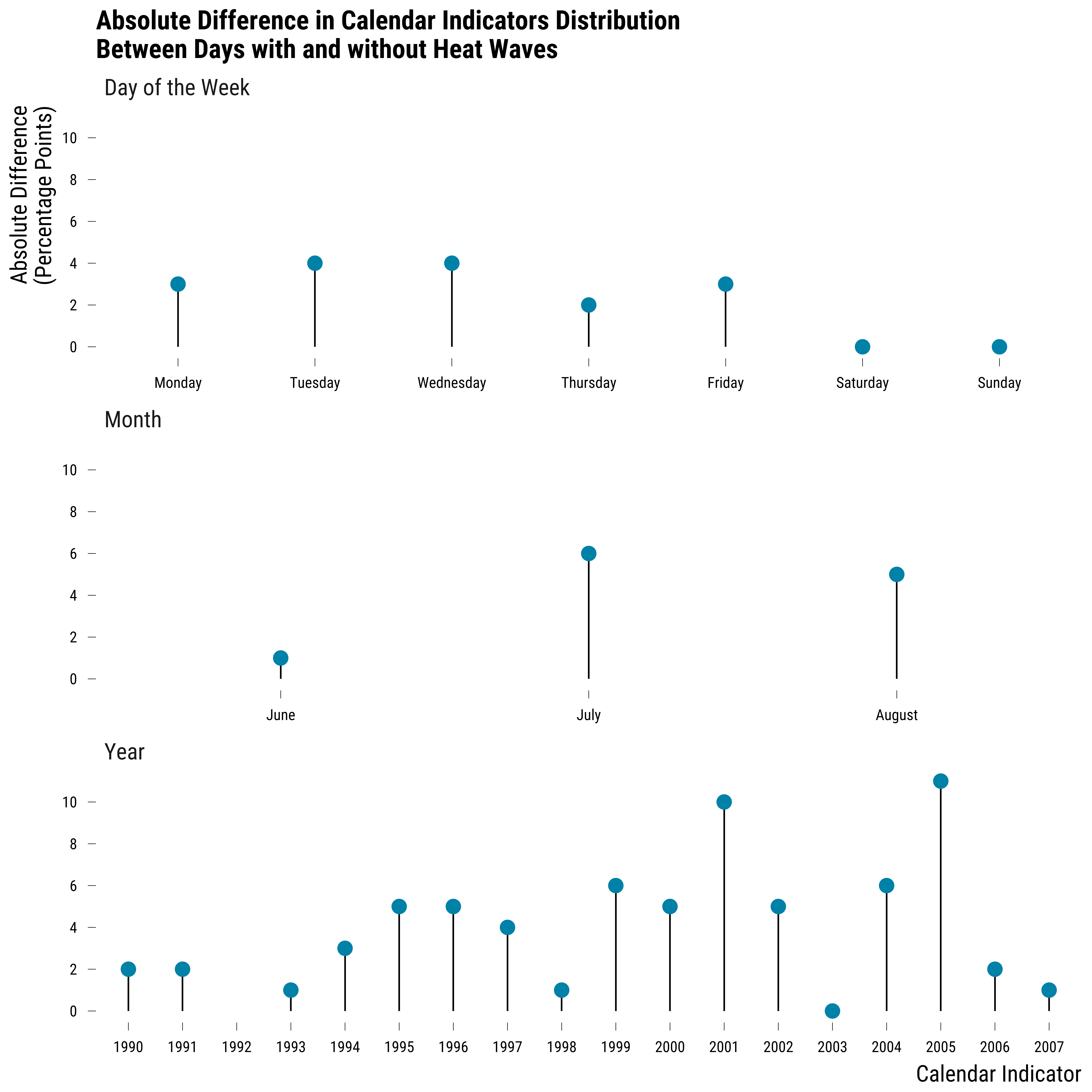
To summarize the imbalance for calendar variables, we can finally compute the difference of proportion (in percentage points) between days with and without heat waves. We compute these differences with the following code:
# compute differences in proportion
data_calendar_difference <- data %>%
  dplyr::select(heat_wave, weekday, month, year) %>%
  mutate_all( ~ as.character(.)) %>%
  pivot_longer(cols = -c(heat_wave),
               names_to = "variable",
               values_to = "value") %>%
  mutate(value = str_to_title(value)) %>%
  # group by is_treated, variable and values
  group_by(heat_wave, variable, value) %>%
  # compute the number of observations
  summarise(n = n()) %>%
  # compute the proportion
  mutate(freq = round(n / sum(n) * 100, 0)) %>%
  ungroup() %>%
  mutate(
    calendar_variable = NA %>%
      ifelse(str_detect(variable, "weekday"), "Day of the Week", .) %>%
      ifelse(str_detect(variable, "month"), "Month", .) %>%
      ifelse(str_detect(variable, "year"), "Year", .)
  ) %>%
  dplyr::select(heat_wave, calendar_variable, value, freq) %>%
  pivot_wider(names_from = heat_wave, values_from = freq) %>%
  mutate(abs_difference = abs(`Days with Heat Wave` - `Days without Heat Wave`)) %>%
  # reoder the values of variable for the graph
  mutate(
    value = fct_relevel(
      value,
      "Monday",
      "Tuesday",
      "Wednesday",
      "Thursday",
      "Friday",
      "Saturday",
      "Sunday",
      "June",
      "July",
      "August"
    )
  )
We plot below the differences in proportion for each calendar indicator:
Please show me the code!
# plot the differences in proportion for each calendar indicator
graph_all_calendar_balance <-
  ggplot(data_calendar_difference, aes(x = value, y = abs_difference)) +
  geom_segment(aes(
    x = value,
    xend = value,
    y = 0,
    yend = abs_difference
  ), size = 0.3) +
  geom_point(colour = my_blue, size = 3) +
  scale_y_continuous(breaks = scales::pretty_breaks(n = 8)) +
  facet_wrap( ~ calendar_variable, scales = "free_x", ncol = 1) +
  ggtitle(
    "Absolute Difference in Calendar Indicators Distribution\nBetween Days with and without Heat Waves"
  ) +
  xlab("Calendar Indicator") + ylab("Absolute Difference\n(Percentage Points)") +
  theme_tufte()

# display the graph
graph_all_calendar_balance
Please show me the code!
# save the graph
ggsave(
  graph_all_calendar_balance + labs(title = NULL),
  filename = here::here("inputs", "3.outputs", "2.graphs", "graph_all_calendar_balance.pdf"),
  width = 18,
  height = 15,
  units = "cm",
  device = cairo_pdf
)
We display in the table below the values of the standardized mean differences by covariates and lags:
Please show me the code!
| Calendard Variable | Value | Absolue Difference in % Points |
|---|---|---|
| Month | August | 5 |
| Month | July | 6 |
| Month | June | 1 |
| Day of the Week | Friday | 3 |
| Day of the Week | Monday | 3 |
| Day of the Week | Saturday | 0 |
| Day of the Week | Sunday | 0 |
| Day of the Week | Thursday | 2 |
| Day of the Week | Tuesday | 4 |
| Day of the Week | Wednesday | 4 |
| Year | 1990 | 2 |
| Year | 1991 | 2 |
| Year | 1993 | 1 |
| Year | 1994 | 3 |
| Year | 1995 | 5 |
| Year | 1996 | 5 |
| Year | 1997 | 4 |
| Year | 1998 | 1 |
| Year | 1999 | 6 |
| Year | 2000 | 5 |
| Year | 2001 | 10 |
| Year | 2002 | 5 |
| Year | 2003 | 0 |
| Year | 2004 | 6 |
| Year | 2005 | 11 |
| Year | 2006 | 2 |
| Year | 2007 | 1 |
| Year | 1992 | NA |
Lack of Common Support
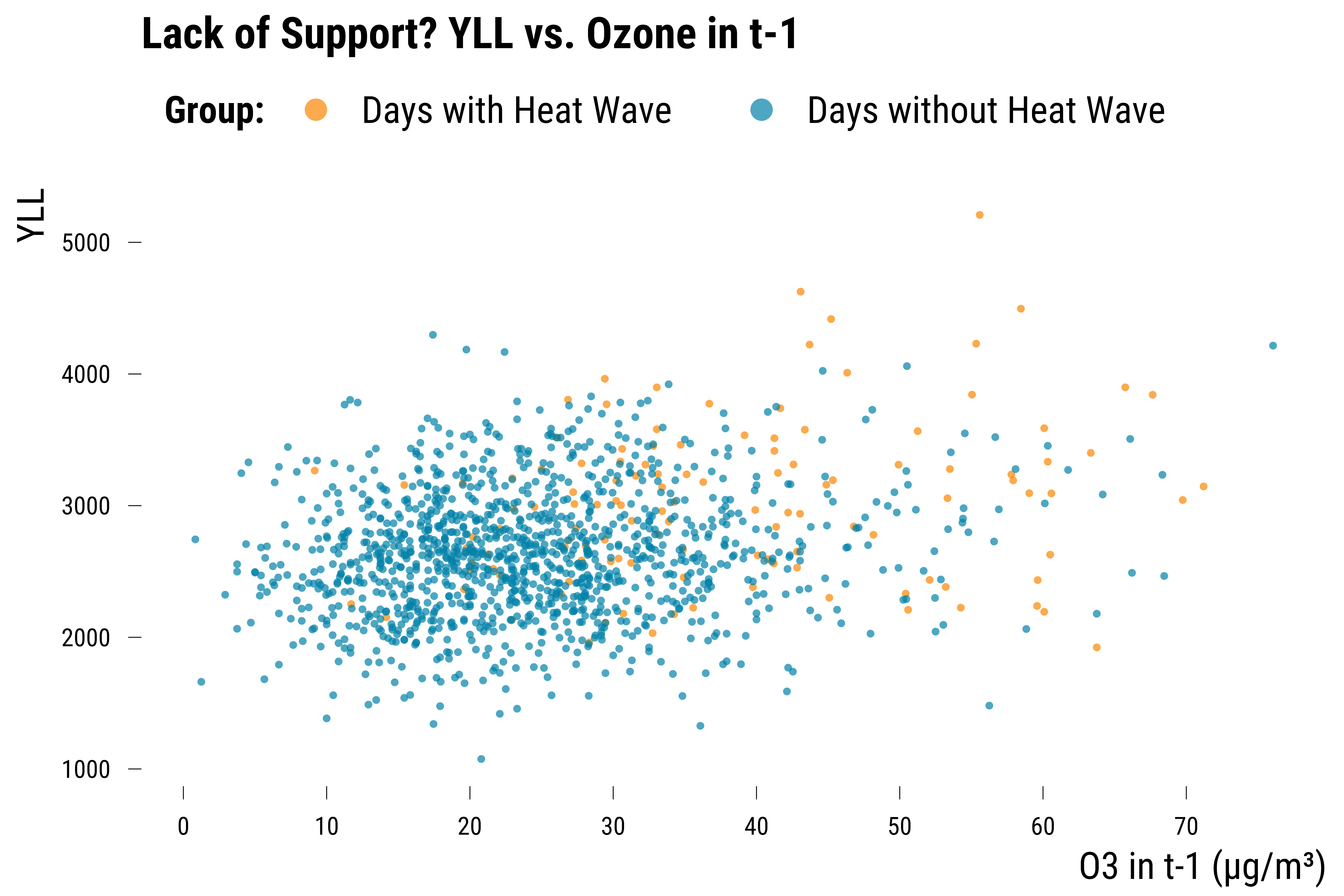
To illustrate the issue of a lack of common support, we plot the YLL against the concentration of ozone in \(t-1\) and color the points according to the heat wave status:
Please show me the code!
# illustrate lack of support
graph_lack_support_1 <- ggplot(data, aes(x = o3_lag_1, y = yll, colour = heat_wave)) +
  geom_point(shape = 16, size = 0.8, alpha = 0.7) +
  scale_colour_manual(values = c(my_orange, my_blue)) +
  scale_x_continuous(breaks = scales::pretty_breaks(n = 8)) +
  labs(colour = "Group:") +
  ggtitle("Lack of Support? YLL vs. Ozone in t-1") +
  xlab("O3 in t-1 (µg/m³)") + ylab("YLL") +
  theme_tufte() +
  guides(colour = guide_legend(override.aes = list(size = 3)))

# display the graph
graph_lack_support_1
Please show me the code!
# save the graph
ggsave(
  graph_lack_support_1 + labs(title = NULL),
  filename = here::here("inputs", "3.outputs", "2.graphs", "graph_lack_support_1.pdf"),
  width = 14,
  height = 12,
  units = "cm",
  device = cairo_pdf
)
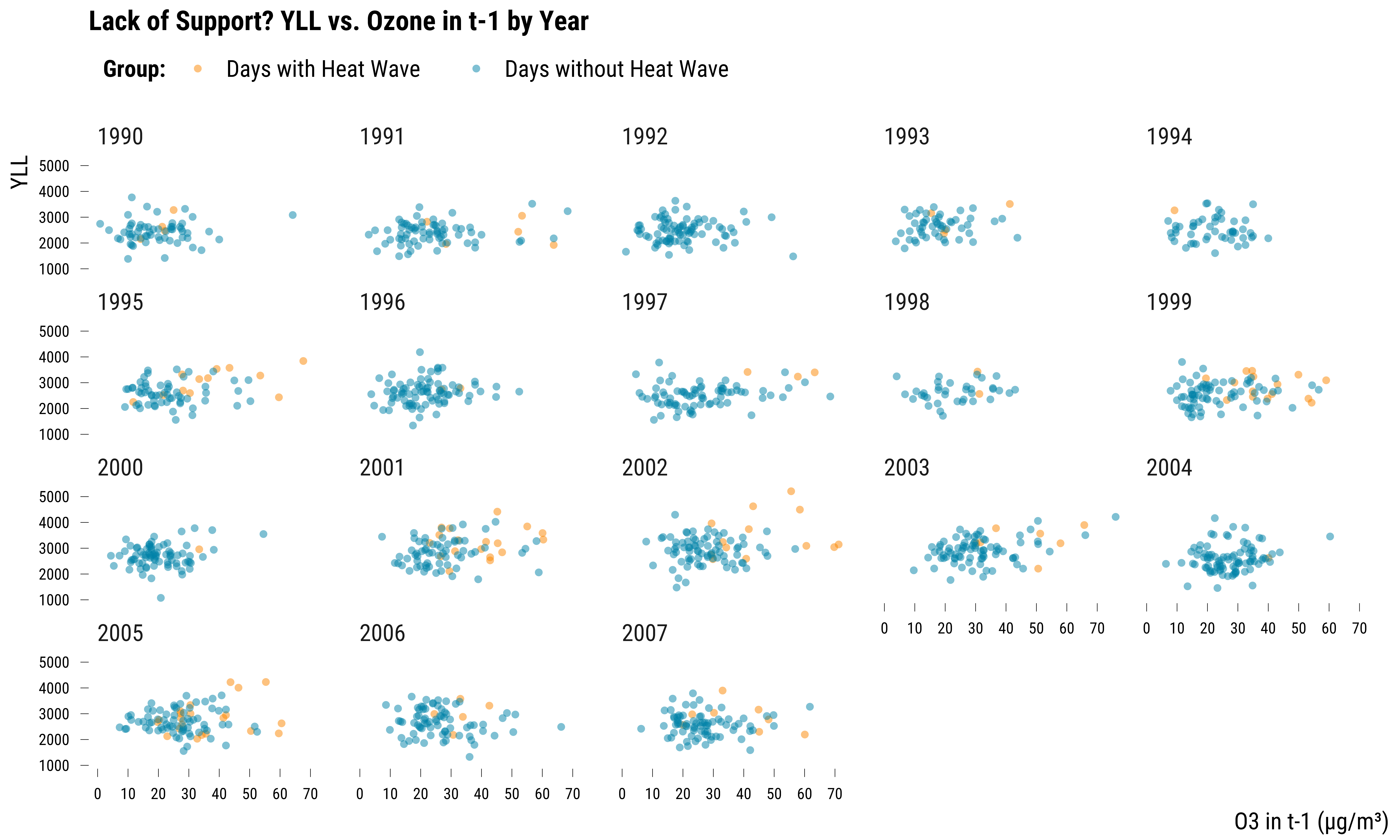
We can see on this graph that some days without heat waves do not have any similar days with heatwaves in terms of ozone concentrations in \(t-1\). We can also reproduce this figure by year:
Please show me the code!
# illustrate lack of support by year
graph_lack_support_2 <- ggplot(data, aes(x = o3_lag_1, y = yll, colour = heat_wave)) +
  geom_point(shape = 16, alpha = 0.5) +
  scale_colour_manual(values = c(my_orange, my_blue)) +
  scale_x_continuous(breaks = scales::pretty_breaks(n = 8)) +
  facet_wrap(~ year) +
  labs(colour = "Group:") +
  ggtitle("Lack of Support? YLL vs. Ozone in t-1 by Year") +
  xlab("O3 in t-1 (µg/m³)") + ylab("YLL") +
  theme_tufte()

# display the graph
graph_lack_support_2
Please show me the code!
# save the graph
ggsave(
  graph_lack_support_2 + labs(title = NULL),
  filename = here::here("inputs", "3.outputs", "2.graphs", "graph_lack_support_2.pdf"),
  width = 30,
  height = 20,
  units = "cm",
  device = cairo_pdf
)
Again, there is a clear lack of common support within each year.
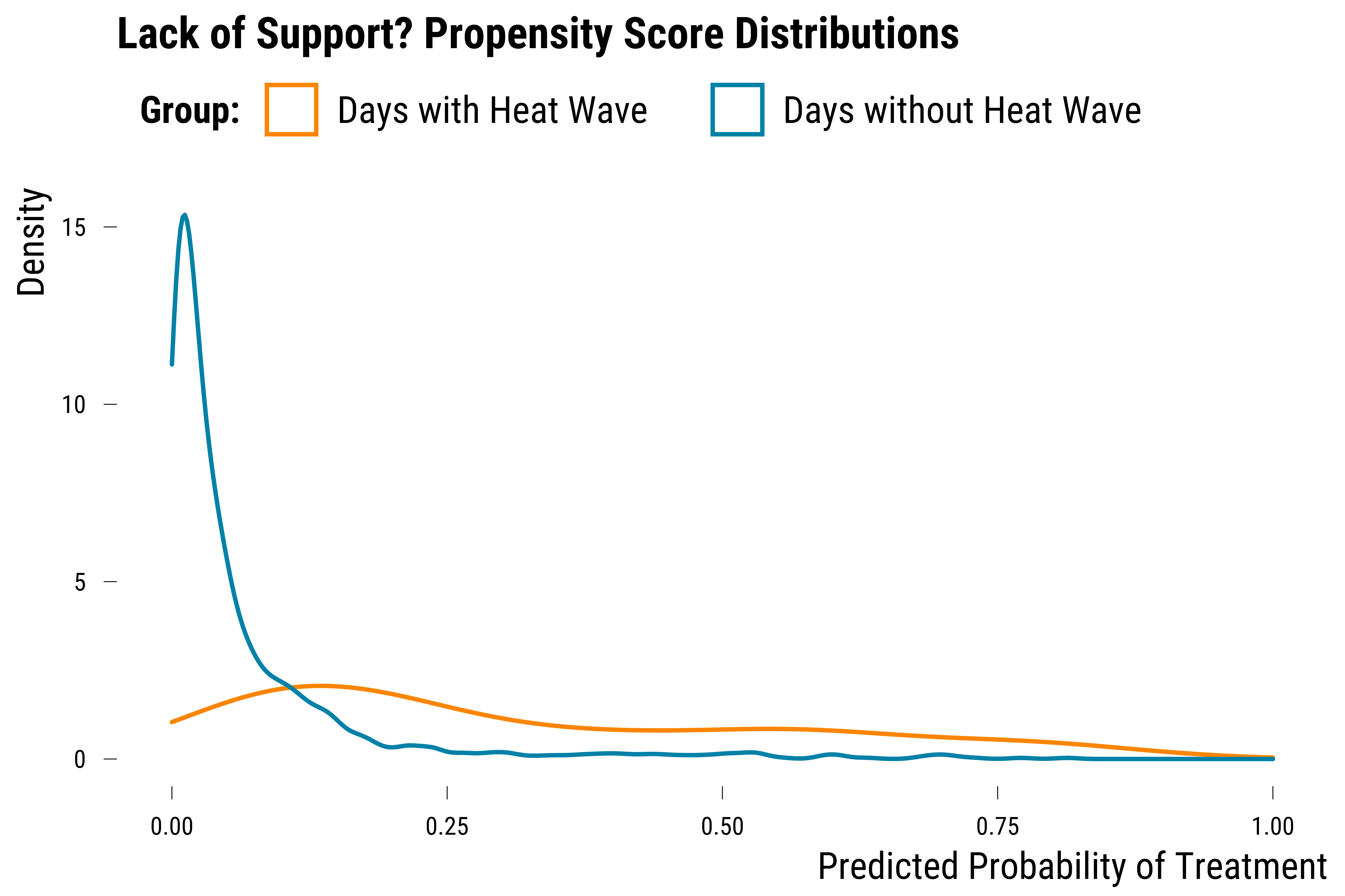
Finally, we can also visualize the imbalance and lack of common support in the data by predicting, using a simple logistic model, the probability of an heat wave to occur for each day.
Please show me the code!
# predict propensity scores
logit_model <- data %>%
  mutate(heat_wave = ifelse(heat_wave == "Days without Heat Wave", 0, 1)) %>%
  glm(
    heat_wave ~ heat_wave_lag_1 + heat_wave_lag_2 + heat_wave_lag_3 +
      humidity_relative +
      o3_lag_1 + o3_lag_2 + o3_lag_3 +
      no2_lag_1 + no2_lag_2 + no2_lag_3 +
      weekend + month + year,
    family = "binomial",
    data = .
  )

# add predicted probabilities
data <- broom::augment(x = logit_model,
                       newdata = data,
                       type.predict = "response")

# create the graph
graph_lack_support_3 <- data %>%
  ggplot(., aes(x = .fitted, colour = heat_wave)) +
  xlim(0, 1) +
  geom_density() +
  scale_colour_manual(values = c(my_orange, my_blue)) +
  labs(colour = "Group:") +
  ggtitle("Lack of Support? Propensity Score Distributions") +
  xlab("Predicted Probability of Treatment") + ylab("Density") +
  theme_tufte()

# display the graph
graph_lack_support_3
Please show me the code!
# save the graph
ggsave(
  graph_lack_support_3 + labs(title = NULL),
  filename = here::here("inputs", "3.outputs", "2.graphs", "graph_lack_support_3.pdf"),
  width = 14,
  height = 10,
  units = "cm",
  device = cairo_pdf
)
We can see on this graph that the two density distributions do not overlap. We display below the summary statistics of the two distributions:
Please show me the code!
| heat_wave | Mean | SD | Min | Max |
|---|---|---|---|---|
| Days with Heat Wave | 0.31 | 0.24 | 0.01 | 0.90 |
| Days without Heat Wave | 0.07 | 0.11 | 0.00 | 0.81 |