In this document, we take great care providing all steps and R codes required to compare the matched data to the initial data. We compare hours where:
- treated units are hours with positive entering cruise traffic in t.
- control units are hours without entering cruise traffic in t.
We adjust for calendar calendar indicator and weather confounding factors.
Should you have any questions, need help to reproduce the analysis or find coding errors, please do not hesitate to contact us at leo.zabrocki@gmail.com and marion.leroutier@hhs.se.
Required Packages
We load the following packages:
# load required packages
library(knitr) # for creating the R Markdown document
library(here) # for files paths organization
library(dtplyr) # to speed up to dplyr
library(tidyverse) # for data manipulation and visualization
library(ggridges) # for ridge density plots
library(kableExtra) # for table formatting
library(Cairo) # for printing custom police of graphs
library(patchwork) # combining plots
We also load our custom ggplot2 theme for graphs:
Comparing Distribution of Covariates in Matched and Initial Datasets
We explore the characteristics of the matched data by comparing the
distribution of its covariates to those of the initial data. We load the
two datasets and bind them in the data_all object:
# load Initial Data
data_matching <-
  readRDS(
    here::here(
      "inputs",
      "1.data",
      "1.hourly_data",
      "2.data_for_analysis",
      "1.matched_data",
      "matching_data.rds"
    )
  ) %>%
  mutate(dataset = "Initial Data")

# load matched data
data_matched <-
  readRDS(
    here::here(
      "inputs",
      "1.data",
      "1.hourly_data",
      "2.data_for_analysis",
      "1.matched_data",
      "matched_data_entry_cruise.rds"
    )
  ) %>%
  mutate(dataset = "Matched Data")

# bind the three datasets
data_all <- bind_rows(data_matching, data_matched) %>% as.data.frame()
Figures
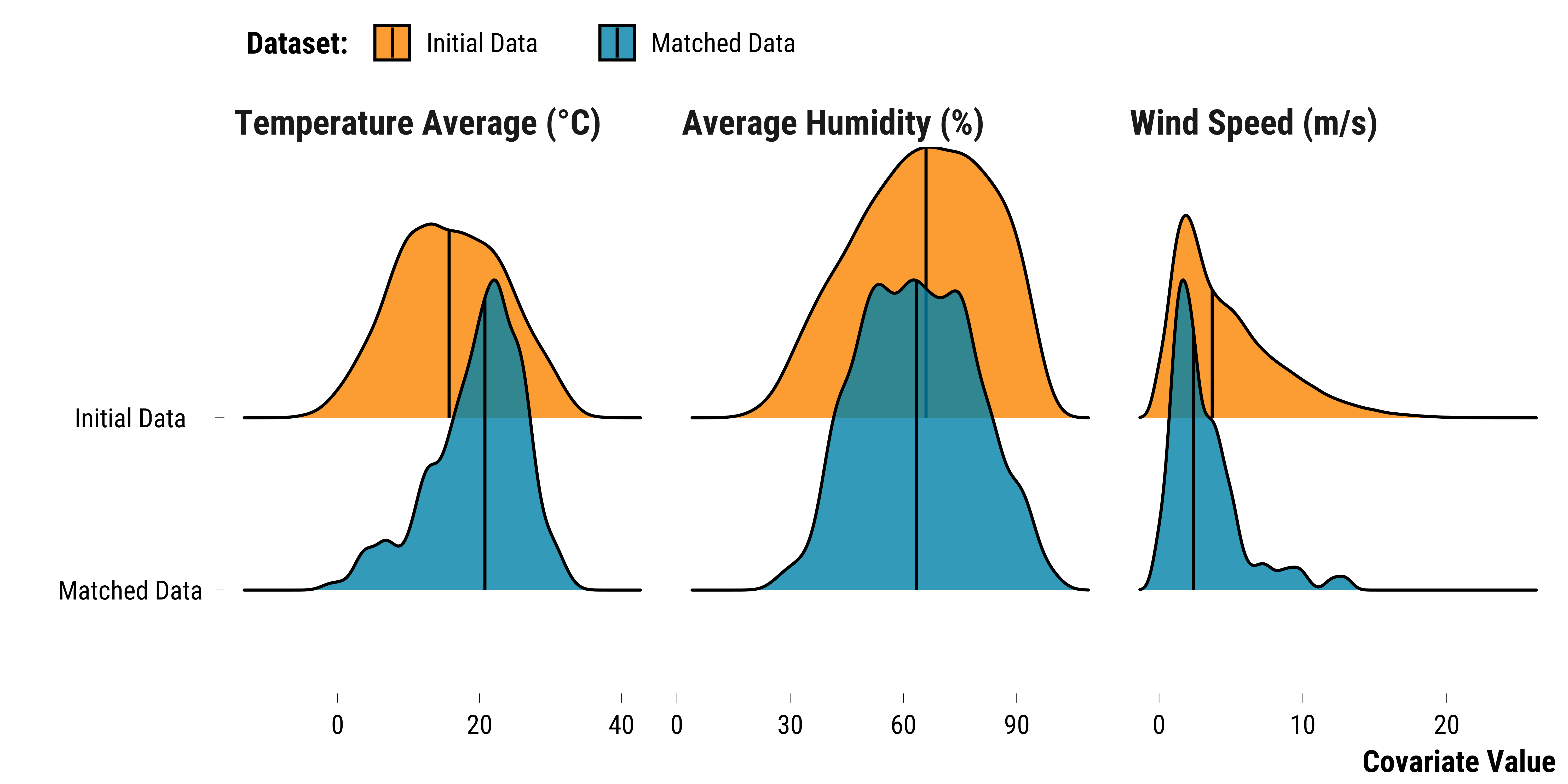
We plot below the density distributions of continuous weather covariates for the two datasets:
Please show me the code!
# we select continuous weather variables and store them in a long dataframe
data_continuous_weather_variables <- data_all %>%
  select(temperature_average, wind_speed, humidity_average, dataset) %>%
  pivot_longer(
    .,
    cols =  c(temperature_average:humidity_average),
    names_to = "variable",
    values_to = "values"
  ) %>%
  mutate(
    variable =  factor(
      variable,
      levels = c("temperature_average", "humidity_average", "wind_speed")
    ) %>%
      fct_recode(
        .,
        "Temperature Average (°C)" = "temperature_average",
        "Average Humidity (%)" = "humidity_average",
        "Wind Speed (m/s)" = "wind_speed"
      )
  ) %>%
  mutate(dataset = fct_relevel(dataset, "Initial Data", "Matched Data"))

# we plot the density distributions
graph_density_continuous_weather_variables <-
  ggplot(data_continuous_weather_variables,
         aes(
           x = values,
           y = fct_rev(dataset),
           fill = fct_rev(dataset)
         )) +
  stat_density_ridges(
    quantile_lines = TRUE,
    quantiles = 2,
    colour = "black",
    alpha = 0.8
  ) +
  scale_fill_manual(values = c(my_blue, my_orange),
                    guide = guide_legend(reverse = TRUE)) +
  ylab("") +
  xlab("Covariate Value") +
  labs(fill = "Dataset:") +
  facet_wrap(~ variable, scale = "free_x", ncol = 3) +
  theme_tufte()

# print the graph
graph_density_continuous_weather_variables
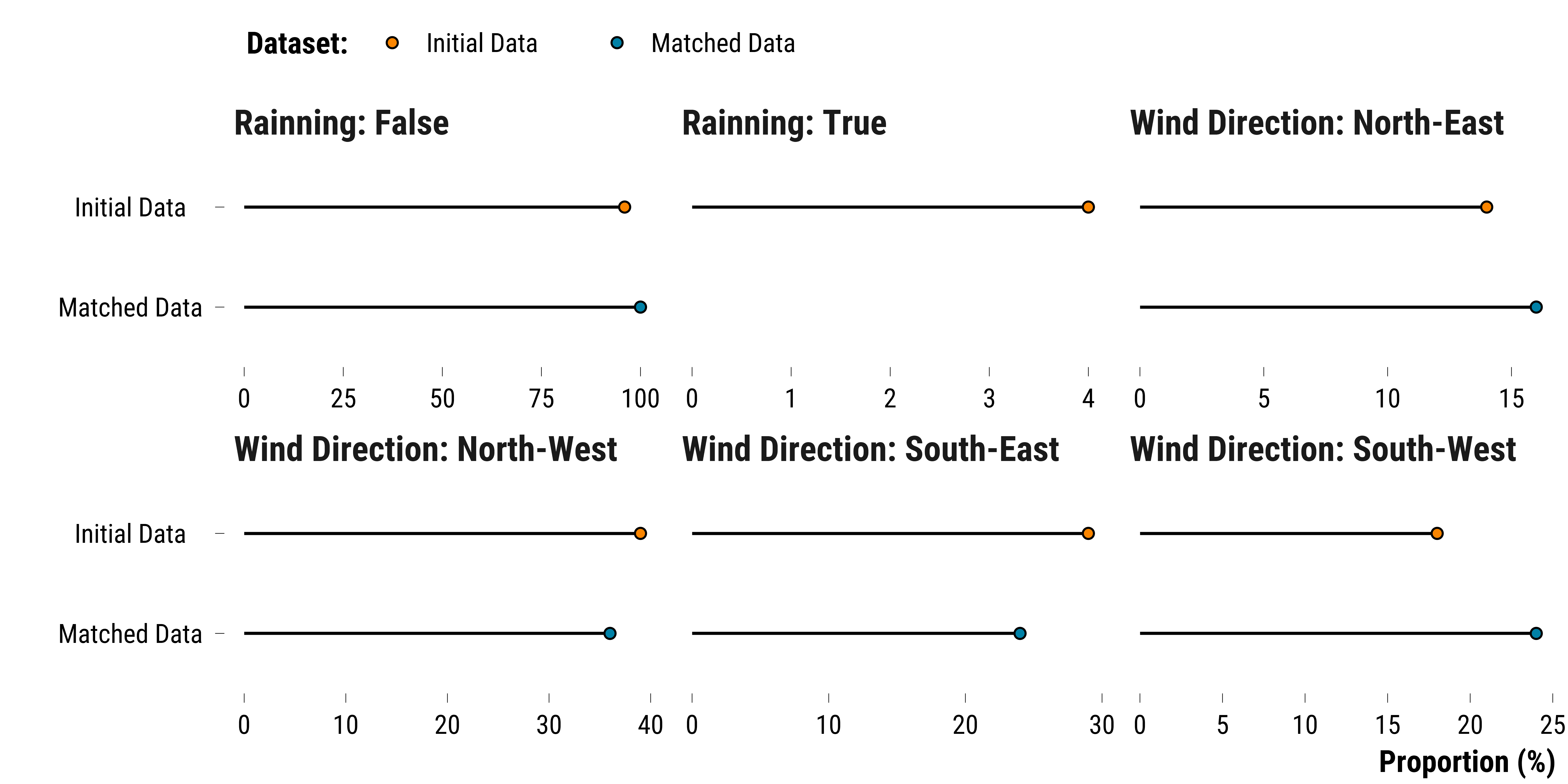
We plot the proportion of weather categorical variables for the two datasets
Please show me the code!
# we select categorical weather variables and store them in a long dataframe
data_categorical_weather_variables <- data_all %>%
  # select relevant variables
  select(wind_direction_categories, rainfall_height_dummy, dataset) %>%
  # recode the rainfall_height_dummy into true/false
  mutate(
    rainfall_height_dummy = ifelse(rainfall_height_dummy == 1, "Rainning: True", "Rainning: False")
  ) %>%
  mutate(
    wind_direction_categories = fct_recode(
      wind_direction_categories,
      "Wind Direction: North-East" = "North-East",
      "Wind Direction: South-East" = "South-East",
      "Wind Direction: South-West" = "South-West",
      "Wind Direction: North-West" = "North-West"
    )
  ) %>%
  # transform variables to character
  mutate_all( ~ as.character(.)) %>%
  # transform the data to long to compute the proportion of observations for each variable
  pivot_longer(cols = -c(dataset),
               names_to = "variable",
               values_to = "values") %>%
  # group by dataset, variable and values
  group_by(dataset, variable, values) %>%
  # compute the number of observations
  summarise(n = n()) %>%
  # compute the proportion
  mutate(freq = round(n / sum(n) * 100, 0)) %>%
  # reorder labels of the dataset variable
  ungroup() %>%
  mutate(dataset = fct_relevel(dataset, "Initial Data", "Matched Data"))

# we plot the cleveland dots plots
graph_categorical_weather_variables <-
  ggplot(data_categorical_weather_variables,
         aes(
           x = freq,
           y = fct_rev(dataset),
           fill =  fct_rev(dataset)
         )) +
  geom_segment(aes(
    x = 0,
    xend = freq,
    y =  fct_rev(dataset),
    yend =  fct_rev(dataset)
  )) +
  geom_point(shape = 21,
             color = "black",
             size = 2) +
  scale_fill_manual(values = c(my_blue, my_orange),
                    guide = guide_legend(reverse = TRUE)) +
  facet_wrap( ~ values, scale = "free_x", ncol = 3) +
  ylab("") +
  xlab("Proportion (%)") +
  labs(fill = "Dataset:") +
  theme_tufte()

# print the graph
graph_categorical_weather_variables
We combine the graph_density_continuous_weather_variables and graph_categorical_weather_variables:
Please show me the code!
# combine plots
graph_weather_three_datasets <-
  graph_density_continuous_weather_variables / graph_categorical_weather_variables +
  plot_annotation(tag_levels = 'A') &
  theme(plot.tag = element_text(size = 30, face = "bold"))

# save the plot
ggsave(
  graph_weather_three_datasets,
  filename = here::here(
    "inputs",
    "3.outputs",
    "1.hourly_analysis",
    "2.experiment_cruise",
    "1.checking_matching_procedure",
    "graph_weather_two_datasets.pdf"
  ),
  width = 50,
  height = 40,
  units = "cm",
  device = cairo_pdf
)
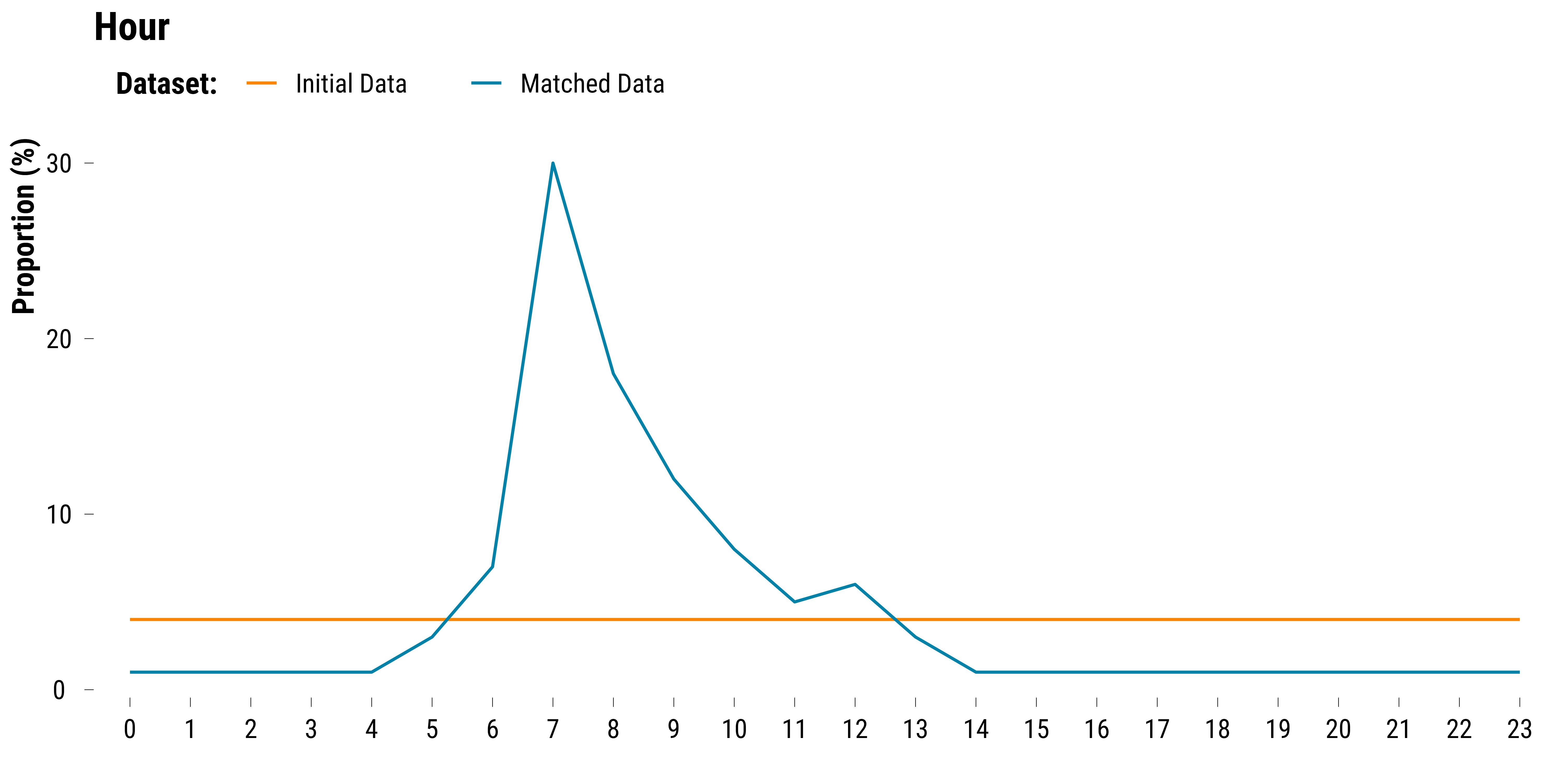
We plot the proportions of observations belonging to each hour by dataset:
Please show me the code!
# we select season and year variables
data_hour <- data_all %>%
  select(hour, dataset) %>%
  pivot_longer(.,-dataset) %>%
  group_by(name, dataset, value) %>%
  summarise(n = n()) %>%
  mutate(proportion = round(n / sum(n) * 100, 0)) %>%
  ungroup() %>%
  mutate(dataset = fct_relevel(dataset, "Initial Data", "Matched Data"))


# we plot the data using cleveland dot plots
graph_hour <-
  ggplot(
    data_hour,
    aes(
      x = as.factor(value),
      y = proportion,
      colour = dataset,
      group = dataset
    )
  ) +
  geom_line() +
  scale_colour_manual(values = c(my_orange, my_blue),
                      guide = guide_legend(reverse = FALSE)) +
  ggtitle("Hour") +
  ylab("Proportion (%)") +
  xlab("") +
  labs(colour = "Dataset:") +
  theme_tufte()

# we print the graph
graph_hour
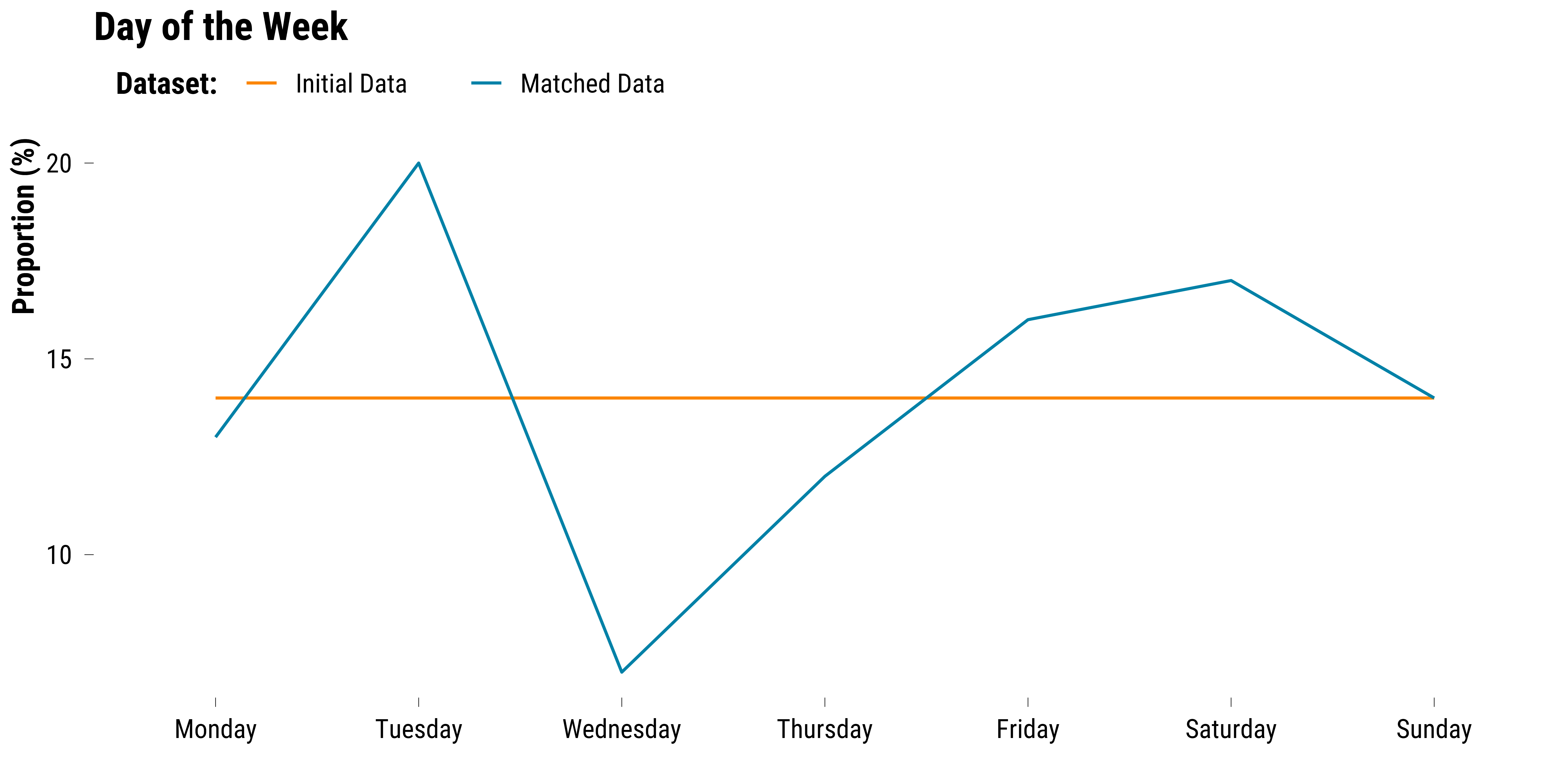
We plot the proportions of observations belonging to each day of the week by dataset:
Please show me the code!
# compute the proportions of observations belonging to each day of the week by dataset
data_weekday <- data_all %>%
  mutate(weekday = lubridate::wday(date, abbr = FALSE, label = TRUE)) %>%
  select(weekday, dataset) %>%
  mutate(
    weekday = fct_relevel(
      weekday,
      "Monday",
      "Tuesday",
      "Wednesday",
      "Thursday",
      "Friday",
      "Saturday",
      "Sunday"
    )
  ) %>%
  pivot_longer(.,-dataset) %>%
  group_by(name, dataset, value) %>%
  summarise(n = n()) %>%
  mutate(proportion = round(n / sum(n) * 100, 0)) %>%
  ungroup() %>%
  mutate(dataset = fct_relevel(dataset, "Initial Data", "Matched Data"))

# we plot the data using cleveland dot plots
graph_weekday <-
  ggplot(
    data_weekday,
    aes(
      x = as.factor(value),
      y = proportion,
      colour = dataset,
      group = dataset
    )
  ) +
  geom_line() +
  scale_colour_manual(values = c(my_orange, my_blue),
                      guide = guide_legend(reverse = FALSE)) +
  ggtitle("Day of the Week") +
  ylab("Proportion (%)") +
  xlab("") +
  labs(colour = "Dataset:") +
  theme_tufte()

# we print the graph
graph_weekday
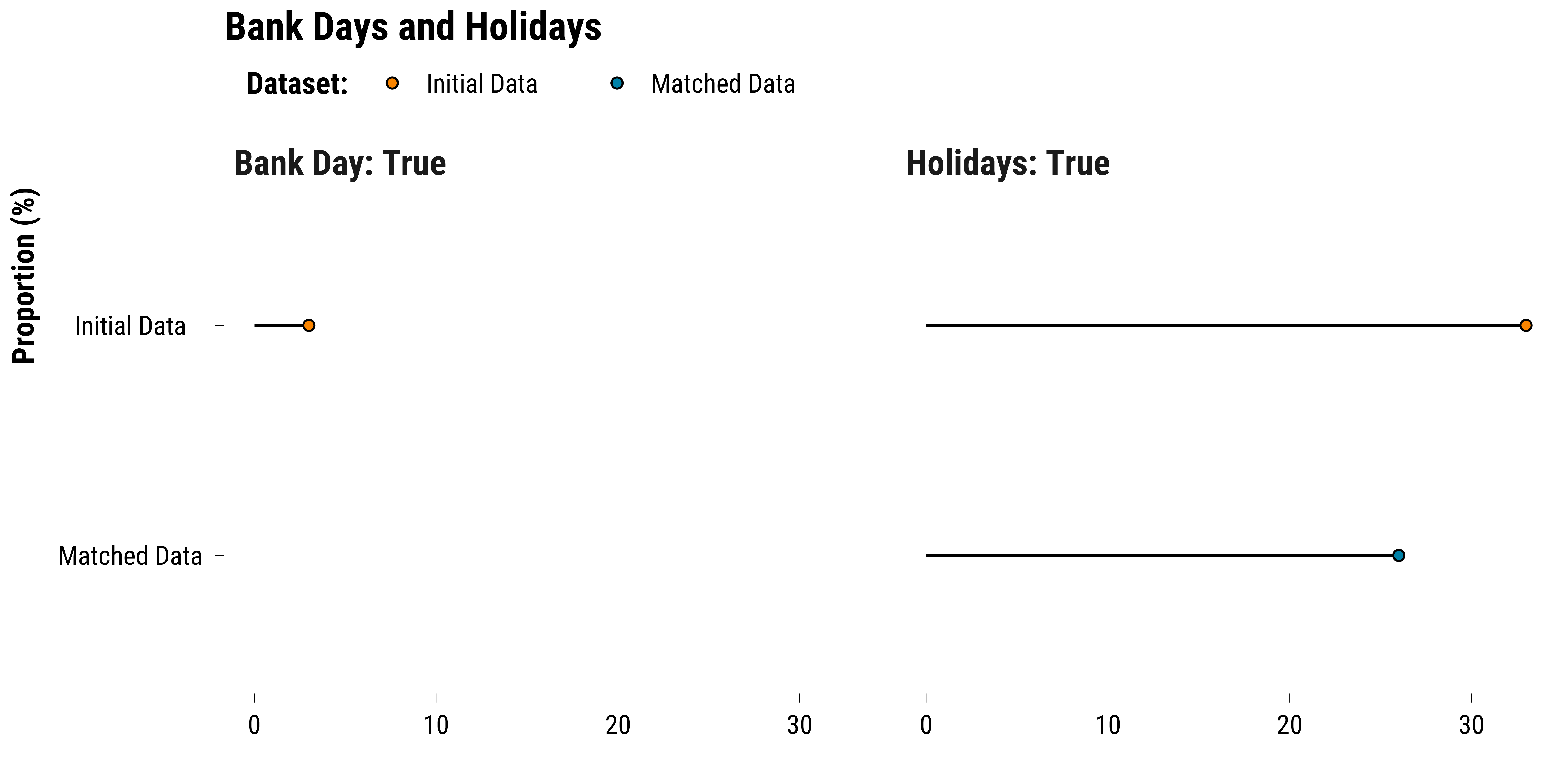
We plot the proportions of observations belonging to bank days and holidays by dataset:
Please show me the code!
# compute the proportions of observations belonging to bank days and holidays by dataset
data_bank_holidays <- data_all %>%
  select(bank_day_dummy, holidays_dummy, dataset) %>%
  pivot_longer(.,-dataset) %>%
  mutate(name = recode(name, bank_day_dummy = "Bank Day", holidays_dummy = "Holidays")) %>%
  group_by(name, dataset, value) %>%
  summarise(n = n()) %>%
  mutate(proportion = round(n / sum(n) * 100, 0)) %>%
  ungroup() %>%
  mutate(dataset = fct_relevel(dataset, "Data", "Initial Data", "Matched Data")) %>%
  filter(value == 1) %>%
  mutate(name = paste(name, ": True", sep = ""))

# we plot the data using cleveland dot plots
graph_bank_holidays <-
  ggplot(data_bank_holidays,
         aes(
           x = proportion,
           y = as.factor(dataset),
           fill = dataset
         )) +
  geom_segment(aes(
    x = 0,
    xend = proportion,
    y =  fct_rev(dataset),
    yend =  fct_rev(dataset)
  )) +
  geom_point(shape = 21,
             colour = "black",
             size = 2) +
  scale_fill_manual(values = c(my_orange, my_blue),
                    guide = guide_legend(reverse = FALSE)) +
  facet_wrap( ~ name) +
  ggtitle("Bank Days and Holidays") +
  ylab("Proportion (%)") +
  xlab("") +
  labs(fill = "Dataset:") +
  theme_tufte()

# we print the graph
graph_bank_holidays
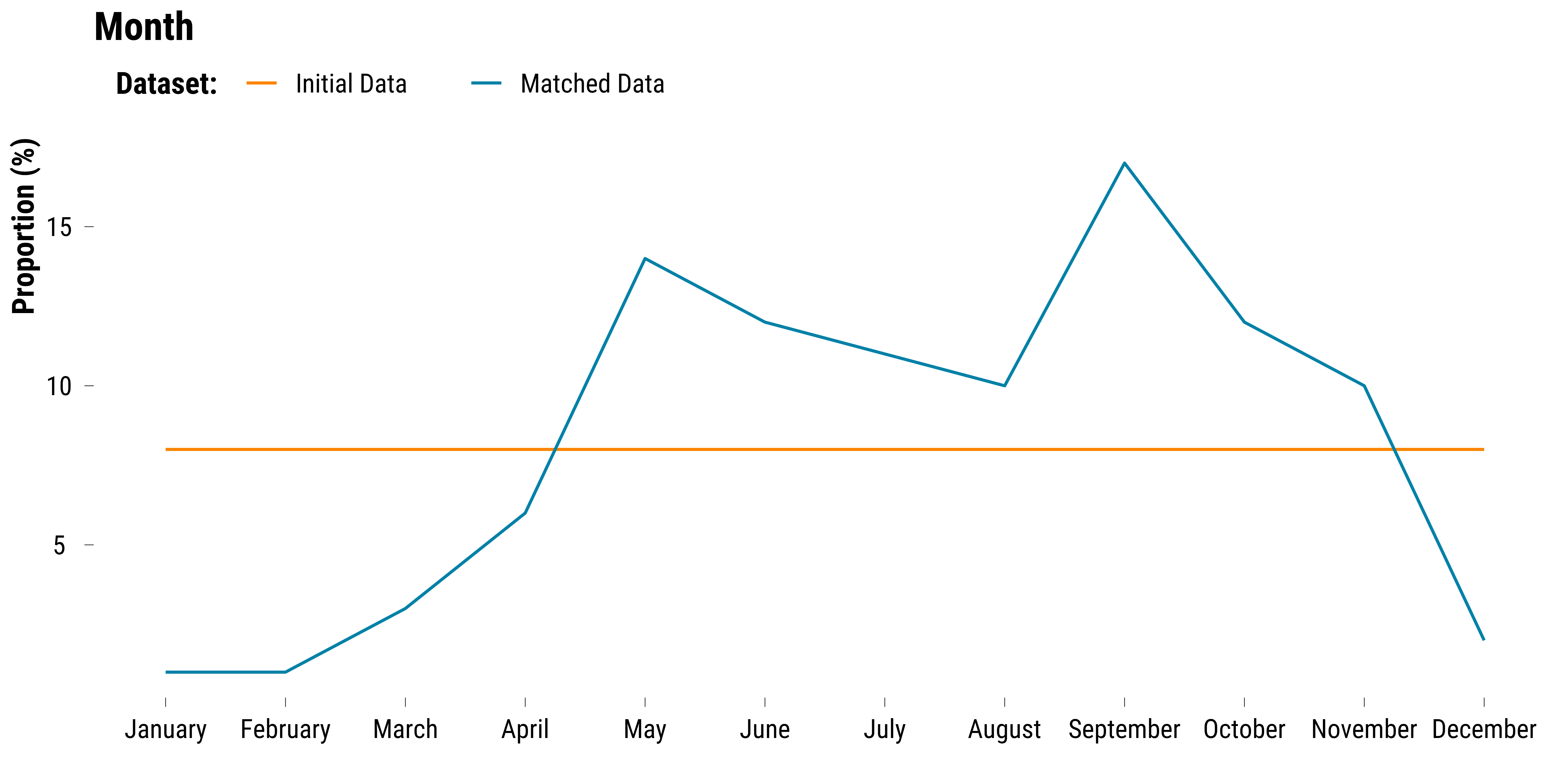
We plot the proportions of observations belonging to each month by dataset:
Please show me the code!
# compute the proportions of observations belonging to each month by dataset
data_month <- data_all %>%
  select(month, dataset) %>%
  mutate(
    month = recode(
      month,
      `1` = "January",
      `2` = "February",
      `3` = "March",
      `4` = "April",
      `5` = "May",
      `6` = "June",
      `7` = "July",
      `8` = "August",
      `9` = "September",
      `10` = "October",
      `11` = "November",
      `12` = "December"
    ) %>%
      fct_relevel(
        .,
        "January",
        "February",
        "March",
        "April",
        "May",
        "June",
        "July",
        "August",
        "September",
        "October",
        "November",
        "December"
      )
  ) %>%
  pivot_longer(.,-dataset) %>%
  group_by(name, dataset, value) %>%
  summarise(n = n()) %>%
  mutate(proportion = round(n / sum(n) * 100, 0)) %>%
  ungroup() %>%
  mutate(dataset = fct_relevel(dataset, "Initial Data", "Matched Data"))


# we plot the data using cleveland dot plots
graph_month <-
  ggplot(
    data_month,
    aes(
      x = as.factor(value),
      y = proportion,
      colour = dataset,
      group = dataset
    )
  ) +
  geom_line() +
  scale_colour_manual(values = c(my_orange, my_blue),
                      guide = guide_legend(reverse = FALSE)) +
  ggtitle("Month") +
  ylab("Proportion (%)") +
  xlab("") +
  labs(colour = "Dataset:") +
  theme_tufte()

# we print the graph
graph_month
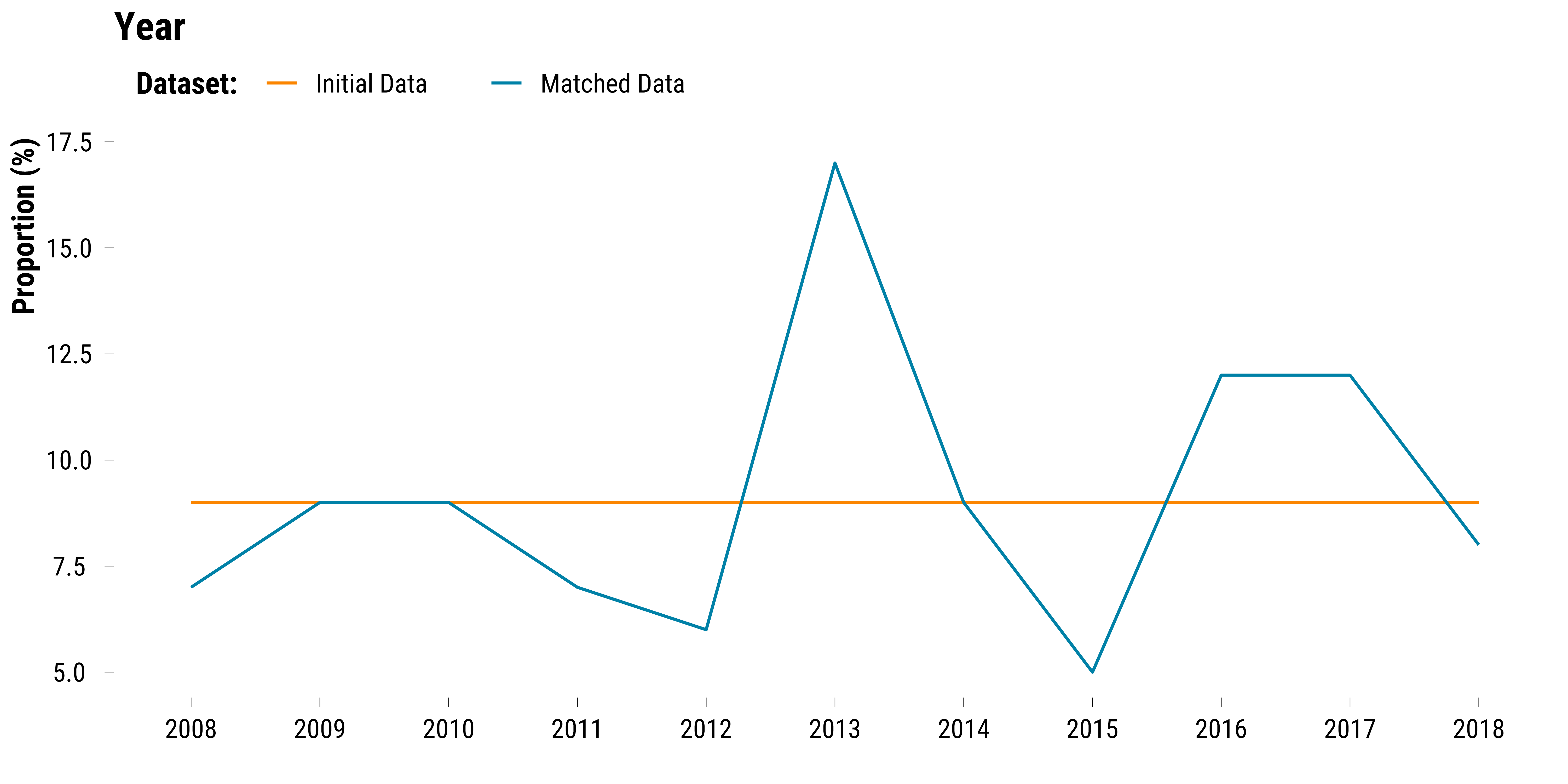
We plot the proportions of observations belonging to each year by dataset:
Please show me the code!
# compute the proportions of observations belonging to each year by dataset
data_year <- data_all %>%
  select(year, dataset) %>%
  pivot_longer(.,-dataset) %>%
  group_by(name, dataset, value) %>%
  summarise(n = n()) %>%
  mutate(proportion = round(n / sum(n) * 100, 0)) %>%
  ungroup() %>%
  mutate(dataset = fct_relevel(dataset, "Initial Data", "Matched Data"))


# we plot the data using cleveland dot plots
graph_year <-
  ggplot(
    data_year,
    aes(
      x = as.factor(value),
      y = proportion,
      colour = dataset,
      group = dataset
    )
  ) +
  geom_line() +
  scale_colour_manual(values = c(my_orange, my_blue),
                      guide = guide_legend(reverse = FALSE)) +
  ggtitle("Year") +
  ylab("Proportion (%)") +
  xlab("") +
  labs(colour = "Dataset:") +
  theme_tufte()

# we print the graph
graph_year
We combine all plots for calendar variables:
Please show me the code!
# combine plots
graph_calendar_three_datasets <-
  (graph_hour + graph_weekday + graph_bank_holidays) / (graph_month + graph_year) +
  plot_annotation(tag_levels = 'A') &
  theme(plot.tag = element_text(size = 30, face = "bold"))

# save the plot
ggsave(
  graph_calendar_three_datasets,
  filename = here::here(
    "inputs",
    "3.outputs",
    "1.hourly_analysis",
    "2.experiment_cruise",
    "1.checking_matching_procedure",
    "graph_calendar_two_datasets.pdf"
  ),
  width = 80,
  height = 40,
  units = "cm",
  device = cairo_pdf
)