In this document, we take great care providing all steps and R codes required to check the intervention we set up in our matching procedure. We compare days where:
- treated units are days with cruise traffic in t.
- control units are day without cruise traffic in t.
We adjust for calendar calendar indicators and weather confounding factors.
Should you have any questions, need help to reproduce the analysis or find coding errors, please do not hesitate to contact us at leo.zabrocki@gmail.com and marion.leroutier@hhs.se.
Required Packages
We load the following packages:
# load required packages
library(knitr) # for creating the R Markdown document
library(here) # for files paths organization
library(tidyverse) # for data manipulation and visualization
library(ggridges) # for ridge density plots
library(Cairo) # for printing custom police of graphs
library(patchwork) # combining plots
We finally load our custom ggplot2 theme for graphs:
Preparing the Data
We load the matched data:
Checking the Hypothetical Intervention
We compute the difference in the daily cruise total gross tonnage for each pair:
# compute the difference in tonnage by pair
pair_difference_tonnage_t <- data_matched %>%
  select(total_gross_tonnage_cruise, is_treated, pair_number) %>%
  arrange(pair_number, is_treated) %>%
  select(-is_treated) %>%
  group_by(pair_number) %>%
  summarise(tonnage_difference = total_gross_tonnage_cruise[2] - total_gross_tonnage_cruise[1])
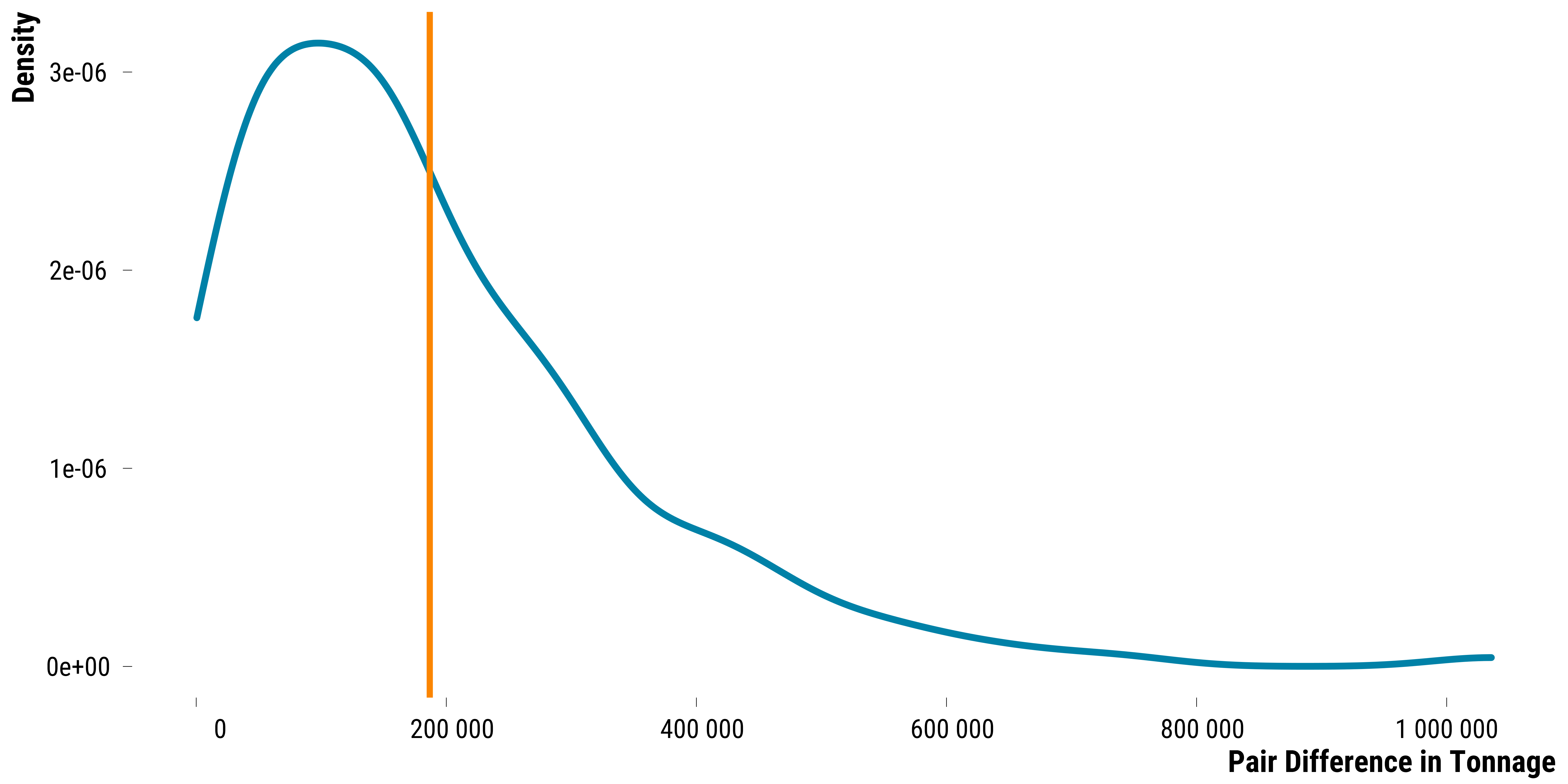
We find on average, a 1.86762^{5} difference in gross tonnage between treated and control units. Below is the distribution of the pair difference in hourly gross tonnage in t:
Please show me the code!
# plot the graph
graph_tonnage_difference_density <-
  ggplot(pair_difference_tonnage_t, aes(x = tonnage_difference)) +
  geom_density(
    colour = my_blue,
    size = 1.1,
    alpha = 0.8
  ) +
  geom_vline(
    xintercept = mean(pair_difference_tonnage_t$tonnage_difference),
    size = 1,
    color = my_orange
  ) +
  scale_x_continuous(
    breaks = scales::pretty_breaks(n = 8),
    labels = function(x)
      format(x, big.mark = " ", scientific = FALSE)
  ) +
  xlab("Pair Difference in Tonnage") + ylab("Density") +
  theme_tufte()

# we print the graph
graph_tonnage_difference_density
Please show me the code!
# save the graph
ggsave(
  graph_tonnage_difference_density,
  filename = here::here(
    "inputs",
    "3.outputs",
    "2.daily_analysis",
    "2.analysis_pollution",
    "1.cruise_experiment",
    "1.checking_matching_procedure",
    "graph_tonnage_difference_cruise_tonnage_density.pdf"
  ),
  width = 20,
  height = 10,
  units = "cm",
  device = cairo_pdf
)
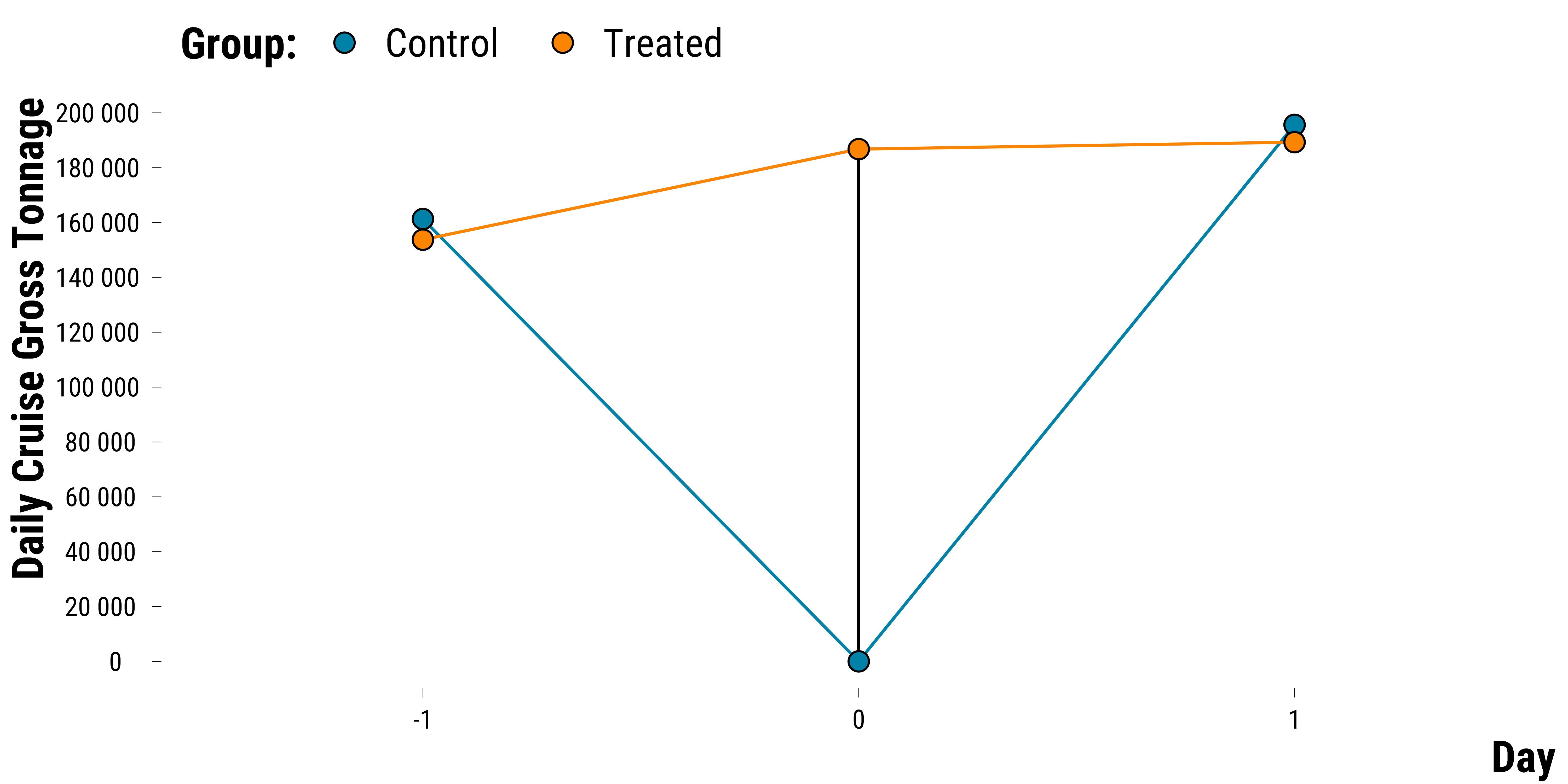
To check which hypothetical intervention we study, we plot below the average tonnage for each day and for treated and control groups :
Please show me the code!
# compute mean tonnage for each day
data_mean_tonnage_day <- data_matched %>%
  # select relevant variables
  select(pair_number,
         is_treated,
         contains("total_gross_tonnage_cruise")) %>%
  # transform data in long format
  pivot_longer(
    cols = -c(pair_number, is_treated),
    names_to = "variable",
    values_to = "tonnage"
  ) %>%
  # create the day variable
  mutate(
    time = 0 %>%
      ifelse(str_detect(variable, "lag_1"),-1, .) %>%
      ifelse(str_detect(variable, "lead_1"), 1, .)
  ) %>%
  # rename the labels of the is_treated dummy
  mutate(is_treated = ifelse(is_treated == TRUE, "Treated", "Control")) %>%
  # compute the mean tonnage for each day and pollutant
  group_by(variable, is_treated, time) %>%
  summarise(tonnage = mean(tonnage, na.rm = TRUE))

# plot the graph
graph_mean_tonnage_day <-
  ggplot(
    data_mean_tonnage_day,
    aes(
      x = as.factor(time),
      y = tonnage,
      group = is_treated,
      colour = is_treated,
      fill = is_treated
    )
  )  +
  geom_segment(
    x = 2,
    y = 0,
    xend = 2,
    yend = 184233,
    lineend = "round",
    # See available arrow types in example above
    linejoin = "round",
    size = 0.5,
    colour = "black"
  ) +
  geom_line() +
  geom_point(shape = 21,
             size = 4,
             colour = "black") +
  scale_colour_manual(values = c(my_blue, my_orange)) +
  scale_fill_manual(values = c(my_blue, my_orange)) +
  scale_y_continuous(
    breaks = scales::pretty_breaks(n = 8),
    labels = function(x)
      format(x, big.mark = " ", scientific = FALSE)
  ) +
  labs(fill = "Group:") +
  xlab("Day") + ylab("Daily Cruise Gross Tonnage") +
  theme_tufte() +
  theme(
    axis.title.y = element_text(size = 20),
    axis.title.x = element_text(size = 20),
    strip.text.x = element_text(size = 18),
    legend.title = element_text(size = 20),
    legend.text = element_text(size = 18)
  ) +
  guides(color = FALSE)

# we print the graph
graph_mean_tonnage_day
Please show me the code!
# save the graph
graph_mean_tonnage_day <- graph_mean_tonnage_day +
  theme(plot.title = element_blank())

ggsave(
  graph_mean_tonnage_day,
  filename = here::here(
    "inputs",
    "3.outputs",
    "2.daily_analysis",
    "2.analysis_pollution",
    "1.cruise_experiment",
    "1.checking_matching_procedure",
    "graph_mean_cruise_tonnage_day.pdf"
  ),
  width = 20,
  height = 10,
  units = "cm",
  device = cairo_pdf
)
Checking Other Vessels’ Types Traffic Evolution
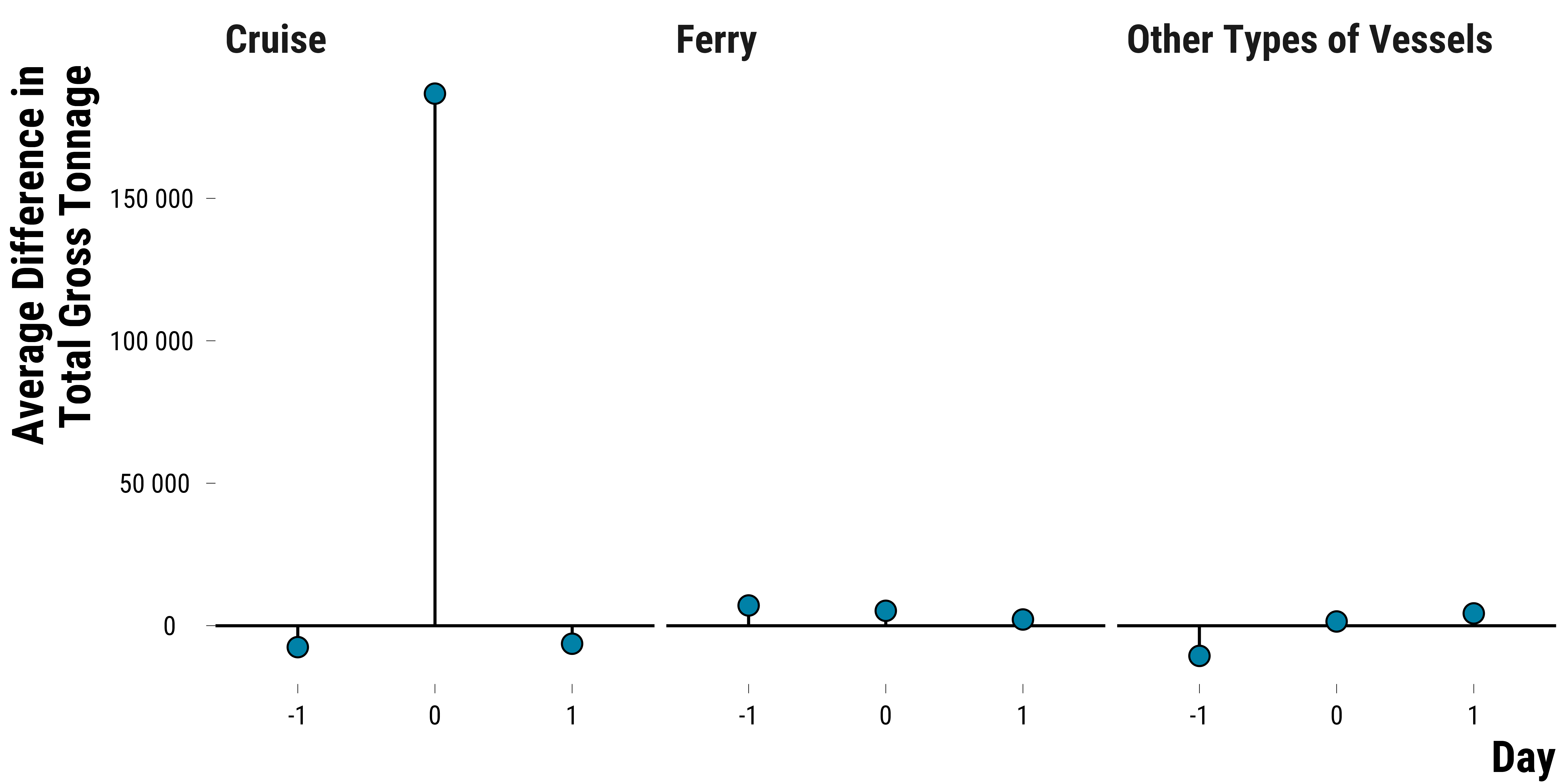
We also check how the difference in tonnage for other vessels’ types between treated and control units evolves:
Please show me the code!
# we create a table with the tonnage for each pair,
# for each vessel type,
# and for -6 hours to + 6 hours
data_vessel_type_tonnage <- data_matched %>%
  # relabel treatment indicator
  mutate(is_treated = ifelse(is_treated == TRUE, "treated", "control")) %>%
  # select relevant variables
  select(
    pair_number,
    is_treated,
    contains("total_gross_tonnage_cruise"),
    contains("total_gross_tonnage_ferry"),
    contains("total_gross_tonnage_other_boat")
  ) %>%
  # transform data in long format
  pivot_longer(
    cols = -c(pair_number, is_treated),
    names_to = "variable",
    values_to = "tonnage"
  ) %>%
  # create vessel type variable
  mutate(
    vessel_type = NA %>%
      ifelse(str_detect(variable, "cruise"), "Cruise", .) %>%
      ifelse(str_detect(variable, "ferry"), "Ferry", .) %>%
      ifelse(str_detect(variable, "other_boat"), "Other Types of Vessels", .)
  ) %>%
  mutate(
    time = 0 %>%
      ifelse(str_detect(variable, "lag_1"),-1, .) %>%
      ifelse(str_detect(variable, "lead_1"), 1, .)
  ) %>%
  select(pair_number, vessel_type, is_treated, time, tonnage) %>%
  pivot_wider(names_from = is_treated, values_from = tonnage)

# compute the average difference in traffic between treated and control units
data_mean_difference <- data_vessel_type_tonnage %>%
  mutate(difference = treated - control) %>%
  select(-c(treated, control)) %>%
  group_by(vessel_type, time) %>%
  summarise(mean_difference = mean(difference, na.rm = TRUE)) %>%
  ungroup()

# plot the evolution
graph_tonnage_difference_vessel_type <-
  ggplot(data_mean_difference,
         aes(x = as.factor(time), y = mean_difference, group = "l"))  +
  geom_hline(yintercept = 0) +
  geom_segment(aes(
    x = as.factor(time),
    xend = as.factor(time),
    y = 0,
    yend = mean_difference
  )) +
  geom_point(
    shape = 21,
    size = 4,
    colour = "black",
    fill = my_blue
  ) +
  scale_y_continuous(
    breaks = scales::pretty_breaks(n = 5),
    labels = function(x)
      format(x, big.mark = " ", scientific = FALSE)
  ) +
  facet_wrap( ~ vessel_type) +
  xlab("Day") + ylab("Average Difference in\n Total Gross Tonnage") +
  theme_tufte() +
  theme(
    axis.title.y = element_text(size = 20),
    axis.title.x = element_text(size = 20),
    strip.text.x = element_text(size = 18),
    legend.title = element_text(size = 20),
    legend.text = element_text(size = 18)
  )


# we print the graph
graph_tonnage_difference_vessel_type
Please show me the code!
# save the graph
ggsave(
  graph_tonnage_difference_vessel_type,
  filename = here::here(
    "inputs",
    "3.outputs",
    "2.daily_analysis",
    "2.analysis_pollution",
    "1.cruise_experiment",
    "1.checking_matching_procedure",
    "graph_tonnage_difference_vessel_type.pdf"
  ),
  width = 30,
  height = 10,
  units = "cm",
  device = cairo_pdf
)
We combine the two previous plots:
Please show me the code!
# combine plots
graph_daily_intervention <-
  graph_mean_tonnage_day / graph_tonnage_difference_vessel_type +
  plot_layout(heights = c(1, 1.5)) +
  plot_annotation(tag_levels = 'A') &
  theme(plot.tag = element_text(size = 30, face = "bold"))

# save the plot
ggsave(
  graph_daily_intervention,
  filename = here::here(
    "inputs",
    "3.outputs",
    "2.daily_analysis",
    "2.analysis_pollution",
    "1.cruise_experiment",
    "1.checking_matching_procedure",
    "graph_daily_intervention.pdf"
  ),
  width = 30,
  height = 30,
  units = "cm",
  device = cairo_pdf
)