In this document, we carry out an exploratory data analysis at the daily level to better understand the distribution and the relationships among our variables.
Should you have any questions, need help to reproduce the analysis or find coding errors, please do not hesitate to contact us at leo.zabrocki@gmail.com and marion.leroutier@hhs.se.
Required Packages and Data Loading
We load the following packages:
We load our custom ggplot2 theme for graphs:
Finally, we load the data:
Maritime Traffic Data
We explore here the seasonal and long-run patterns of cruise traffic.
Long-Term Evolution of Cruise Traffic
We plot the average daily gross tonnage of cruise traffic for each month over the 2008-2018 period:
Please show me the code!
# cruise traffic - time series for all years at the monthly level
data_month <- data %>%
  mutate(month_year = lubridate::floor_date(date, "month")) %>%
  group_by(month_year) %>%
  summarise(mean_total_gross_tonnage_cruise = mean(total_gross_tonnage_cruise, na.rm = TRUE))

data_year <- data %>%
   group_by(year) %>%
  summarise(mean_total_gross_tonnage_cruise = mean(total_gross_tonnage_cruise, na.rm = TRUE))

# make the graph
ts_cruise_tonnage_evolution <- ggplot(data_month, aes(x = month_year, y = mean_total_gross_tonnage_cruise)) + geom_line(color = my_blue, size = 1.2) +
  scale_x_date(date_labels = "%m-%Y", breaks = scales::pretty_breaks(n = 10)) +
  scale_y_continuous(breaks = scales::pretty_breaks(n = 5), labels = function(x) format(x, big.mark = " ", scientific = FALSE)) +
  ylab("Monthly Average of Daily Gross Tonnage") +
  xlab("Date") +
  theme_tufte()

# print the graph
ts_cruise_tonnage_evolution
Please show me the code!
# save the graph
ggsave(ts_cruise_tonnage_evolution, filename = here("inputs", "3.outputs", "2.daily_analysis", "1.eda", "ts_cruise_tonnage_evolution.pdf"),
       width = 25, height = 15, units = "cm", device = cairo_pdf)
Monthly Seasonality of Cruise Traffic
We plot the distribution of the daily gross tonnage of cruise traffic for each month:
Please show me the code!
# distribution of cruise tonnage by month
graph_distribution_tonnage_month <- data %>%
  ggplot(., aes(x = total_gross_tonnage_cruise, y = reorder(month, desc(month)))) +
  geom_boxplot(colour = my_blue) +
  scale_x_continuous(breaks = scales::pretty_breaks(n = 5), labels = function(x) format(x, big.mark = " ", scientific = FALSE)) +
  xlab("Daily Gross Tonnage") + ylab("") +
  theme_tufte()

# print the graph
graph_distribution_tonnage_month
Please show me the code!
# save the graph
ggsave(graph_distribution_tonnage_month, filename = here("inputs", "3.outputs", "2.daily_analysis", "1.eda", "graph_distribution_tonnage_month.pdf"),
       width = 25, height = 15, units = "cm", device = cairo_pdf)
Weekly Variation of Cruise Traffic
We plot the distribution of the daily gross tonnage of cruise traffic for each day of the week:
Please show me the code!
# density of tonnage by day of the week
graph_distribution_tonnage_weekday <- data %>%
  ggplot(., aes(x = total_gross_tonnage_cruise, y = reorder(weekday, desc(weekday)))) +
  geom_boxplot(colour = my_blue) +
  scale_x_continuous(breaks = scales::pretty_breaks(n = 5), labels = function(x) format(x, big.mark = " ", scientific = FALSE)) +
  xlab("Daily Gross Tonnage") + ylab("") +
  theme_tufte()

# print the graph
graph_distribution_tonnage_weekday
Please show me the code!
# save the graph
ggsave(graph_distribution_tonnage_weekday, filename = here("inputs", "3.outputs", "2.daily_analysis", "1.eda", "graph_distribution_tonnage_weekday.pdf"),
       width = 25, height = 15, units = "cm", device = cairo_pdf)
Air Pollutants
We explore here the seasonal and long-run patterns of air pollutant concentrations.
Long-term Evolution of Air Pollutant Concentrations
We plot the daily average concentration of a pollutant for each month over the 2008-2018 period:
Please show me the code!
# pollutant concentration - time series for all years at the month level
data_pollutant_month_year <- data %>%
  mutate(month_year = lubridate::floor_date(date, "month")) %>%
  group_by(month_year) %>%
  summarise_at(vars( mean_no2_sl,mean_no2_l, mean_pm10_sl, mean_pm10_l, mean_pm25_l, mean_so2_l, mean_o3_l),
               ~ mean(., na.rm = TRUE)) %>%
  pivot_longer(cols = c(mean_no2_sl:mean_o3_l), names_to = "pollutant", values_to = "concentration")


# correctly label the variables
variable_labels <- c(mean_no2_sl = "NO2 Saint-Louis",
                     mean_no2_l = "NO2 Longchamp",
                     mean_pm10_sl = "PM10 Saint-Louis",
                     mean_pm10_l = "PM10 Longchamp",
                     mean_pm25_l = "PM2.5 Longchamp",
                     mean_so2_l = "SO2 Longchamp",
                     mean_o3_l = "O3 Longchamp")

data_pollutant_month_year$pollutant <- plyr::revalue(data_pollutant_month_year$pollutant, variable_labels)

# make the graph
ts_pollutant_evolution <- ggplot(data_pollutant_month_year, aes(x = month_year, y = concentration)) +
  geom_line(color = my_blue) +
  scale_x_date(date_labels = "%m-%Y", breaks = scales::pretty_breaks(n = 5)) +
  facet_wrap(~ pollutant, scales = "free", ncol = 4) +
  ylab("Concentration (µg/m³)") +
  xlab("Date") +
  theme_tufte()

# print the graph
ts_pollutant_evolution
Please show me the code!
# save the graph
ggsave(ts_pollutant_evolution, filename = here("inputs", "3.outputs", "2.daily_analysis", "1.eda", "ts_pollutant_evolution.pdf"),
       width = 45, height = 18, units = "cm", device = cairo_pdf)
Weekly Variation of Air Pollutant Concentrations
We plot the distribution of the daily average concentration of a pollutant for each day of the week:
Please show me the code!
# reshape data into long format
data_pollutant_weekday <- data %>%
  select(
    weekday,
    mean_no2_sl,
    mean_no2_l,
    mean_pm10_sl,
    mean_pm10_l,
    mean_pm25_l,
    mean_so2_l,
    mean_o3_l
  ) %>%
  pivot_longer(
    cols = c(mean_no2_sl:mean_o3_l),
    names_to = "pollutant",
    values_to = "concentration"
  )

# correctly label the variables
variable_labels <- c(
  mean_no2_sl = "NO2 Saint-Louis",
  mean_no2_l = "NO2 Longchamp",
  mean_pm10_sl = "PM10 Saint-Louis",
  mean_pm10_l = "PM10 Longchamp",
  mean_pm25_l = "PM2.5 Longchamp",
  mean_so2_l = "SO2 Longchamp",
  mean_o3_l = "O3 Longchamp"
)

data_pollutant_weekday$pollutant <-
  plyr::revalue(data_pollutant_weekday$pollutant, variable_labels)

# make the graph
graph_distribution_pollutant_weekday <-
  ggplot(data_pollutant_weekday, aes(x = weekday, y = concentration)) +
  geom_boxplot(colour = my_blue) +
  facet_wrap(~ pollutant, scales = "free", ncol = 4) +
  xlab("") + ylab("Concentration (µg/m³)") +
  theme_tufte()

# print the graph
graph_distribution_pollutant_weekday
Please show me the code!
# save the graph
ggsave(
  graph_distribution_pollutant_weekday,
  filename = here(
    "inputs",
    "3.outputs",
    "2.daily_analysis",
    "1.eda",
    "graph_distribution_pollutant_weekday.pdf"
  ),
  width = 55,
  height = 20,
  units = "cm",
  device = cairo_pdf
)
Weather Variables
We explore here the seasonal patterns of weather parameters.
Monthly Variation in Weather Parameters
We plot the distribution of continuous weather parameters by month:
Please show me the code!
# distribution of weather parameters by month
graph_distribution_weather_month <- data %>%
  select(
    month,
    rainfall_height,
    rainfall_duration,
    temperature_average,
    humidity_average,
    wind_speed
  ) %>%
  rename(
    "Rainfall Height (mm)" = rainfall_height,
    "Rainfall Duration (min)" = rainfall_duration,
    "Average Temperature (°C)" = temperature_average,
    "Average Humidity (%)" = humidity_average,
    "Wind Speed (m/s)" = wind_speed
  ) %>%
  pivot_longer(cols = -c(month),
               names_to = "weather_parameter",
               values_to = "value") %>%
  ggplot(., aes(x = value, y = reorder(month, desc(month)))) +
  geom_boxplot(colour = my_blue) +
  scale_x_continuous(
    breaks = scales::pretty_breaks(n = 5),
    labels = function(x)
      format(x, big.mark = " ", scientific = FALSE)
  ) +
  facet_wrap( ~ weather_parameter, scales = "free_x", ncol = 5) +
  xlab("Value") + ylab("") +
  theme_tufte()

# print the graph
graph_distribution_weather_month
Please show me the code!
# save the graph
ggsave(
  graph_distribution_weather_month,
  filename = here(
    "inputs",
    "3.outputs",
    "2.daily_analysis",
    "1.eda",
    "graph_distribution_weather_month.pdf"
  ),
  width = 55,
  height = 20,
  units = "cm",
  device = cairo_pdf
)
We also plot the distribution of wind direction categories by month:
Please show me the code!
# distribution of wind direction by month
graph_distribution_wd_month <- data %>%
  select(month, wind_direction_categories) %>%
  pivot_longer(cols = -c(month),
               names_to = "wind_direction_categories",
               values_to = "categories") %>%
  group_by(month, categories) %>%
  summarise(n = n()) %>%
  mutate(freq = n / sum(n) * 100) %>%
  ggplot(., aes(x = fct_rev(month), y = freq, group = "l")) +
  geom_line(colour = my_blue) +
  facet_wrap(~ categories, ncol = 4) +
  coord_flip() +
  xlab("") + ylab("Proportion (%)") +
  theme_tufte()

# print the graph
graph_distribution_wd_month
Please show me the code!
# save the graph
ggsave(graph_distribution_wd_month, filename = here("inputs", "3.outputs", "2.daily_analysis", "1.eda", "graph_distribution_wd_month.pdf"),
       width = 30, height = 10, units = "cm", device = cairo_pdf)
Polar Plot of Wind Direction
We plot the polar plot of wind direction:
Please show me the code!
# create the wind direction proportion data
data_polar_plot_wind_direction <- data %>%
  select(wind_direction) %>%
  mutate(wind_direction = ifelse(wind_direction == 360, 0, wind_direction)) %>%
  group_by(wind_direction) %>%
  # compute the number of observations
  summarise(n = n()) %>%
  # compute the proportion
  mutate(freq = round(n / sum(n)*100, 0))

# make the graph
graph_polar_plot_wind_direction <- ggplot(data_polar_plot_wind_direction, aes(x = as.factor(wind_direction), y = freq, group = "l")) +
  geom_segment((aes(x = as.factor(wind_direction), xend = as.factor(wind_direction), y = 0, yend = freq)), colour = my_blue, lineend = "round") +
  coord_polar(start = -5*pi/ 180) +
  xlab("") + ylab("Proportion (%)") +
  theme_tufte()

# print the graph
graph_polar_plot_wind_direction
Please show me the code!
# save the graph
ggsave(graph_polar_plot_wind_direction, filename = here::here("inputs", "3.outputs", "2.daily_analysis", "1.eda", "graph_polar_plot_wind_direction.pdf"),
       width = 20, height = 20, units = "cm", device = cairo_pdf)
Air Pollutant Concentrations by Wind Direction and Wind Speed
We finally plot the the predicted air pollutant concentrations using the wind components:
Please show me the code!
# make the polar plots for each pollutant
a <- polarPlot(data, pollutant = "mean_no2_sl", x = "wind_speed", wd = "wind_direction",
               main = "Average NO2 at Saint-Louis (' * mu * 'g/m' ^3 *')", key.header = "", key.footer = "",
               resolution="fine")

b <- polarPlot(data, pollutant = "mean_no2_l", x = "wind_speed", wd = "wind_direction",
               main = "Average NO2 at Longchamp (' * mu * 'g/m' ^3 *')", key.header = "", key.footer = "",
               resolution="fine")

c <- polarPlot(data, pollutant = "mean_pm10_sl", x = "wind_speed", wd = "wind_direction",
               main = "Average PM10 at Saint-Louis (' * mu * 'g/m' ^3 *')", key.header = "", key.footer = "",
               resolution="fine")

d <- polarPlot(data, pollutant = "mean_pm10_l", x = "wind_speed", wd = "wind_direction",
              main = "Average PM10 at Longchamp (' * mu * 'g/m' ^3 *')", key.header = "", key.footer = "",
               resolution="fine")

e <- polarPlot(data, pollutant = "mean_pm25_l", x = "wind_speed", wd = "wind_direction",
               main = "Average PM2.5 at Longchamp (' * mu * 'g/m' ^3 *')", key.header = "", key.footer = "",
               resolution="fine")

f <- polarPlot(data, pollutant = "mean_o3_l", x = "wind_speed", wd = "wind_direction",
               main = "Average O3 at Longchamp (' * mu * 'g/m' ^3 *')", key.header = "", key.footer = "",
               resolution="fine")

g <- polarPlot(data, pollutant = "mean_so2_l", x = "wind_speed", wd = "wind_direction",
               main = "Average SO2 at Longchamp (' * mu * 'g/m' ^3 *')", key.header = "", key.footer = "",
               resolution="fine")

# save the graph
pdf(here("inputs", "3.outputs", "2.daily_analysis", "1.eda", "graph_polar_plots_pollutants.pdf"), width = 14, height = 5)
print(a, split = c(1, 1, 4, 2), more = TRUE)
print(b, split = c(2, 1, 4, 2), more = TRUE)
print(c, split = c(3, 1, 4, 2), more = TRUE)
print(d, split = c(4, 1, 4, 2), more = TRUE)
print(e, split = c(1, 2, 4, 2), more = TRUE)
print(f, split = c(2, 2, 4, 2), more = TRUE)
print(g, split = c(3, 2, 4, 2), more = FALSE)
dev.off()
Road Traffic
We explore here the seasonal patterns of road traffic.
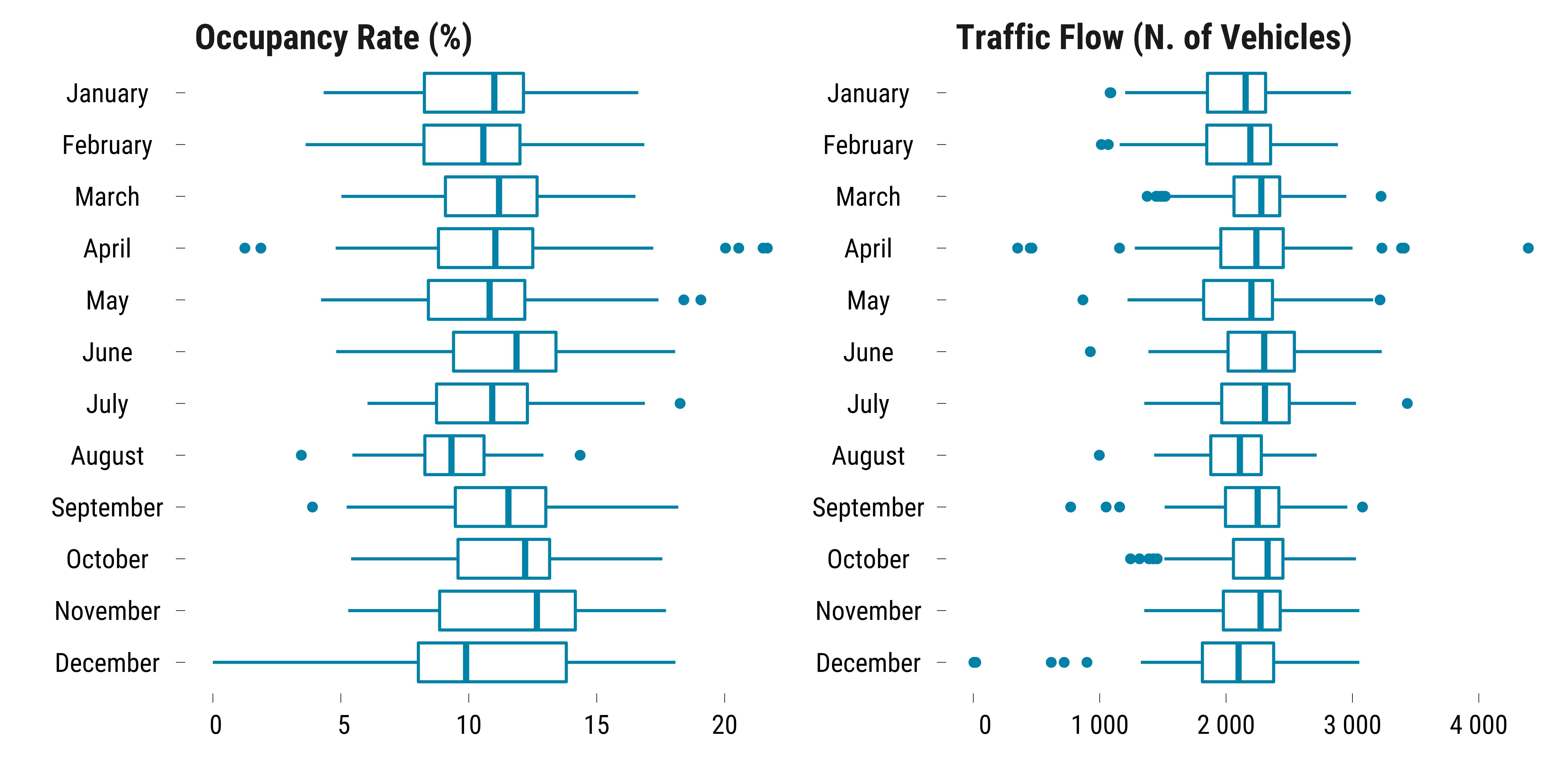
Monthly Seasonality of Road Traffic
We plot the distribution of vehicles flow and road occupancy rate by month:
Please show me the code!
# distribution of road traffic by month
graph_distribution_road_traffic_month <- data %>%
  pivot_longer(cols = c(road_traffic_flow_all, road_occupancy_rate), names_to = "traffic_measure", values_to = "value") %>%
  mutate(traffic_measure = ifelse(traffic_measure == "road_occupancy_rate", "Occupancy Rate (%)", "Traffic Flow (N. of Vehicles)")) %>%
  ggplot(., aes(x = value, y = reorder(month, desc(month)))) +
  geom_boxplot(colour = my_blue) +
  scale_x_continuous(breaks = scales::pretty_breaks(n = 5), labels = function(x) format(x, big.mark = " ", scientific = FALSE)) +
  facet_wrap(~ traffic_measure, scales = "free") +
  xlab("") + ylab("") +
  theme_tufte()

# print the graph
graph_distribution_road_traffic_month
Please show me the code!
# save the graph
ggsave(graph_distribution_road_traffic_month, filename = here("inputs", "3.outputs", "2.daily_analysis", "1.eda", "graph_distribution_road_traffic_month.pdf"),
       width = 20, height = 10, units = "cm", device = cairo_pdf)
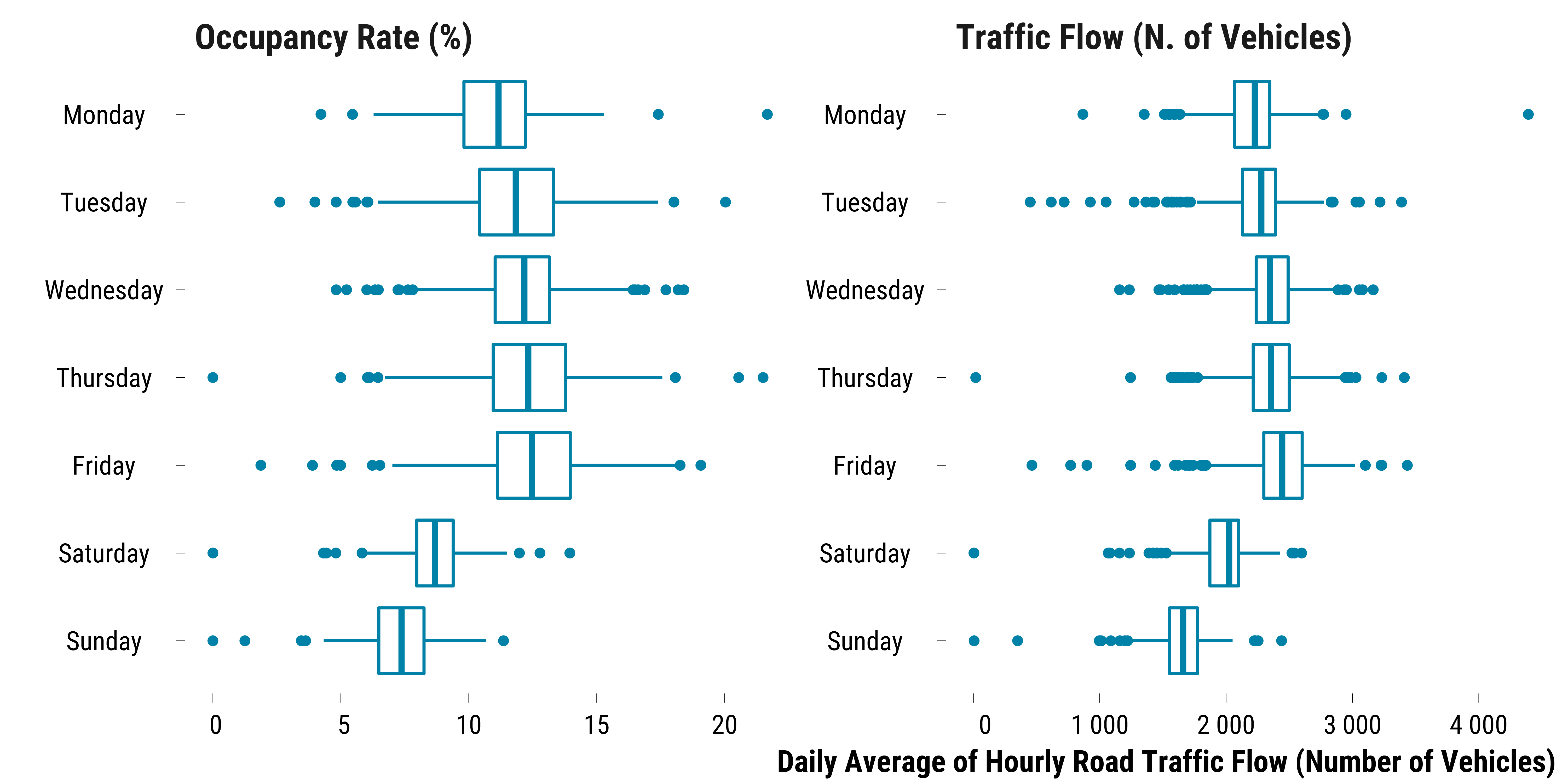
Weekly Variation of Road Traffic
We plot the distribution of vehicles flow by day of the week:
Please show me the code!
# density of road traffic by day of the week
graph_distribution_tonnage_weekday <- data %>%
  pivot_longer(cols = c(road_traffic_flow_all, road_occupancy_rate), names_to = "traffic_measure", values_to = "value") %>%
  mutate(traffic_measure = ifelse(traffic_measure == "road_occupancy_rate", "Occupancy Rate (%)", "Traffic Flow (N. of Vehicles)")) %>%
  ggplot(., aes(x = value, y = reorder(weekday, desc(weekday)))) +
  geom_boxplot(colour = my_blue) +
  scale_x_continuous(
    breaks = scales::pretty_breaks(n = 5),
    labels = function(x)
      format(x, big.mark = " ", scientific = FALSE)
  ) +
  facet_wrap(~ traffic_measure, scales = "free") +
  xlab("Daily Average of Hourly Road Traffic Flow (Number of Vehicles)") + ylab("") +
  theme_tufte()

# print the graph
graph_distribution_tonnage_weekday
Please show me the code!
# save the graph
ggsave(
  graph_distribution_tonnage_weekday,
  filename = here(
    "inputs",
    "3.outputs",
    "2.daily_analysis",
    "1.eda",
    "graph_distribution_road_traffic_weekday.pdf"
  ),
  width = 20,
  height = 15,
  units = "cm",
  device = cairo_pdf
)