In this document, we take great care providing all steps and R codes required to check whether our most matching procedure achieved balance. We compare hours where:
- treated units are hours with positive entering cruise traffic in t.
- control units are hours without entering cruise traffic in t.
We adjust for calendar calendar indicator and weather confounding factors.
Should you have any questions, need help to reproduce the analysis or find coding errors, please do not hesitate to contact us at leo.zabrocki@gmail.com and marion.leroutier@hhs.se.
Required Packages
We load the following packages:
# load required packages
library(knitr) # for creating the R Markdown document
library(here) # for files paths organization
library(tidyverse) # for data manipulation and visualization
library(ggridges) # for ridge density plots
library(Cairo) # for printing custom police of graphs
library(patchwork) # combining plots
We also load our custom ggplot2 theme for graphs:
Preparing the Data
We load the matched data:
Figures for Covariates Distribution for Treated and Control Units
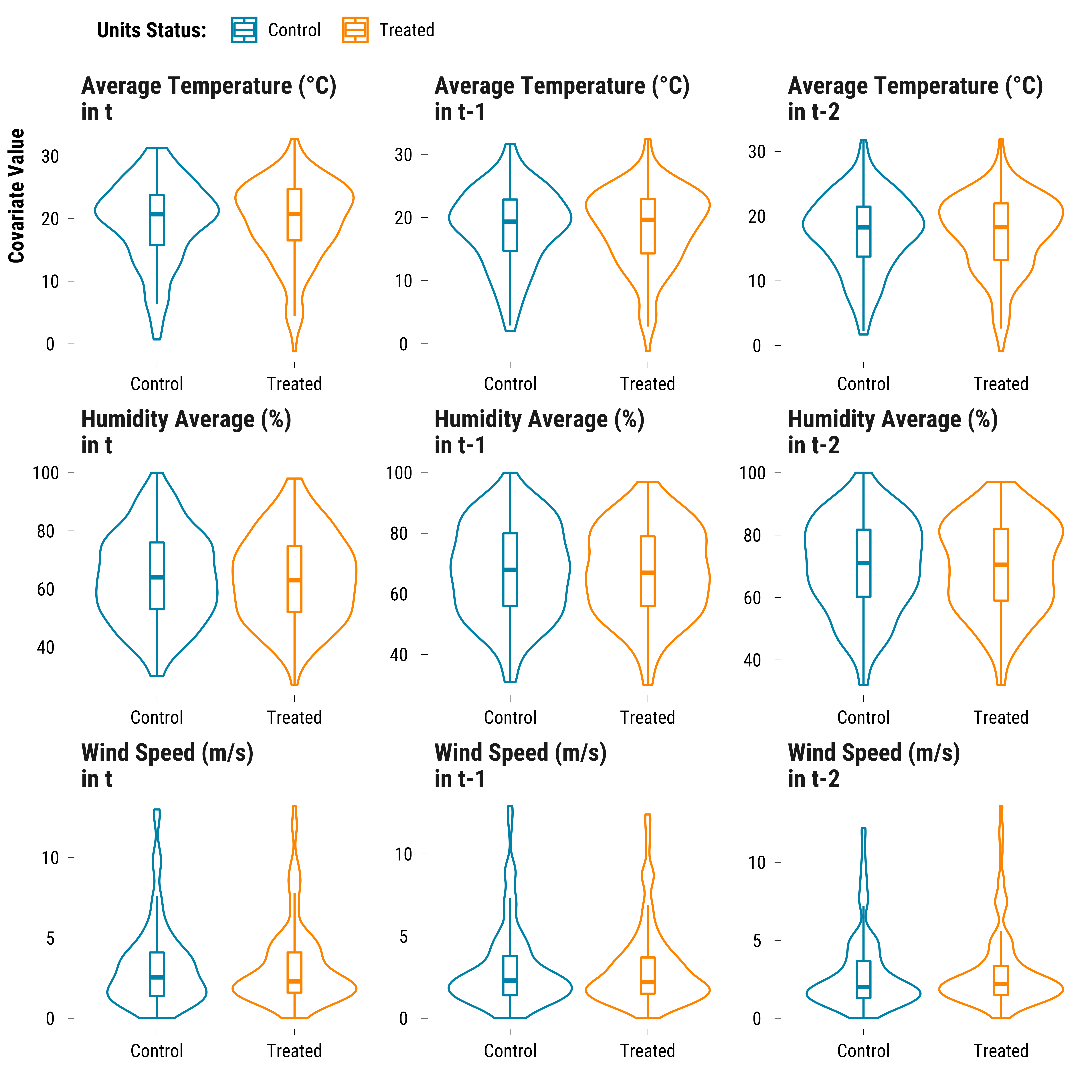
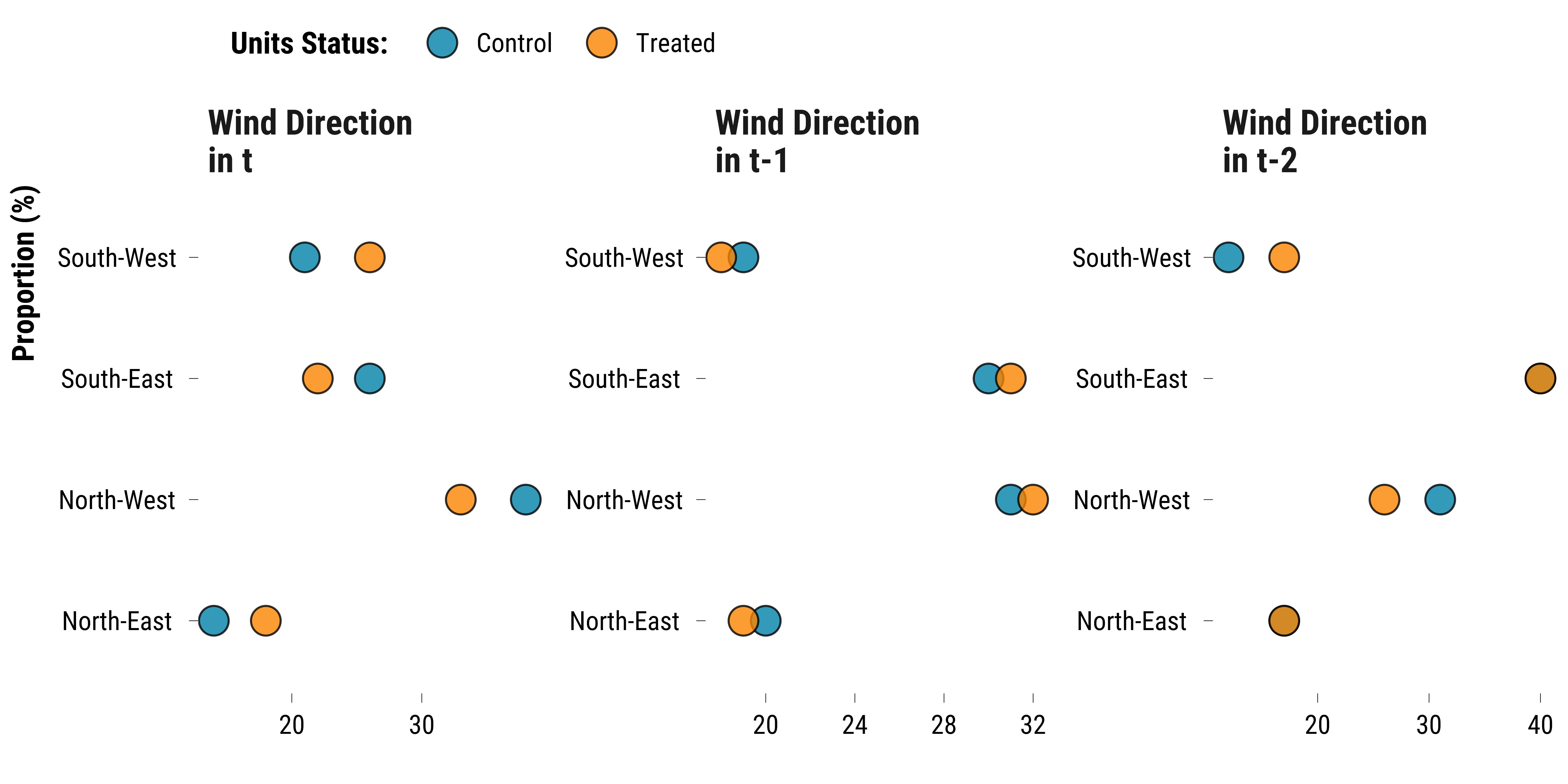
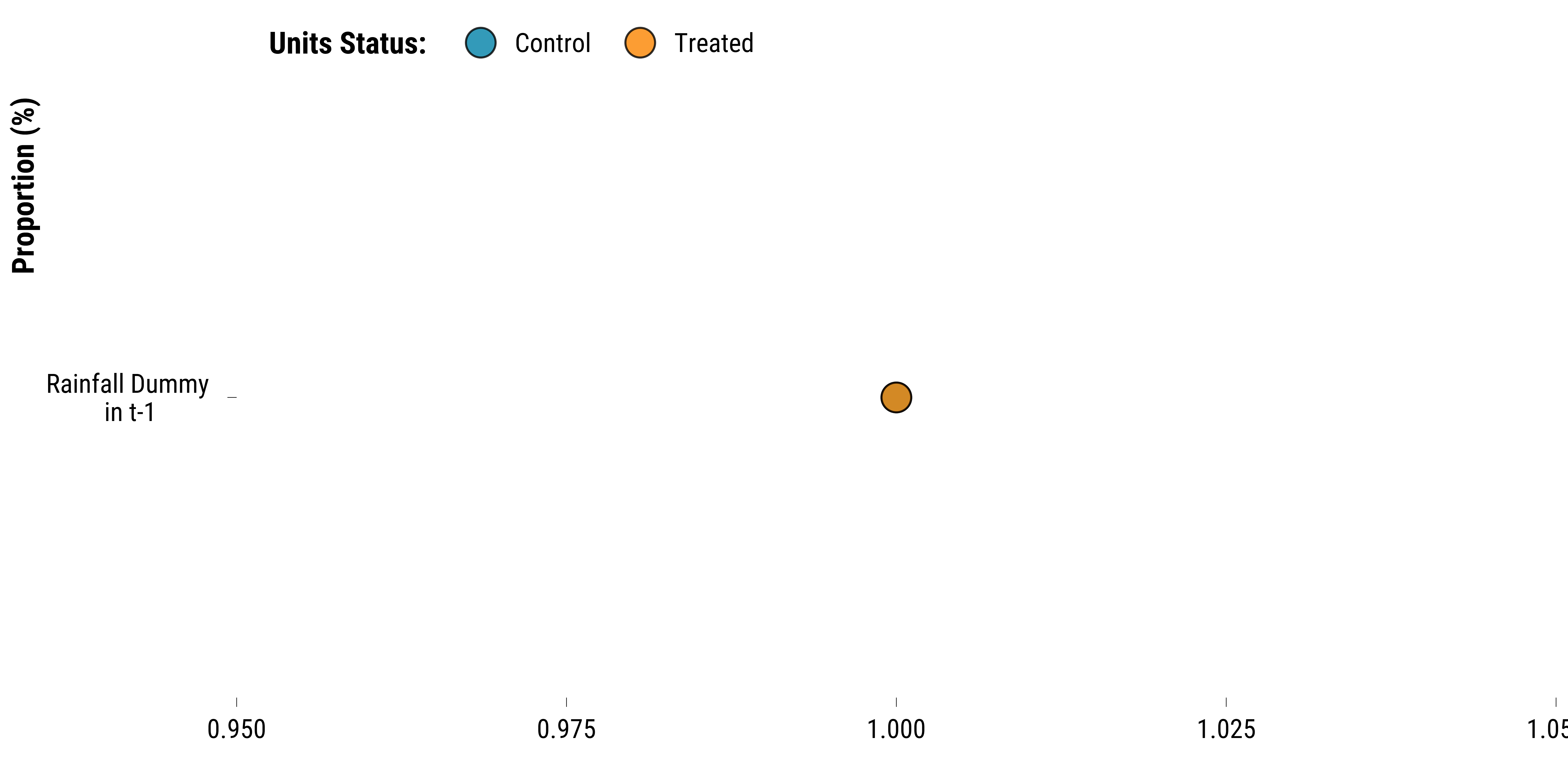
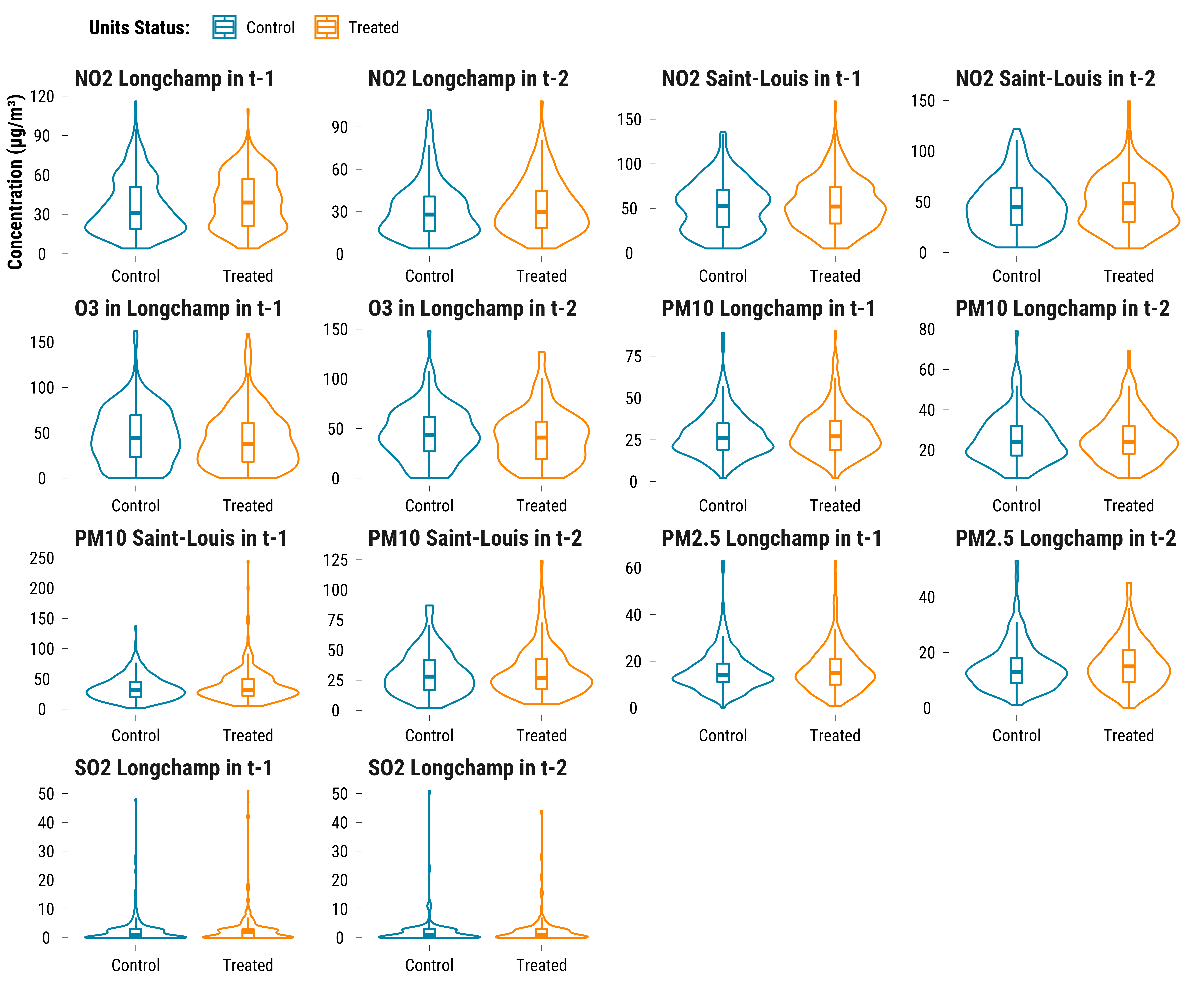
We check whether coviariates balance was achieved with the thresholds we defined for our matching procedure. We plot distributions of weather and calendar variables (Lags 0-2) and pollutants (Lags 1-2) for treated and control groups.
Weather Covariates
For continuous weather covariates, we draw boxplots for treated and control groups:
Please show me the code!
# we select control variables and store them in a long dataframe
data_weather_continuous_variables <- data_matched %>%
  select(
    temperature_average,
    temperature_average_lag_1,
    temperature_average_lag_2,
    humidity_average,
    humidity_average_lag_1,
    humidity_average_lag_2,
    wind_speed,
    wind_speed_lag_1,
    wind_speed_lag_2,
    is_treated
  ) %>%
  pivot_longer(
    cols = -c(is_treated),
    names_to = "variable",
    values_to = "values"
  ) %>%
  mutate(
    new_variable = NA %>%
      ifelse(
        str_detect(variable, "temperature_average"),
        "Average Temperature (°C)",
        .
      ) %>%
      ifelse(
        str_detect(variable, "humidity_average"),
        "Humidity Average (%)",
        .
      ) %>%
      ifelse(str_detect(variable, "wind_speed"), "Wind Speed (m/s)", .)
  ) %>%
  mutate(time = "\nin t" %>%
           ifelse(str_detect(variable, "lag_1"), "\nin t-1", .) %>%
           ifelse(str_detect(variable, "lag_2"), "\nin t-2", .)) %>%
  mutate(variable = paste(new_variable, time, sep = " ")) %>%
  mutate(is_treated = if_else(is_treated == TRUE, "Treated", "Control"))

graph_boxplot_continuous_weather <-
  ggplot(data_weather_continuous_variables,
         aes(x = is_treated, y = values, colour = is_treated)) +
  geom_violin() +
  geom_boxplot(width = 0.1, outlier.shape = NA) +
  scale_color_manual(values = c(my_blue, my_orange)) +
  ylab("Covariate Value") +
  xlab("") +
  labs(colour = "Units Status:") +
  facet_wrap( ~ variable, scale = "free", ncol = 3) +
  theme_tufte()

# we print the graph
graph_boxplot_continuous_weather
Please show me the code!
# save the graph
ggsave(
  graph_boxplot_continuous_weather,
  filename = here::here(
    "inputs",
    "3.outputs",
    "1.hourly_analysis",
    "2.experiment_cruise",
        "1.checking_matching_procedure",
    "graph_boxplot_continuous_weather.pdf"
  ),
  width = 50,
  height = 50,
  units = "cm",
  device = cairo_pdf
)
For the rainfall dummy and the wind direction categories, we plot the proportions:
Please show me the code!
# we select the rainfall variables
data_weather_categorical <- data_matched %>%
  select(
    rainfall_height_dummy,
    rainfall_height_dummy_lag_1,
    rainfall_height_dummy_lag_2,
    wind_direction_categories,
    wind_direction_categories_lag_1,
    wind_direction_categories_lag_2,
    is_treated
  ) %>%
  mutate_at(
    vars(rainfall_height_dummy:rainfall_height_dummy_lag_2),
    ~ ifelse(. == 1, "True", "False")
  ) %>%
  mutate_all( ~ as.character(.)) %>%
  pivot_longer(
    cols = -c(is_treated),
    names_to = "variable",
    values_to = "values"
  ) %>%
  # group by is_treated, variable and values
  group_by(is_treated, variable, values) %>%
  # compute the number of observations
  summarise(n = n()) %>%
  # compute the proportion
  mutate(freq = round(n / sum(n) * 100, 0)) %>%
  ungroup() %>%
  filter(!(
    variable %in% c(
      "rainfall_height_dummy",
      "rainfall_height_dummy_lag_1",
      "rainfall_height_dummy_lag_2"
    ) & values == "False"
  )) %>%
  mutate(
    new_variable = NA %>%
      ifelse(str_detect(variable, "wind"), "Wind Direction", .) %>%
      ifelse(str_detect(variable, "rainfall"), "Rainfall Dummy", .)
  ) %>%
  mutate(time = "\nin t" %>%
           ifelse(str_detect(variable, "lag_1"), "\nin t-1", .) %>%
           ifelse(str_detect(variable, "lag_2"), "\nin t-2", .)) %>%
  mutate(variable = paste(new_variable, time, sep = " ")) %>%
  mutate(is_treated = if_else(is_treated == TRUE, "Treated", "Control"))


# build the graph for wind direction
graph_categorical_wd_weather <- data_weather_categorical %>%
  filter(new_variable == "Wind Direction") %>%
  ggplot(., aes(x = freq, y = values, fill = is_treated)) +
  geom_point(shape = 21,
             size = 6,
             alpha = 0.8) +
  scale_fill_manual(values = c(my_blue, my_orange)) +
  facet_wrap( ~ variable, scales = "free") +
  ylab("Proportion (%)") +
  xlab("") +
  labs(fill = "Units Status:") +
  theme_tufte() +
  theme(
    legend.position = "top",
    legend.justification = "left",
    legend.direction = "horizontal"
  )

# we print the graph
graph_categorical_wd_weather
Please show me the code!
# build the graph for rainfall dummy
graph_categorical_rainfall_weather <- data_weather_categorical %>%
  filter(new_variable == "Rainfall Dummy") %>%
  ggplot(., aes(x = freq, y = variable, fill = is_treated)) +
  geom_point(shape = 21,
             size = 6,
             alpha = 0.8) +
  scale_fill_manual(values = c(my_blue, my_orange)) +
  ylab("Proportion (%)") +
  xlab("") +
  labs(fill = "Units Status:") +
  theme_tufte()

# we print the graph
graph_categorical_rainfall_weather
Please show me the code!
# combine plots
graph_categorical_weather <-
  graph_categorical_wd_weather / graph_categorical_rainfall_weather +
  plot_annotation(tag_levels = 'A') &
  theme(plot.tag = element_text(size = 30, face = "bold"))


# save the graph
ggsave(
  graph_categorical_weather,
  filename = here::here(
    "inputs",
    "3.outputs",
    "1.hourly_analysis",
    "2.experiment_cruise",
        "1.checking_matching_procedure",
    "graph_categorical_weather.pdf"
  ),
  width = 60,
  height = 40,
  units = "cm",
  device = cairo_pdf
)
For pollutants:
Please show me the code!
# we select control variables and store them in a long dataframe
data_pollutant_variables <- data_matched %>%
  select(
    mean_no2_l:mean_o3_l,
    mean_no2_l_lag_1:mean_o3_l_lag_1,
    mean_no2_l_lag_2:mean_o3_l_lag_2,
    is_treated
  ) %>%
  # transform the data to long to compute the proportion of observations for each variable
  pivot_longer(
    cols = -c(is_treated),
    names_to = "variable",
    values_to = "values"
  ) %>%
  mutate(is_treated = ifelse(is_treated == "TRUE", "Treated", "Control")) %>%
  mutate(
    pollutant = NA %>%
      ifelse(str_detect(variable, "no2_l"), "NO2 Longchamp", .) %>%
      ifelse(str_detect(variable, "no2_sl"), "NO2 Saint-Louis", .) %>%
      ifelse(str_detect(variable, "o3"), "O3 in Longchamp", .) %>%
      ifelse(str_detect(variable, "pm10_l"), "PM10 Longchamp", .) %>%
      ifelse(str_detect(variable, "pm10_sl"), "PM10 Saint-Louis", .) %>%
      ifelse(str_detect(variable, "pm25"), "PM2.5 Longchamp", .) %>%
      ifelse(str_detect(variable, "so2"), "SO2 Longchamp", .)
  ) %>%
  mutate(time = "in t-1" %>%
           ifelse(str_detect(variable, "lag_2"), "in t-2", .)) %>%
  mutate(variable = paste(pollutant, time, sep = " "))


# second graph for hourly pollutants
graph_boxplot_pollutants_hourly <- data_pollutant_variables %>%
  ggplot(., aes(x = is_treated, y = values, colour = is_treated)) +
  geom_violin() +
  geom_boxplot(width = 0.1, outlier.shape = NA) +
  scale_color_manual(values = c(my_blue, my_orange)) +
  ylab("Concentration (µg/m³)") +
  xlab("") +
  labs(colour = "Units Status:") +
  facet_wrap( ~ variable, scale = "free", ncol = 4) +
  theme_tufte()

# we print the graph
graph_boxplot_pollutants_hourly
Please show me the code!
# save the graph
ggsave(
  graph_boxplot_pollutants_hourly,
  filename = here::here(
    "inputs",
    "3.outputs",
    "1.hourly_analysis",
    "2.experiment_cruise",
        "1.checking_matching_procedure",
    "graph_boxplot_pollutants_hourly.pdf"
  ),
  width = 80,
  height = 60,
  units = "cm",
  device = cairo_pdf
)
Calendar Indicator
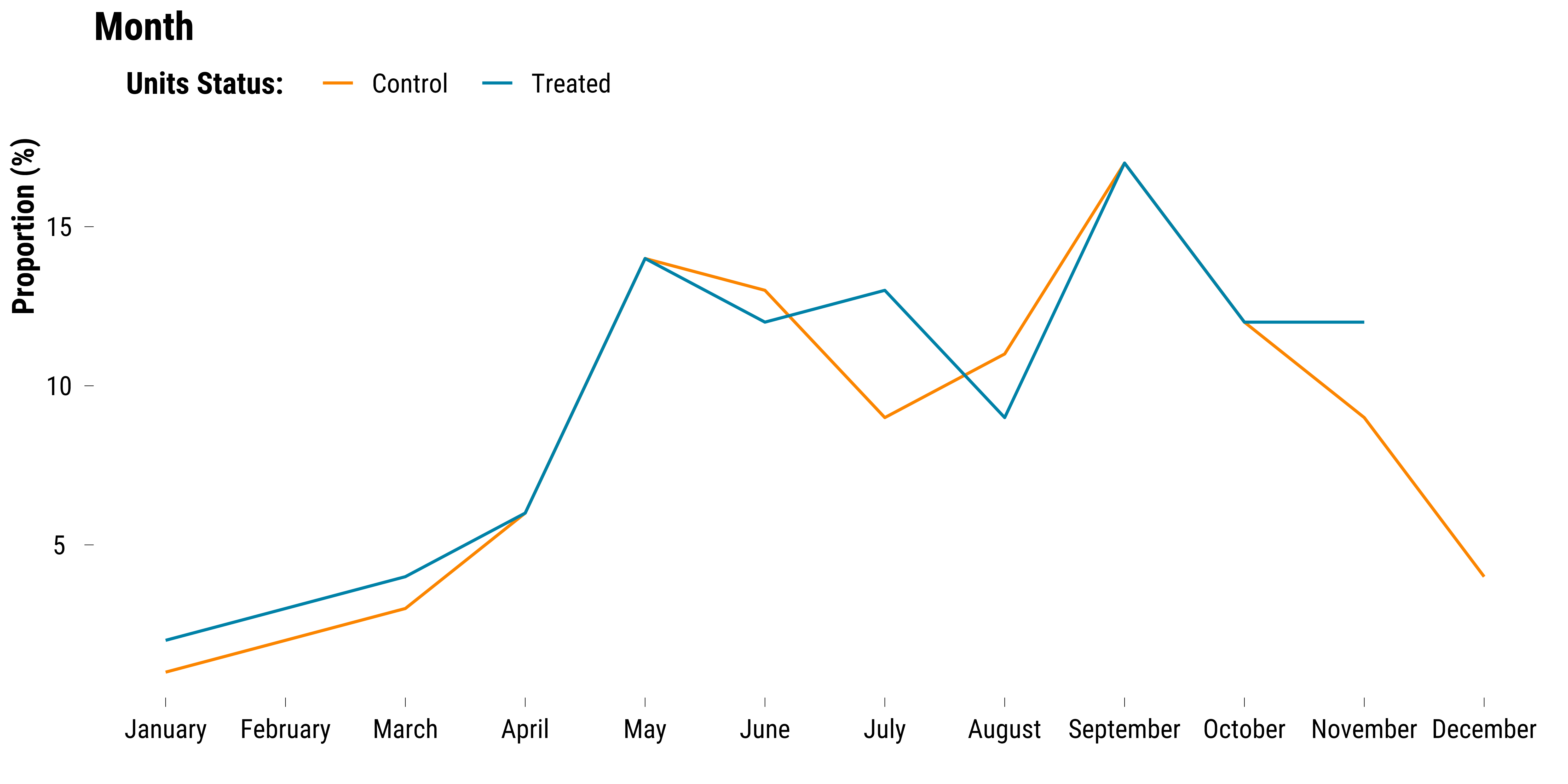
For calendar variables such as the hour of the day, the day of the week, bank days and holidays we matched strictly. We plot the proportions of observations belonging to each year by treatment status:
Please show me the code!
# compute the proportions of observations belonging to each month by treatment status
data_month <- data_matched %>%
  mutate(is_treated = ifelse(is_treated == "TRUE", "Treated", "Control")) %>%
  select(month, is_treated) %>%
  mutate(
    month = recode(
      month,
      `1` = "January",
      `2` = "February",
      `3` = "March",
      `4` = "April",
      `5` = "May",
      `6` = "June",
      `7` = "July",
      `8` = "August",
      `9` = "September",
      `10` = "October",
      `11` = "November",
      `12` = "December"
    ) %>%
      fct_relevel(
        .,
        "January",
        "February",
        "March",
        "April",
        "May",
        "June",
        "July",
        "August",
        "September",
        "October",
        "November",
        "December"
      )
  ) %>%
  pivot_longer(.,-is_treated) %>%
  group_by(name, is_treated, value) %>%
  summarise(n = n()) %>%
  mutate(proportion = round(n / sum(n) * 100, 0)) %>%
  ungroup()

# we plot the data using cleveland dot plots
graph_month <-
  ggplot(data_month,
         aes(
           x = as.factor(value),
           y = proportion,
           colour = is_treated,
           group = is_treated
         )) +
  geom_line() +
  scale_colour_manual(values = c(my_orange, my_blue),
                      guide = guide_legend(reverse = FALSE)) +
  ggtitle("Month") +
  ylab("Proportion (%)") +
  xlab("") +
  labs(colour = "Units Status:") +
  theme_tufte()

# we print the graph
graph_month
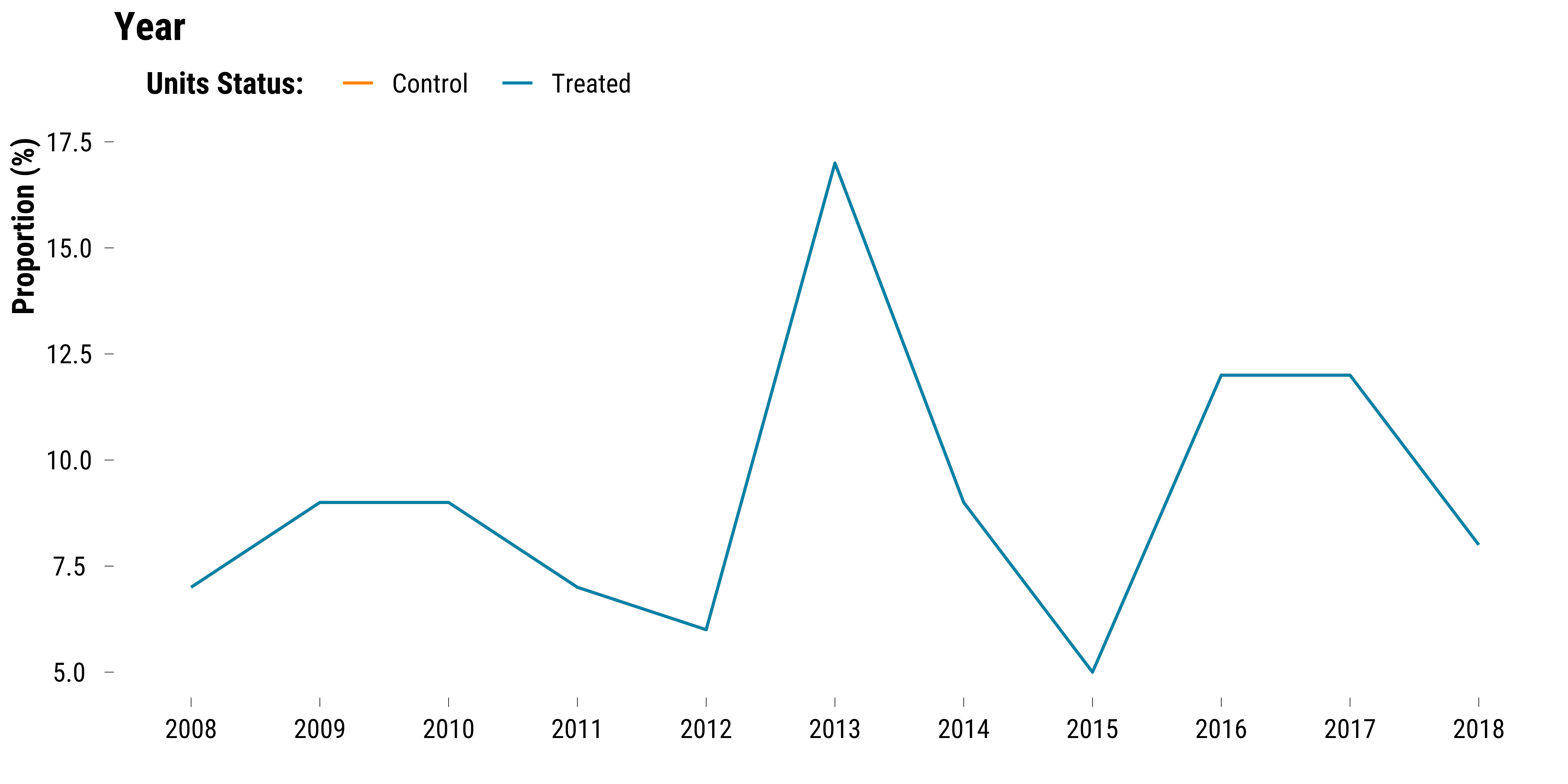
We plot the proportions of observations belonging to each year by treatment status:
Please show me the code!
# compute the proportions of observations belonging to each year by treatment status
data_year <- data_matched %>%
  mutate(is_treated = ifelse(is_treated == "TRUE", "Treated", "Control")) %>%
  select(year, is_treated) %>%
  pivot_longer(.,-is_treated) %>%
  group_by(name, is_treated, value) %>%
  summarise(n = n()) %>%
  mutate(proportion = round(n / sum(n) * 100, 0)) %>%
  ungroup()

# we plot the data using cleveland dot plots
graph_year <-
  ggplot(data_year,
         aes(
           x = as.factor(value),
           y = proportion,
           colour = is_treated,
           group = is_treated
         )) +
  geom_line() +
  scale_colour_manual(values = c(my_orange, my_blue),
                      guide = guide_legend(reverse = FALSE)) +
  ggtitle("Year") +
  ylab("Proportion (%)") +
  xlab("") +
  labs(colour = "Units Status:") +
  theme_tufte()

# we print the graph
graph_year
We combine and save the two previous:
Please show me the code!
# combine plots
graph_month_year <- graph_month / graph_year +
  plot_annotation(tag_levels = 'A') &
  theme(plot.tag = element_text(size = 30, face = "bold"))

# save the plot
ggsave(
  graph_month_year,
  filename = here::here(
    "inputs",
    "3.outputs",
    "1.hourly_analysis",
    "2.experiment_cruise",
    "1.checking_matching_procedure",
    "graph_month_year.pdf"
  ),
  width = 40,
  height = 40,
  units = "cm",
  device = cairo_pdf
)