In this document, we take great care providing all steps and R codes required to analyze the effects of cruise traffic on air pollutants at the daily level. We compare days where:
- treated units are days with positive cruise traffic in t.
- control units are days without cruise traffic in t.
We adjust for calendar calendar indicator and weather confouding factors.
Should you have any questions, need help to reproduce the analysis or find coding errors, please do not hesitate to contact us at leo.zabrocki@gmail.com and marion.leroutier@hhs.se.
Required Packages
We load the following packages:
# load required packages
library(knitr) # for creating the R Markdown document
library(here) # for files paths organization
library(tidyverse) # for data manipulation and visualization
library(broom) # for cleaning regression outputs
library(MatchIt) # for matching procedures
library(cobalt) # for assessing covariates balance
library(randChecks) # for randomization check
library(lmtest) # for modifying regression standard errors
library(sandwich) # for robust and cluster robust standard errors
library(Cairo) # for printing custom police of graphs
library(patchwork) # combining plots
We also load our custom ggplot2 theme for graphs:
Preparing the Data
We load the matched data:
Distribution of the Pair Differences in Concentration between Treated and Control units for each Pollutant
Computing Pairs Differences in Pollutant Concentrations
We first compute the differences in a pollutant’s concentration for each pair over time:
data_matched_wide <- data_matched %>%
  mutate(is_treated = ifelse(is_treated == TRUE, "treated", "control")) %>%
  select(
    is_treated,
    pair_number,
    contains("mean_no2_l"),
    contains("mean_no2_sl"),
    contains("mean_o3"),
    contains("mean_pm10_l"),
    contains("mean_pm10_sl"),
    contains("mean_pm25"),
    contains("mean_so2")
  ) %>%
  pivot_longer(
    cols = -c(pair_number, is_treated),
    names_to = "variable",
    values_to = "concentration"
  ) %>%
  mutate(
    pollutant = NA %>%
      ifelse(str_detect(variable, "no2_l"), "NO2 Longchamp", .) %>%
      ifelse(str_detect(variable, "no2_sl"), "NO2 Saint-Louis", .) %>%
      ifelse(str_detect(variable, "o3"), "O3 Longchamp", .) %>%
      ifelse(str_detect(variable, "pm10_l"), "PM10 Longchamp", .) %>%
      ifelse(str_detect(variable, "pm10_sl"), "PM10 Saint-Louis", .) %>%
      ifelse(str_detect(variable, "pm25"), "PM2.5 Longchamp", .) %>%
      ifelse(str_detect(variable, "so2"), "SO2 Lonchamp", .)
  ) %>%
  mutate(time = 0 %>%
           ifelse(str_detect(variable, "lag_1"),-1, .) %>%
           ifelse(str_detect(variable, "lead_1"), 1, .)) %>%
  select(-variable) %>%
  select(pair_number, is_treated, pollutant, time, concentration) %>%
  pivot_wider(names_from = is_treated, values_from = concentration)

data_pair_difference_pollutant <- data_matched_wide %>%
  mutate(difference = treated - control) %>%
  select(-c(treated, control))
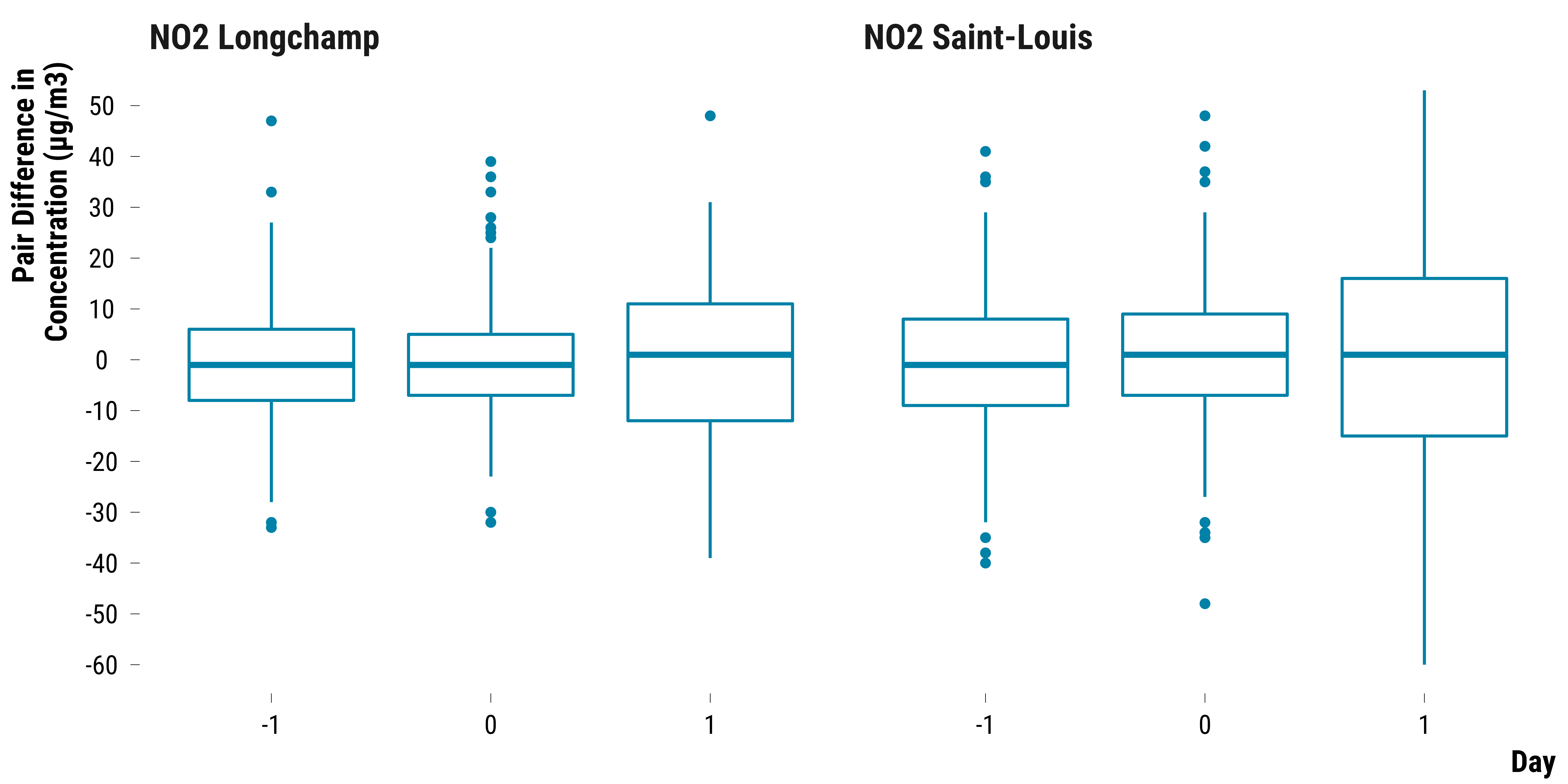
Pairs Differences in NO2 Concentrations
Boxplots for NO2:
Please show me the code!
# create the graph for no2
graph_boxplot_difference_pollutant_no2 <-
  data_pair_difference_pollutant %>%
  filter(str_detect(pollutant, "NO2")) %>%
  ggplot(., aes(x = as.factor(time), y = difference)) +
  geom_boxplot(colour = my_blue) +
  scale_y_continuous(breaks = scales::pretty_breaks(n = 10)) +
  facet_wrap( ~ pollutant) +
  ylab("Pair Difference in \nConcentration (µg/m3)") + xlab("Day") +
  theme_tufte()

# display the graph
graph_boxplot_difference_pollutant_no2
Please show me the code!
# save the graph
ggsave(
  graph_boxplot_difference_pollutant_no2,
  filename = here::here(
    "inputs",
    "3.outputs",
    "2.daily_analysis",
    "2.analysis_pollution",
    "1.cruise_experiment",
    "2.matching_results",
    "graph_boxplot_difference_pollutant_no2.pdf"
  ),
  width = 30,
  height = 15,
  units = "cm",
  device = cairo_pdf
)
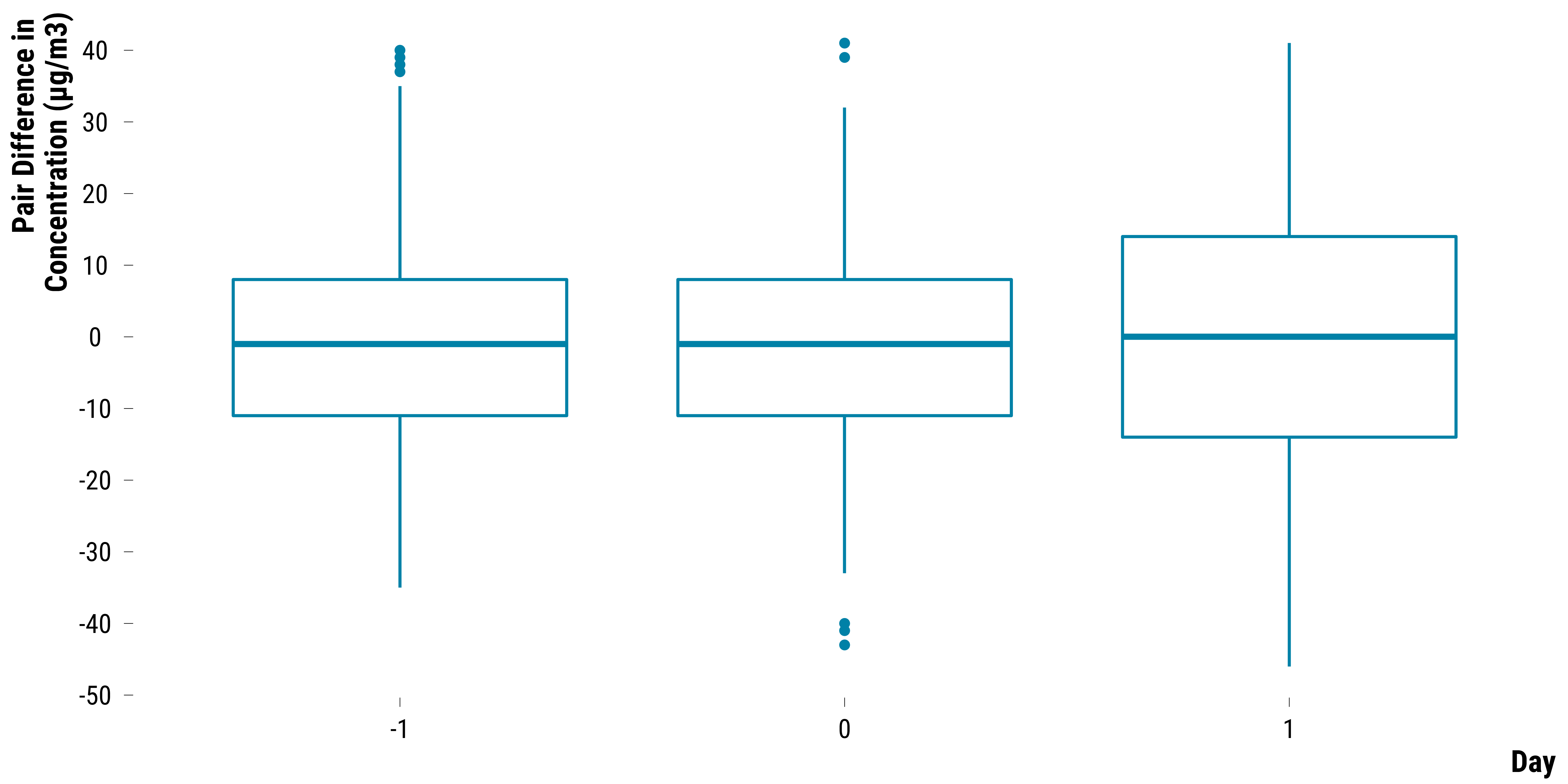
Pairs Differences in O3 Concentrations
Boxplots for O3:
Please show me the code!
# create the graph for o3
graph_boxplot_difference_pollutant_o3 <-
  data_pair_difference_pollutant %>%
  filter(str_detect(pollutant, "O3")) %>%
  ggplot(., aes(x = as.factor(time), y = difference)) +
  geom_boxplot(colour = my_blue) +
  scale_y_continuous(breaks = scales::pretty_breaks(n = 10)) +
  ylab("Pair Difference in \nConcentration (µg/m3)") + xlab("Day") +
  theme_tufte()

# display the graph
graph_boxplot_difference_pollutant_o3
Please show me the code!
# save the graph
ggsave(
  graph_boxplot_difference_pollutant_o3,
  filename = here::here(
    "inputs",
    "3.outputs",
    "2.daily_analysis",
    "2.analysis_pollution",
    "1.cruise_experiment",
    "2.matching_results",
    "graph_boxplot_difference_pollutant_o3.pdf"
  ),
  width = 30,
  height = 15,
  units = "cm",
  device = cairo_pdf
)
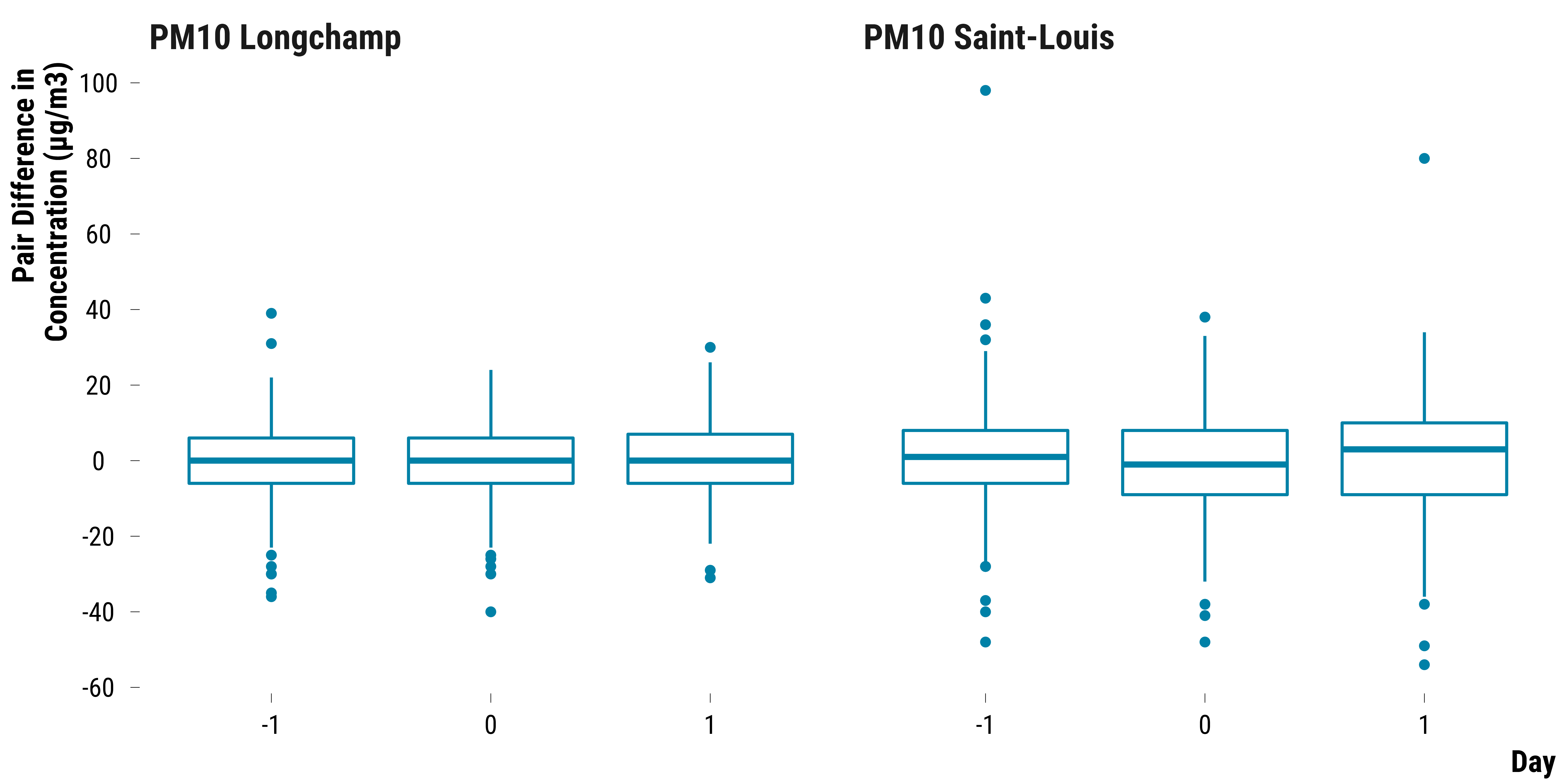
Pairs Differences in PM10 Concentrations
Boxplots for PM10:
Please show me the code!
# create the graph for pm10
graph_boxplot_difference_pollutant_pm10 <-
  data_pair_difference_pollutant %>%
  filter(str_detect(pollutant, "PM10")) %>%
  ggplot(., aes(x = as.factor(time), y = difference)) +
  geom_boxplot(colour = my_blue) +
  scale_y_continuous(breaks = scales::pretty_breaks(n = 10)) +
  facet_wrap( ~ pollutant) +
  ylab("Pair Difference in \nConcentration (µg/m3)") + xlab("Day") +
  theme_tufte()

# display the graph
graph_boxplot_difference_pollutant_pm10
Please show me the code!
# save the graph
ggsave(
  graph_boxplot_difference_pollutant_pm10,
  filename = here::here(
    "inputs",
    "3.outputs",
    "2.daily_analysis",
    "2.analysis_pollution",
    "1.cruise_experiment",
    "2.matching_results",
    "graph_boxplot_difference_pollutant_pm10.pdf"
  ),
  width = 30,
  height = 15,
  units = "cm",
  device = cairo_pdf
)
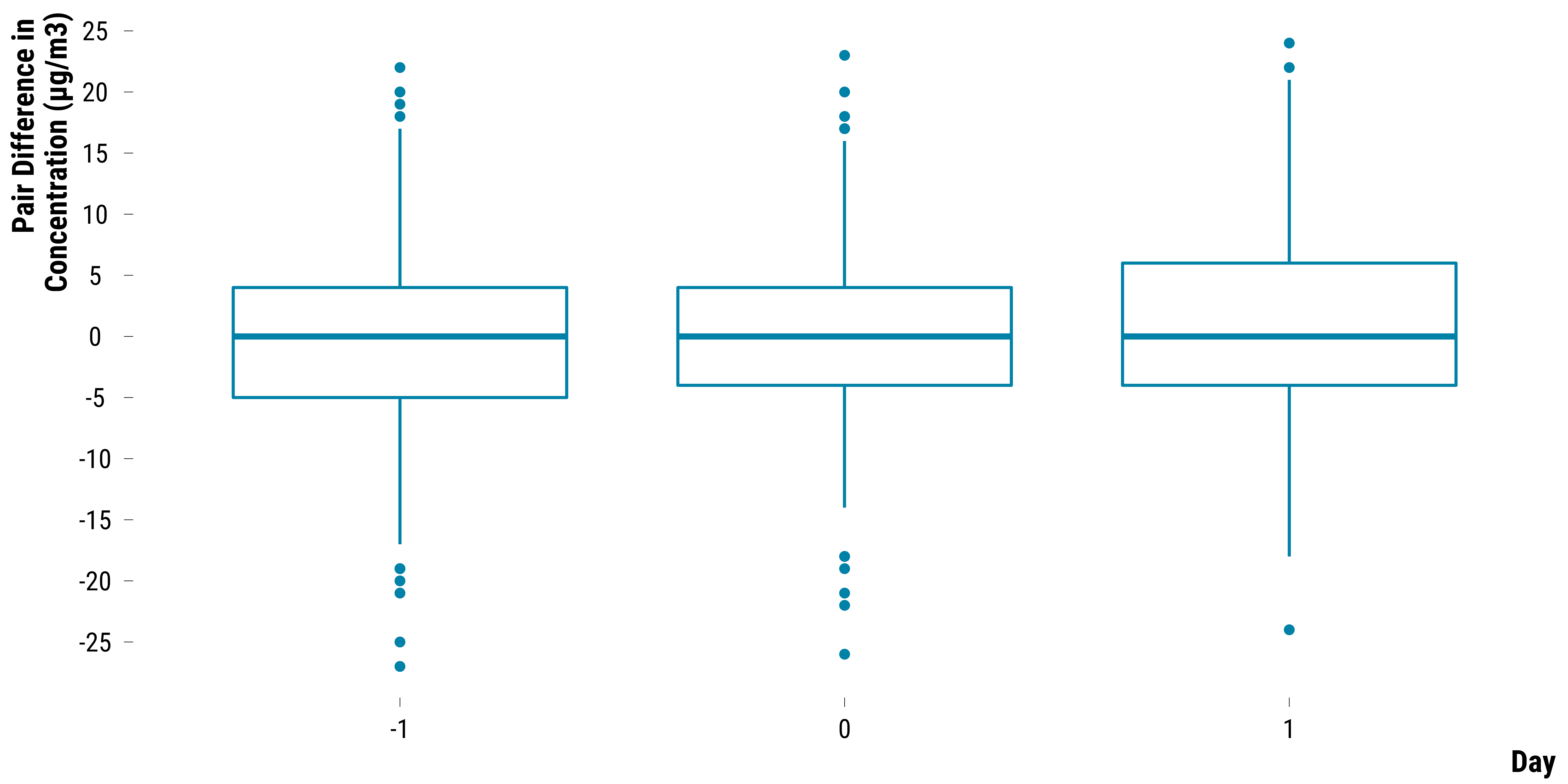
Pairs Differences in PM2.5 Concentrations
Boxplots for PM2.5:
Please show me the code!
# create the graph for pm2.5
graph_boxplot_difference_pollutant_pm25 <-
  data_pair_difference_pollutant %>%
  filter(str_detect(pollutant, "PM2.5")) %>%
  ggplot(., aes(x = as.factor(time), y = difference)) +
  geom_boxplot(colour = my_blue) +
  scale_y_continuous(breaks = scales::pretty_breaks(n = 10)) +
  ylab("Pair Difference in \nConcentration (µg/m3)") + xlab("Day") +
  theme_tufte()

# display the graph
graph_boxplot_difference_pollutant_pm25
Please show me the code!
# save the graph
ggsave(
  graph_boxplot_difference_pollutant_pm25,
  filename = here::here(
    "inputs",
    "3.outputs",
    "2.daily_analysis",
    "2.analysis_pollution",
    "1.cruise_experiment",
    "2.matching_results",
    "graph_boxplot_difference_pollutant_pm25.pdf"
  ),
  width = 30,
  height = 15,
  units = "cm",
  device = cairo_pdf
)
Pairs Differences in SO2 Concentrations
Boxplots for SO2:
Please show me the code!
# create the graph for so2
graph_boxplot_difference_pollutant_so2 <-
  data_pair_difference_pollutant %>%
  filter(str_detect(pollutant, "SO2")) %>%
  ggplot(., aes(x = as.factor(time), y = difference)) +
  geom_boxplot(colour = my_blue) +
  scale_y_continuous(breaks = scales::pretty_breaks(n = 10)) +
  ylab("Pair Difference in \nConcentration (µg/m3)") + xlab("Day") +
  theme_tufte()

# display the graph
graph_boxplot_difference_pollutant_so2
Please show me the code!
# save the graph
ggsave(
  graph_boxplot_difference_pollutant_so2,
  filename = here::here(
    "inputs",
    "3.outputs",
    "2.daily_analysis",
    "2.analysis_pollution",
    "1.cruise_experiment",
    "2.matching_results",
    "graph_boxplot_difference_pollutant_so2.pdf"
  ),
  width = 30,
  height = 15,
  units = "cm",
  device = cairo_pdf
)
Testing the Sharp Null Hypothesis
We test the sharp null hypothesis of no effect for any units. We first create a dataset where we nest the pair differences by pollutant and time. We also compute the observed test statistic which is the observed average of pair differences:
# nest the data by pollutant and time
ri_data_sharp_null <- data_pair_difference_pollutant   %>%
  select(pollutant, time, difference) %>%
  group_by(pollutant, time) %>%
  mutate(observed_mean_difference = mean(difference)) %>%
  group_by(pollutant, time, observed_mean_difference) %>%
  summarise(data_difference = list(difference))
We then create a function to compute the randomization distribution of the test statistic:
# randomization distribution function
# this function takes the vector of pair differences
# and then compute the average pair difference according
# to the permuted treatment assignment
function_randomization_distribution <- function(data_difference) {
  randomization_distribution = NULL
  n_columns = dim(permutations_matrix)[2]
  for (i in 1:n_columns) {
    randomization_distribution[i] =  sum(data_difference * permutations_matrix[, i]) / number_pairs
  }
  return(randomization_distribution)
}
We store the number of pairs and the number of simulations we want to run:
# define number of pairs in the experiment
number_pairs <- nrow(data_matched) / 2

# define number of simulations
number_simulations <- 100000
We compute the permutations matrix:
For each pollutant and time, we compute the randomization distribution of the test statistic using 100,000 iterations. It took us 46 seconds to run this code chunck on our basic local computer:
# set seed
set.seed(42)
# compute the test statistic distribution
ri_data_sharp_null <- ri_data_sharp_null %>%
mutate(
randomization_distribution = map(data_difference, ~ function_randomization_distribution(.))
)
Using the observed value of the test statistic and its randomization distribution, we compute the two-sided p-values:
# function to compute the upper one-sided p-value
function_fisher_upper_p_value <-
function(observed_mean_difference,
randomization_distribution) {
sum(randomization_distribution >= observed_mean_difference) / number_simulations
}
# function compute the lower one-sided p-value
function_fisher_lower_p_value <-
function(observed_mean_difference,
randomization_distribution) {
sum(randomization_distribution <= observed_mean_difference) / number_simulations
}
# compute the lower and upper one-sided p-values
ri_data_sharp_null <- ri_data_sharp_null %>%
mutate(
p_value_upper = map2_dbl(
observed_mean_difference,
randomization_distribution,
~ function_fisher_upper_p_value(.x, .y)
),
p_value_lower = map2_dbl(
observed_mean_difference,
randomization_distribution,
~ function_fisher_lower_p_value(.x, .y)
)
)
# compute the two-sided p-value using rosenbaum (2010) procedure
ri_data_sharp_null <- ri_data_sharp_null %>%
rowwise() %>%
mutate(two_sided_p_value = min(c(p_value_upper, p_value_lower)) * 2) %>%
mutate(two_sided_p_value = min(two_sided_p_value, 1)) %>%
select(pollutant, time, observed_mean_difference, two_sided_p_value) %>%
ungroup()
We plot below the two-sided p-values for the sharp null hypothesis for each pollutant:
Please show me the code!
# make the graph
graph_p_values <- ri_data_sharp_null %>%
ggplot(., aes(x = as.factor(time), y = two_sided_p_value)) +
geom_segment(aes(
x = as.factor(time),
xend = as.factor(time),
y = 0,
yend = two_sided_p_value
)) +
geom_point(
shape = 21,
size = 4,
colour = "black",
fill = my_blue
) +
facet_wrap( ~ pollutant, ncol = 4) +
xlab("Day") + ylab("Two-Sided P-Value") +
theme_tufte()
# display the graph
graph_p_values
Please show me the code!
# save the graph
ggsave(
graph_p_values,
filename = here::here(
"inputs",
"3.outputs",
"2.daily_analysis",
"2.analysis_pollution",
"1.cruise_experiment",
"2.matching_results",
"graph_p_values.pdf"
),
width = 30,
height = 15,
units = "cm",
device = cairo_pdf
)
We display below the table of Fisher p-values:
Please show me the code!
ri_data_sharp_null %>%
select(pollutant, time, observed_mean_difference, two_sided_p_value) %>%
rename(
"Pollutant" = pollutant,
"Time" = time,
"Observed Value of the Test Statistic" = observed_mean_difference,
"Two-Sided P-Values" = two_sided_p_value
) %>%
rmarkdown::paged_table(.)
Computing Fisherian intervals
To compute Fisherian intervals, we first create a nested dataset with the pair differences for each pollutant and day. We also add the set of hypothetical constant effects.
# create a nested dataframe with
# the set of constant treatment effect sizes
# and the vector of observed pair differences
ri_data_fi <- data_pair_difference_pollutant %>%
select(pollutant, time, difference) %>%
group_by(pollutant, time) %>%
summarise(data_difference = list(difference)) %>%
group_by(pollutant, time, data_difference) %>%
expand(effect = seq(from = -10, to = 10, by = 0.1)) %>%
ungroup()
We then substract for each pair difference the hypothetical constant effect:
# function to get the observed statistic
adjusted_pair_difference_function <-
function(pair_differences, effect) {
adjusted_pair_difference <- pair_differences - effect
return(adjusted_pair_difference)
}
# compute the adjusted pair differences
ri_data_fi <- ri_data_fi %>%
mutate(
data_adjusted_pair_difference = map2(
data_difference,
effect,
~ adjusted_pair_difference_function(.x, .y)
)
)
We compute the observed mean of adjusted pair differences:
We use the same function_randomization_distribution to
compute the randomization distribution of the test statistic but only
run 10,000 iterations for each pollutant-day observation:
# define number of pairs in the experiment
number_pairs <- nrow(data_matched) / 2
# define number of simulations
number_simulations <- 10000
# set seed
set.seed(42)

# compute the permutations matrix
permutations_matrix <-
  matrix(
    rbinom(number_pairs * number_simulations, 1, .5) * 2 - 1,
    nrow = number_pairs,
    ncol = number_simulations
  )
# randomization distribution function
# this function takes the vector of pair differences
# and then compute the average pair difference according
# to the permuted treatment assignment
function_randomization_distribution <- function(data_difference) {
randomization_distribution = NULL
n_columns = dim(permutations_matrix)[2]
for (i in 1:n_columns) {
randomization_distribution[i] = sum(data_difference * permutations_matrix[, i]) / number_pairs
}
return(randomization_distribution)
}
We ran the function. It took about one and a half minutes to run on our laptop computer. To quickly compile the .Rmd document, we therefore store the results of the simulations. The code we used is displayed below:
# set seed
set.seed(42)

tictoc::tic()

# compute the test statistic distribution
ri_data_fi <- ri_data_fi %>%
  mutate(
    randomization_distribution = map(
      data_adjusted_pair_difference,
      ~ function_randomization_distribution(.)
    )
  )

#----------------------------------------------------

# Computing the lower and upper *p*-values functions

#----------------------------------------------------

# define the p-values functions
function_fisher_upper_p_value <-
  function(observed_mean_difference,
           randomization_distribution) {
    sum(randomization_distribution >= observed_mean_difference) / number_simulations
  }

function_fisher_lower_p_value <-
  function(observed_mean_difference,
           randomization_distribution) {
    sum(randomization_distribution <= observed_mean_difference) / number_simulations
  }

# compute the lower and upper one-sided p-values
ri_data_fi <- ri_data_fi %>%
  mutate(
    p_value_upper = map2_dbl(
      observed_mean_difference,
      randomization_distribution,
      ~ function_fisher_upper_p_value(.x, .y)
    ),
    p_value_lower = map2_dbl(
      observed_mean_difference,
      randomization_distribution,
      ~ function_fisher_lower_p_value(.x, .y)
    )
  )

#----------------------------------------------------------

# RETRIEVING LOWER AND UPPER BOUNDS OF FISHERIAN INTERVALS

#----------------------------------------------------------

# retrieve the constant effects with the p-values equal or the closest to 0.025
ri_data_fi <- ri_data_fi %>%
  mutate(
    p_value_upper = abs(p_value_upper - 0.025),
    p_value_lower = abs(p_value_lower - 0.025)
  ) %>%
  group_by(pollutant, time) %>%
  filter(p_value_upper == min(p_value_upper) |
           p_value_lower == min(p_value_lower)) %>%
  # in case two effect sizes have a p-value equal to 0.025, we take the effect size
  # that make the Fisherian interval wider to be conservative
  summarise(lower_fi = min(effect),
            upper_fi = max(effect))

#----------------------------------------------------------

# COMPUTING POINT ESTIMATES

#----------------------------------------------------------

# compute observed average of pair differences
ri_data_fi_point_estimate <- data_pair_difference_pollutant   %>%
  select(pollutant, time, difference) %>%
  group_by(pollutant, time) %>%
  summarise(observed_mean_difference = mean(difference)) %>%
  ungroup()

#----------------------------------------------------------

# MERGING POINT ESTIMATES WITH INTERVALS

#----------------------------------------------------------

# merge ri_data_fi_point_estimate with ri_data_fi
ri_data_fi_final <-
  left_join(ri_data_fi,
            ri_data_fi_point_estimate,
            by = c("pollutant", "time"))

# create an indicator to alternate shading of confidence intervals
ri_data_fi_final <- ri_data_fi_final %>%
  arrange(pollutant, time) %>%
  mutate(stripe = ifelse((time %% 2) == 0, "Grey", "White")) %>%
  ungroup()

# save the data
saveRDS(
  ri_data_fi_final,
  here::here(
    "inputs",
    "1.data",
    "2.daily_data",
    "2.data_for_analysis",
    "1.cruise_experiment",
    "ri_data_fisherian_intervals.rds"
  )
)

tictoc::toc()
We plot below the 95% Fisherian intervals:
Please show me the code!
# read the data on 95% fisherian intervals
ri_data_fi_final <-
  readRDS(
    here::here(
      "inputs",
      "1.data",
      "2.daily_data",
      "2.data_for_analysis",
      "1.cruise_experiment",
      "ri_data_fisherian_intervals.rds"
    )
  )

# make the graph
graph_fisherian_intervals <-
  ggplot(ri_data_fi_final,
         aes(x = as.factor(time), y = observed_mean_difference)) +
  geom_rect(
    aes(fill = stripe),
    xmin = as.numeric(as.factor(ri_data_fi_final$time)) - 0.42,
    xmax = as.numeric(as.factor(ri_data_fi_final$time)) + 0.42,
    ymin = -Inf,
    ymax = Inf,
    color = NA,
    alpha = 0.4
  ) +
  geom_hline(yintercept = 0, color = "black") +
  geom_vline(xintercept = c(1.6), color = "black") +
  geom_pointrange(
    aes(
      x = as.factor(time),
      y = observed_mean_difference,
      ymin = lower_fi ,
      ymax = upper_fi
    ),
    colour = my_blue,
    lwd = 1.2
  ) +
  facet_wrap( ~ pollutant, ncol = 4) +
  scale_fill_manual(values = c('gray80', "NA")) +
  guides(fill = FALSE) +
  ylab("Constant-Additive Increase \nin Concentrations (µg/m³)") + xlab("Day") +
  theme_tufte()

# print the graph
graph_fisherian_intervals
Please show me the code!
# save the graph
ggsave(
  graph_fisherian_intervals,
  filename = here::here(
    "inputs",
    "3.outputs",
    "2.daily_analysis",
    "2.analysis_pollution",
    "1.cruise_experiment",
    "2.matching_results",
    "graph_fisherian_intervals.pdf"
  ),
  width = 30,
  height = 15,
  units = "cm",
  device = cairo_pdf
)
We display below the table with the 95% fisherian intervals and the Hodges-Lehmann point estimates:
Please show me the code!
ri_data_fi_final %>%
  select(pollutant, time, observed_mean_difference, lower_fi, upper_fi) %>%
  mutate(observed_mean_difference = round(observed_mean_difference, 1)) %>%
  rename(
    "Pollutant" = pollutant,
    "Time" = time,
    "Point Estimate" = observed_mean_difference,
    "Lower Bound of the 95% Fisherian Interval" = lower_fi,
    "Upper Bound of the 95% Fisherian Interval" = upper_fi
  ) %>%
  rmarkdown::paged_table(.)
Checking the Robustness of Results
In this section, we carry out four investigations:
- We check how our results are sensitive to outliers by computing 95% Fisherian intervals based on the Wilcoxon’s signed rank test statistic.
- As we imputed the missing pollutant concentrations, we also want to see how our results might for the non-missing outcomes. We compute 95% Fisherian intervals based on the Wilcoxon’s signed rank test statistic.
- We compute confidence intervals for the average treatment effect using Neyman’s approach and a randomization inference procedure based on a studentized test statistic.
Outliers
To gauge how sensitive our results are to outliers, we use a Wilcoxon
signed rank test statistic and compute 95% Fisherian intervals using the
wilcox.test() function.
Please show me the code!
# carry out the wilcox.test
data_rank_ci <- data_pair_difference_pollutant %>%
  select(-pair_number) %>%
  group_by(pollutant, time) %>%
  nest() %>%
  mutate(
    effect = map(data, ~ wilcox.test(.$difference, conf.int = TRUE)$estimate),
    lower_ci = map(data, ~ wilcox.test(.$difference, conf.int = TRUE)$conf.int[1]),
    upper_ci = map(data, ~ wilcox.test(.$difference, conf.int = TRUE)$conf.int[2])
  ) %>%
  unnest(cols = c(effect, lower_ci, upper_ci)) %>%
  mutate(data = "Wilcoxon Rank Test Statistic")

# bind ri_data_fi_final with data_rank_ci
data_ci <- ri_data_fi_final %>%
  rename(effect = observed_mean_difference,
         lower_ci = lower_fi,
         upper_ci = upper_fi) %>%
  mutate(data = "Average Pair Difference Test Statistic") %>%
  bind_rows(., data_rank_ci)

# create an indicator to alternate shading of confidence intervals
data_ci <- data_ci %>%
  arrange(pollutant, time) %>%
  mutate(stripe = ifelse((time %% 2) == 0, "Grey", "White")) %>%
  ungroup()

# make the graph
graph_ri_ci_wilcoxon <-
  ggplot(
    data_ci,
    aes(
      x = as.factor(time),
      y = effect,
      ymin = lower_ci,
      ymax = upper_ci,
      colour = data,
      shape = data
    )
  ) +
  geom_rect(
    aes(fill = stripe),
    xmin = as.numeric(as.factor(data_ci$time)) - 0.42,
    xmax = as.numeric(as.factor(data_ci$time)) + 0.42,
    ymin = -Inf,
    ymax = Inf,
    color = NA,
    alpha = 0.4
  ) +
  geom_hline(yintercept = 0, color = "black") +
  geom_pointrange(position = position_dodge(width = 1), size = 1.2) +
  scale_shape_manual(name = "Test Statistic:", values = c(16, 17)) +
  scale_color_manual(name = "Test Statistic:", values = c(my_orange, my_blue)) +
  facet_wrap(~ pollutant, ncol = 4) +
  scale_fill_manual(values = c('grey90', "white")) +
  guides(fill = FALSE) +
  ylab("Constant-Additive Increase \nin Concentrations (µg/m³)") + xlab("Day") +
  theme_tufte()

# print the graph
graph_ri_ci_wilcoxon
Please show me the code!
# save the graph
ggsave(
  graph_ri_ci_wilcoxon,
  filename = here::here(
    "inputs",
    "3.outputs",
    "2.daily_analysis",
    "2.analysis_pollution",
    "1.cruise_experiment",
    "2.matching_results",
    "graph_ri_ci_wilcoxon.pdf"
  ),
  width = 30,
  height = 15,
  units = "cm",
  device = cairo_pdf
)
Missing Outcomes
We load non-imputed air pollution data and compute for each pollutant the 0-1 daily lags and leads:
# load marseille raw air pollution data
data_marseille_raw_pollutants <-
  readRDS(
    here::here(
      "inputs",
      "1.data",
      "2.daily_data",
      "1.raw_data" ,
      "3.pollution_data",
      "raw_marseille_pollutants_2008_2018_data.rds"
    )
  ) %>%
  rename_at(vars(-date), function(x)
    paste0("raw_", x))

# we first define data_marseille_raw_pollutants_leads and data_marseille_raw_pollutants_lags
# to store leads and lags

data_marseille_raw_pollutants_leads <- data_marseille_raw_pollutants
data_marseille_raw_pollutants_lags <- data_marseille_raw_pollutants

#
# create leads
#

# create a list to store dataframe of leads
leads_list <- vector(mode = "list", length = 1)
names(leads_list) <- c(1)

# create the leads
for (i in 1) {
  leads_list[[i]] <- data_marseille_raw_pollutants_leads %>%
    mutate_at(vars(-date), ~  lead(., n = i, order_by = date)) %>%
    rename_at(vars(-date), function(x)
      paste0(x, "_lead_", i))
}

# merge the dataframes of leads
data_leads <- leads_list %>%
  reduce(left_join, by = "date")

# merge the leads with the data_marseille_raw_pollutants_leads
data_marseille_raw_pollutants_leads <-
  left_join(data_marseille_raw_pollutants_leads, data_leads, by = "date") %>%
  select(-c(raw_mean_no2_sl:raw_mean_o3_l))

#
# create lags
#

# create a list to store dataframe of lags
lags_list <- vector(mode = "list", length = 1)
names(lags_list) <- c(1)

# create the lags
for (i in 1) {
  lags_list[[i]] <- data_marseille_raw_pollutants_lags %>%
    mutate_at(vars(-date), ~  lag(., n = i, order_by = date)) %>%
    rename_at(vars(-date), function(x)
      paste0(x, "_lag_", i))
}

# merge the dataframes of lags
data_lags <- lags_list %>%
  reduce(left_join, by = "date")

# merge the lags with the initial data_marseille_raw_pollutants_lags
data_marseille_raw_pollutants_lags <-
  left_join(data_marseille_raw_pollutants_lags, data_lags, by = "date")

#
# merge data_marseille_raw_pollutants_leads with data_marseille_raw_pollutants_lags
#

data_marseille_raw_pollutants <-
  left_join(data_marseille_raw_pollutants_lags,
            data_marseille_raw_pollutants_leads,
            by = "date")
We merge these data with the matched data and compute pair differences:
# merge with the matched_data
data_matched_with_raw_pollutants <-
  left_join(data_matched, data_marseille_raw_pollutants, by = "date")

# compute pair differences
data_matched_wide_raw_pollutants <-
  data_matched_with_raw_pollutants %>%
  mutate(is_treated = ifelse(is_treated == TRUE, "treated", "control")) %>%
  select(
    is_treated,
    pair_number,
    contains("raw_mean_no2_l"),
    contains("raw_mean_no2_sl"),
    contains("raw_mean_o3"),
    contains("raw_mean_pm10_l"),
    contains("raw_mean_pm10_sl"),
    contains("raw_mean_pm25"),
    contains("raw_mean_so2")
  ) %>%
  pivot_longer(
    cols = -c(pair_number, is_treated),
    names_to = "variable",
    values_to = "concentration"
  ) %>%
  mutate(
    pollutant = NA %>%
      ifelse(str_detect(variable, "no2_l"), "NO2 Longchamp", .) %>%
      ifelse(str_detect(variable, "no2_sl"), "NO2 Saint-Louis", .) %>%
      ifelse(str_detect(variable, "o3"), "O3 Longchamp", .) %>%
      ifelse(str_detect(variable, "pm10_l"), "PM10 Longchamp", .) %>%
      ifelse(str_detect(variable, "pm10_sl"), "PM10 Saint-Louis", .) %>%
      ifelse(str_detect(variable, "pm25"), "PM2.5 Longchamp", .) %>%
      ifelse(str_detect(variable, "so2"), "SO2 Lonchamp", .)
  ) %>%
  mutate(time = 0 %>%
           ifelse(str_detect(variable, "lag_1"),-1, .) %>%
           ifelse(str_detect(variable, "lead_1"), 1, .)) %>%
  select(-variable) %>%
  select(pair_number, is_treated, pollutant, time, concentration) %>%
  pivot_wider(names_from = is_treated, values_from = concentration)

data_raw_pair_difference_pollutant <-
  data_matched_wide_raw_pollutants %>%
  mutate(difference = treated - control) %>%
  select(-c(treated, control))
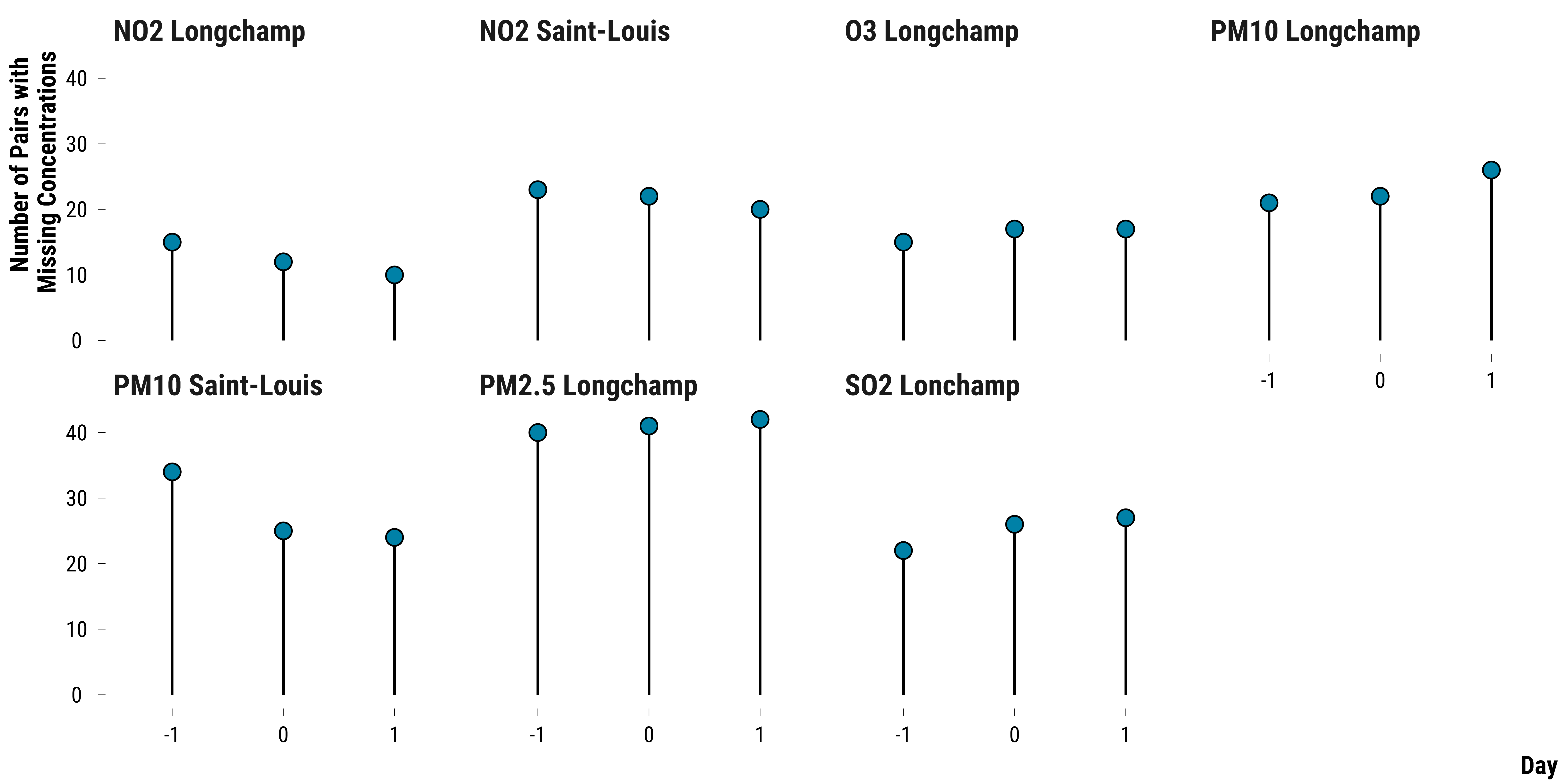
We display below the number of missing differences by pollutant and day:
Please show me the code!
# make the graph
graph_missing_pollutants <- data_raw_pair_difference_pollutant %>%
  group_by(pollutant, time) %>%
  summarise(n_missing = sum(is.na(difference))) %>%
  ggplot(., aes(x = as.factor(time), y = n_missing)) +
  geom_segment(aes(
    x = as.factor(time),
    xend = as.factor(time),
    y = 0,
    yend = n_missing
  )) +
  geom_point(
    shape = 21,
    size = 4,
    colour = "black",
    fill = my_blue
  ) +
  facet_wrap( ~ pollutant, ncol = 4) +
  xlab("Day") + ylab("Number of Pairs with \nMissing Concentrations") +
  theme_tufte()

# display the graph
graph_missing_pollutants
Please show me the code!
# save the graph
ggsave(
  graph_missing_pollutants,
  filename = here::here(
    "inputs",
    "3.outputs",
    "2.daily_analysis",
    "2.analysis_pollution",
    "1.cruise_experiment",
    "2.matching_results",
    "graph_missing_pollutants.pdf"
  ),
  width = 30,
  height = 15,
  units = "cm",
  device = cairo_pdf
)
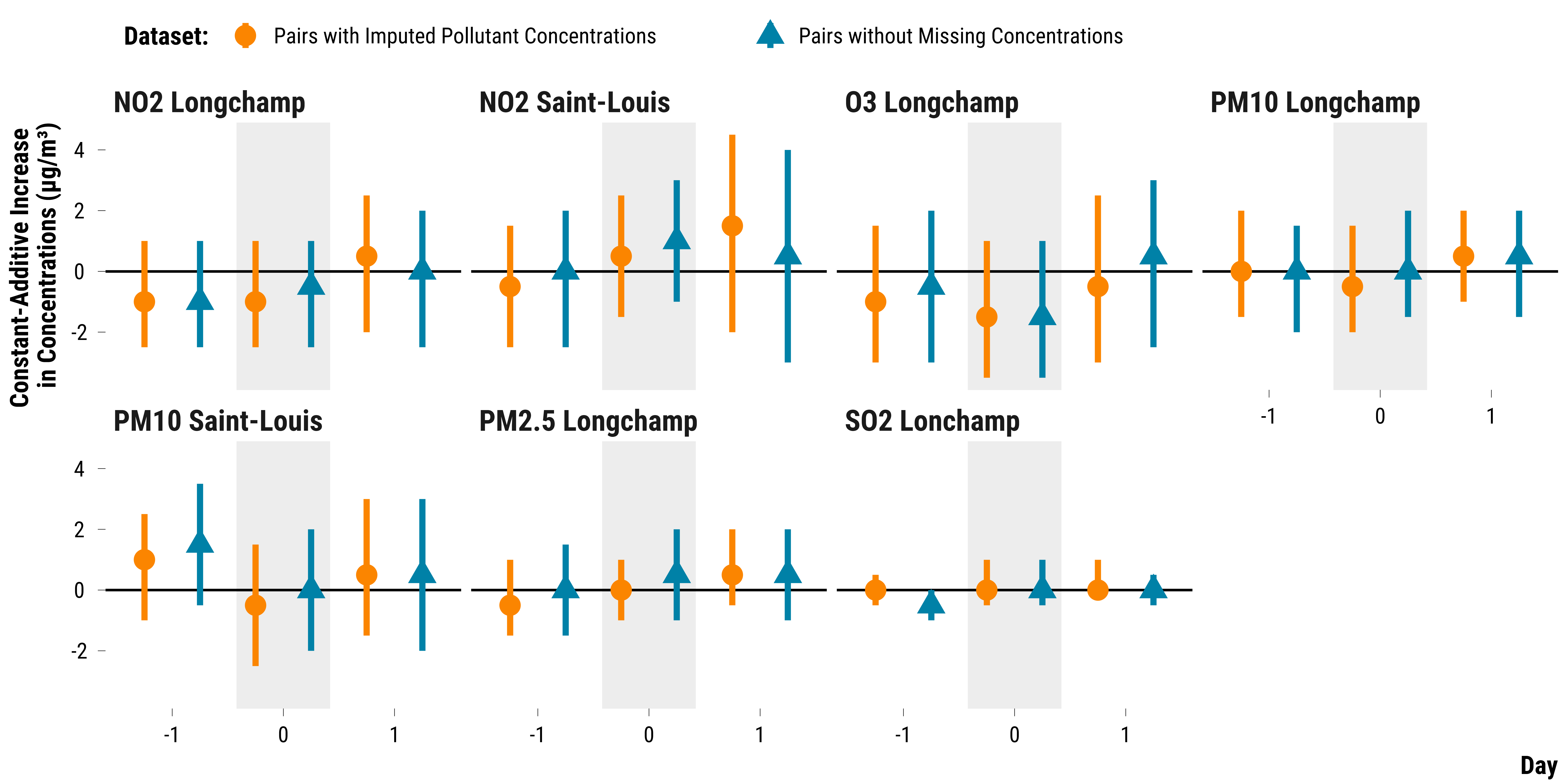
As we have 189 pairs, up to 21% of the pairs can have missing pollutant concentrations. We compute below the 95% fisherian intervals for pairs without missing concentrations and compare the results to those found with the imputed dataset:
Please show me the code!
# carry out the wilcox.test
data_raw_rank_ci <- data_raw_pair_difference_pollutant %>%
  drop_na() %>%
  select(-pair_number) %>%
  group_by(pollutant, time) %>%
  nest() %>%
  mutate(
    effect = map(data, ~ wilcox.test(.$difference, conf.int = TRUE)$estimate),
    lower_ci = map(data, ~ wilcox.test(.$difference, conf.int = TRUE)$conf.int[1]),
    upper_ci = map(data, ~ wilcox.test(.$difference, conf.int = TRUE)$conf.int[2])
  ) %>%
  unnest(cols = c(effect, lower_ci, upper_ci)) %>%
  mutate(data = "Pairs without Missing Concentrations")

# bind data_rank_ci with data_raw_rank_ci
data_ci <- data_rank_ci %>%
  mutate(data = "Pairs with Imputed Pollutant Concentrations") %>%
  bind_rows(., data_raw_rank_ci)

# create an indicator to alternate shading of confidence intervals
data_ci <- data_ci %>%
  arrange(pollutant, time) %>%
  mutate(stripe = ifelse((time %% 2) == 0, "Grey", "White")) %>%
  ungroup()

# make the graph
graph_ri_ci_missing_concentration <-
  ggplot(
    data_ci,
    aes(
      x = as.factor(time),
      y = effect,
      ymin = lower_ci,
      ymax = upper_ci,
      colour = data,
      shape = data
    )
  ) +
  geom_rect(
    aes(fill = stripe),
    xmin = as.numeric(as.factor(data_ci$time)) - 0.42,
    xmax = as.numeric(as.factor(data_ci$time)) + 0.42,
    ymin = -Inf,
    ymax = Inf,
    color = NA,
    alpha = 0.4
  ) +
  geom_hline(yintercept = 0, color = "black") +
  geom_pointrange(position = position_dodge(width = 1), size = 1.2) +
  scale_shape_manual(name = "Dataset:", values = c(16, 17)) +
  scale_color_manual(name = "Dataset:", values = c(my_orange, my_blue)) +
  facet_wrap( ~ pollutant, ncol = 4) +
  scale_fill_manual(values = c('grey90', "white")) +
  guides(fill = FALSE) +
  ylab("Constant-Additive Increase \nin Concentrations (µg/m³)") + xlab("Day") +
  theme_tufte()

# print the graph
graph_ri_ci_missing_concentration
Please show me the code!
# save the graph
ggsave(
  graph_ri_ci_missing_concentration,
  filename = here::here(
    "inputs",
    "3.outputs",
    "2.daily_analysis",
    "2.analysis_pollution",
    "1.cruise_experiment",
    "2.matching_results",
    "graph_ri_ci_missing_concentration.pdf"
  ),
  width = 30,
  height = 15,
  units = "cm",
  device = cairo_pdf
)
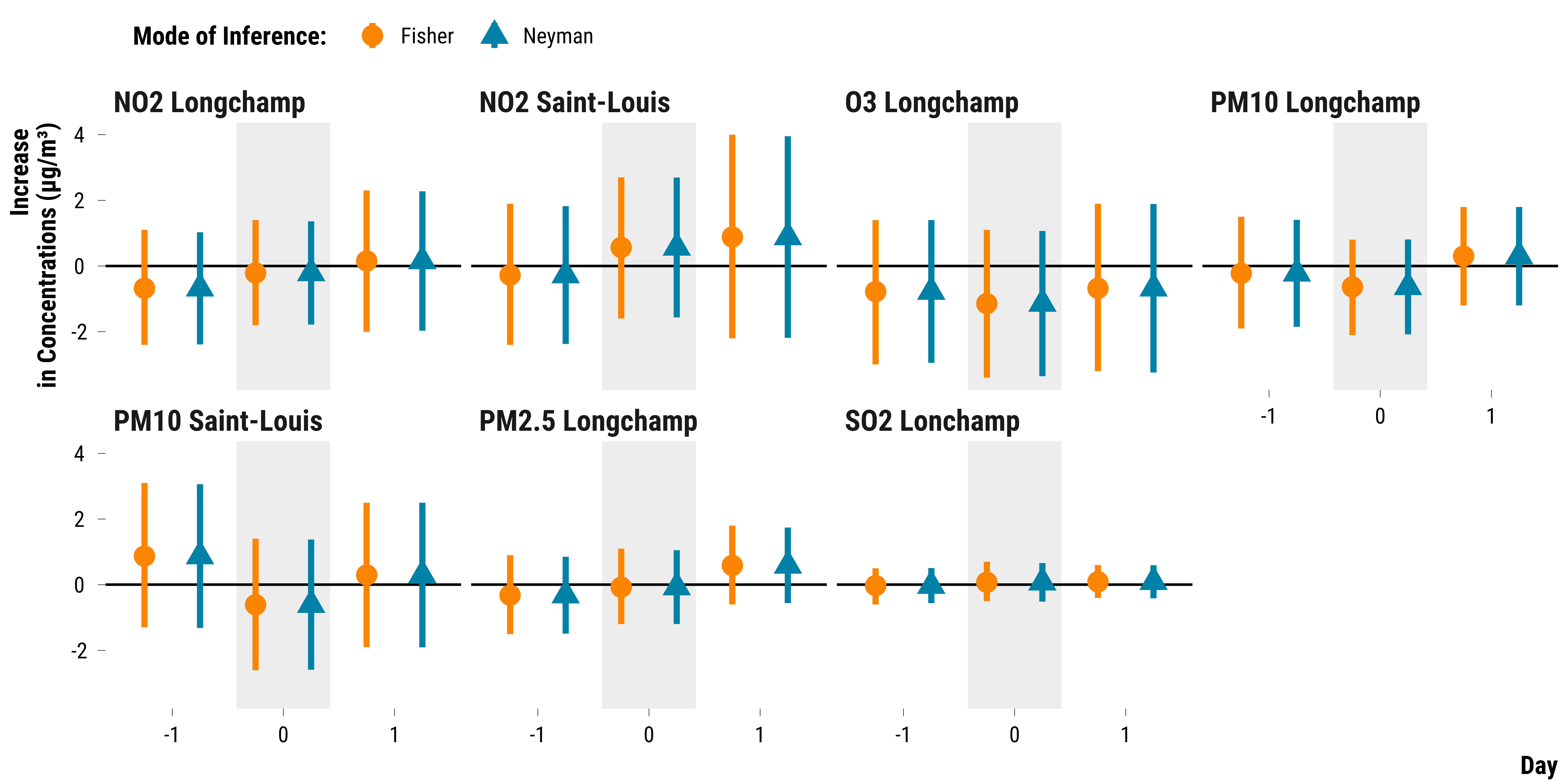
Neyman’s Approach: Computing Confidence Intervals for the Average Treatment Effects
We compute confidence intervals for the average treatment effect using Neyman’s approach. We use the formula for the standard error of pair randomized experiment found in Imbens and Rubin (2015).
# we first compute the average treatment effects for each pollutant and hour
data_pair_mean_difference <- data_pair_difference_pollutant %>%
  group_by(pollutant, time) %>%
  summarise(mean_difference = mean(difference)) %>%
  ungroup()

# we store the number of pairs
n_pair <- nrow(data_matched) / 2

# compute the standard error
data_se_neyman_pair <-
  left_join(
    data_pair_difference_pollutant,
    data_pair_mean_difference,
    by = c("pollutant", "time")
  ) %>%
  mutate(squared_difference = (difference - mean_difference) ^ 2) %>%
  group_by(pollutant, time) %>%
  summarise(standard_error = sqrt(1 / (n_pair * (n_pair - 1)) * sum(squared_difference))) %>%
  select(pollutant, time, standard_error) %>%
  ungroup()

# merge the average treatment effect data witht the standard error data
data_neyman <-
  left_join(data_pair_mean_difference,
            data_se_neyman_pair,
            by = c("pollutant", "time")) %>%
  # compute the 95% confidence intervals
  mutate(
    ci_lower_95 = mean_difference - 1.96 * standard_error,
    ci_upper_95 = mean_difference + 1.96 * standard_error
  ) %>%
  mutate(data = "Neyman")

# we save the results to compare them with an outcome regression approach
saveRDS(
  data_neyman,
  here(
    "inputs",
    "1.data",
    "2.daily_data",
    "2.data_for_analysis",
    "1.cruise_experiment",
    "data_neyman.rds"
  )
)
We plot the the point estimates for the average treatment effects and their associated 95% confidence intervals:
Please show me the code!
# merge data on fisherian intervals with neymanian intervals
data_ci <- ri_data_fi_final %>%
  rename(ci_upper_95 = upper_fi,
         ci_lower_95 = lower_fi,
         mean_difference = observed_mean_difference) %>%
  mutate(data = "Fisher") %>%
  bind_rows(., data_neyman)

# create an indicator to alternate shading of confidence intervals
data_ci <- data_ci %>%
  arrange(pollutant, time) %>%
  mutate(stripe = ifelse((time %% 2) == 0, "Grey", "White")) %>%
  ungroup()

# make the graph
graph_neyman_ci <-
  ggplot(
    data_ci,
    aes(
      x = as.factor(time),
      y = mean_difference,
      ymin = ci_upper_95,
      ymax = ci_lower_95,
      colour = data,
      shape = data
    )
  ) +
  geom_rect(
    aes(fill = stripe),
    xmin = as.numeric(as.factor(data_ci$time)) - 0.42,
    xmax = as.numeric(as.factor(data_ci$time)) + 0.42,
    ymin = -Inf,
    ymax = Inf,
    color = NA,
    alpha = 0.4
  ) +
  geom_hline(yintercept = 0, color = "black") +
  geom_pointrange(position = position_dodge(width = 1), size = 1.2) +
  scale_shape_manual(name = "Mode of Inference:", values = c(16, 17)) +
  scale_color_manual(name = "Mode of Inference:", values = c(my_orange, my_blue)) +
  facet_wrap( ~ pollutant, ncol = 4) +
  scale_fill_manual(values = c('grey90', "white")) +
  guides(fill = FALSE) +
  ylab("Increase \nin Concentrations (µg/m³)") + xlab("Day") +
  theme_tufte()

# print the graph
graph_neyman_ci
Please show me the code!
# save the graph
ggsave(
  graph_neyman_ci,
  filename = here::here(
    "inputs",
    "3.outputs",
    "2.daily_analysis",
    "2.analysis_pollution",
    "1.cruise_experiment",
    "2.matching_results",
    "graph_ci_neyman.pdf"
  ),
  width = 30,
  height = 15,
  units = "cm",
  device = cairo_pdf
)
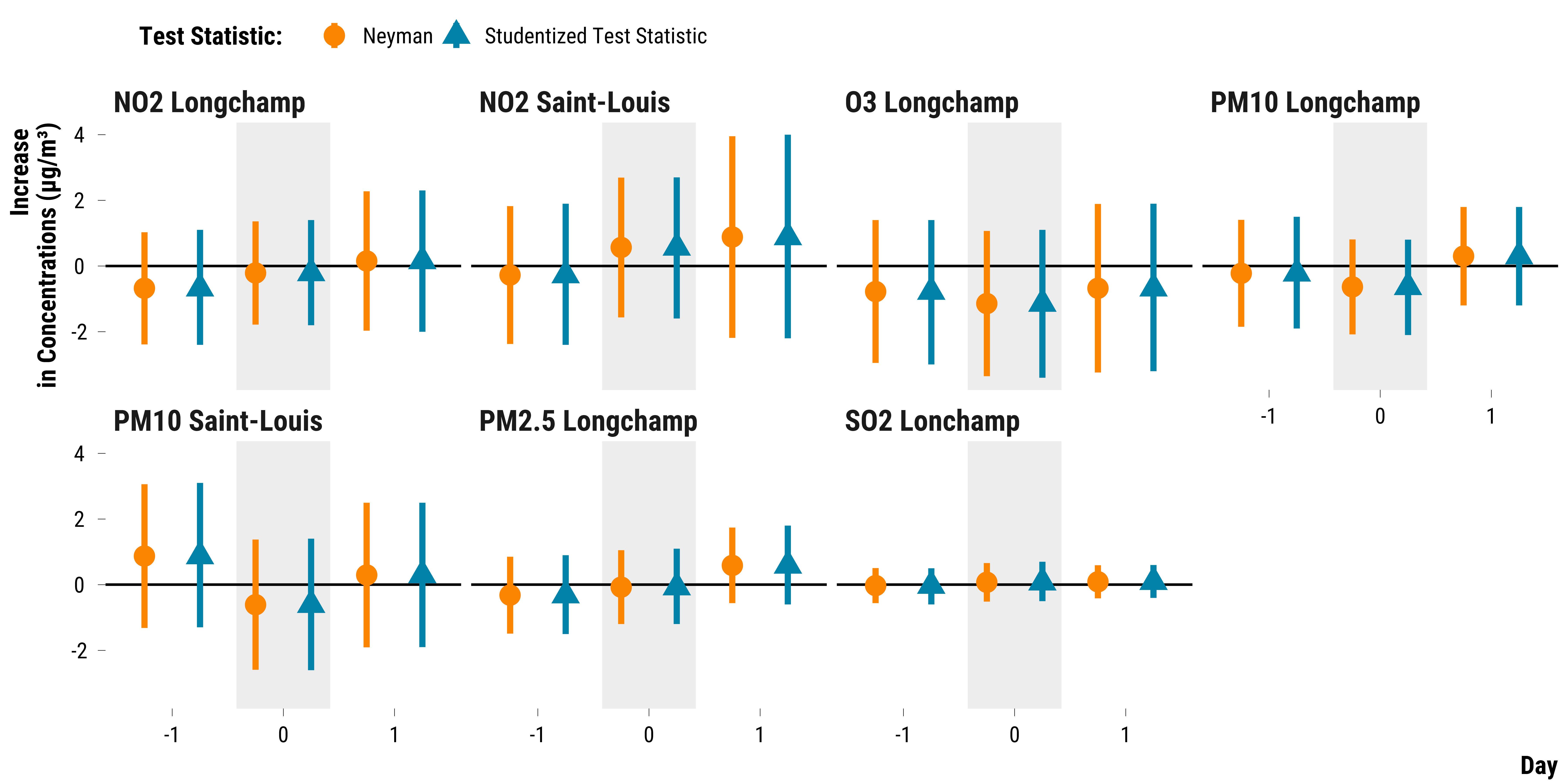
Randomization Inference for Weak Nulls
Many researchers restrain from using randomization inference as a mode of inference since it assumes that treatment effects are constant across units. In our study, this is arguably an unrealistic assumption. To overcome this limit, Jason Wu & Peng Ding (2021) propose to adopt a studentized test statistic that is finite-sample exact under sharp null hypotheses but also asymptotically conservative for the weak null hypothesis.
In our case, this studentized test statistic is equal to the observed average of pair differences divided by the standard error of a pairwise experiment. We therefore just follow the same previous procedure for computing Fisherian intervals but use the studentized statistic proposed by Jason Wu & Peng Ding (2021).
First, we create the data for testing a range of weak null hypotheses with the randomization inference:
# create a nested dataframe with
# the set of constant treatment effect sizes
# and the vector of observed pair differences
ri_data_fi_weak <- data_pair_difference_pollutant %>%
  select(pollutant, time, difference) %>%
  group_by(pollutant, time) %>%
  summarise(data_difference = list(difference)) %>%
  group_by(pollutant, time, data_difference) %>%
  expand(effect = seq(from = -10, to = 10, by = 0.1)) %>%
  ungroup()
We then subtract for each pair difference the hypothetical constant effect:
# function to get the observed statistic
adjusted_pair_difference_function <-
  function(pair_differences, effect) {
    adjusted_pair_difference <- pair_differences - effect
    return(adjusted_pair_difference)
  }

# compute the adjusted pair differences
ri_data_fi_weak <- ri_data_fi_weak %>%
  mutate(
    data_adjusted_pair_difference = map2(
      data_difference,
      effect,
      ~ adjusted_pair_difference_function(.x, .y)
    )
  )
We then compute the observed studentized statistics:
# define number of pairs in the experiment
number_pairs <- nrow(data_matched) / 2

# function to compute neyman t-statistic
function_neyman_t_stat <- function(pair_differences) {
  # compute the average of pair differences
  average_pair_difference <- mean(pair_differences)
  # compute the standard error
  squared_difference <-
    (pair_differences - average_pair_difference) ^ 2
  # compute the standard error
  standard_error <-
    sqrt(1 / (number_pairs * (number_pairs - 1)) * sum(squared_difference))
  # compute neyman t-statistic
  neyman_t_stat <- average_pair_difference / standard_error
  return(neyman_t_stat)
}


# compute the observed mean of adjusted pair differences
ri_data_fi_weak <- ri_data_fi_weak %>%
  mutate(
    observed_neyman_t_stat = map(
      data_adjusted_pair_difference,
      ~ function_neyman_t_stat(.)
    )
  ) %>%
  unnest(cols = c(observed_neyman_t_stat)) %>%
  ungroup()

# display the table
ri_data_fi_weak
# A tibble: 4,221 x 6
   pollutant      time data_difference effect data_adjusted_pair_diff~
   <chr>         <dbl> <list>           <dbl> <list>
 1 NO2 Longchamp    -1 <dbl [189]>      -10   <dbl [189]>
 2 NO2 Longchamp    -1 <dbl [189]>       -9.9 <dbl [189]>
 3 NO2 Longchamp    -1 <dbl [189]>       -9.8 <dbl [189]>
 4 NO2 Longchamp    -1 <dbl [189]>       -9.7 <dbl [189]>
 5 NO2 Longchamp    -1 <dbl [189]>       -9.6 <dbl [189]>
 6 NO2 Longchamp    -1 <dbl [189]>       -9.5 <dbl [189]>
 7 NO2 Longchamp    -1 <dbl [189]>       -9.4 <dbl [189]>
 8 NO2 Longchamp    -1 <dbl [189]>       -9.3 <dbl [189]>
 9 NO2 Longchamp    -1 <dbl [189]>       -9.2 <dbl [189]>
10 NO2 Longchamp    -1 <dbl [189]>       -9.1 <dbl [189]>
# ... with 4,211 more rows, and 1 more variable:
#   observed_neyman_t_stat <dbl>
We then implement the randomization inference procedure using the
function_randomization_distribution_t_stat with 10,000
iterations for each pollutant-day observation:
# define number of pairs in the experiment
number_pairs <- nrow(data_matched) / 2

# define number of simulations
number_simulations <- 10000

# set seed
set.seed(42)

# compute the permutations matrix
permutations_matrix <-
  matrix(
    rbinom(number_pairs * number_simulations, 1, .5) * 2 - 1,
    nrow = number_pairs,
    ncol = number_simulations
  )

# randomization distribution function
# this function takes the vector of pair differences
# and then compute the studentized statistic according
# to the permuted treatment assignment
function_randomization_distribution_t_stat <-
  function(data_adjusted_pair_difference) {
    randomization_distribution = NULL
    n_columns = dim(permutations_matrix)[2]
    for (i in 1:n_columns) {
      # compute the average of pair differences
      average_pair_difference <-
        sum(data_adjusted_pair_difference * permutations_matrix[, i]) / number_pairs
      # compute the standard error
      squared_difference <-
        (data_adjusted_pair_difference - average_pair_difference) ^ 2
      # compute the standard error
      standard_error <-
        sqrt(1 / (number_pairs * (number_pairs - 1)) * sum(squared_difference))
      # compute neyman t-statistic
      randomization_distribution[i] = average_pair_difference / standard_error
    }
    return(randomization_distribution)
  }
It takes about 6 minutes to run the procedure. To quickly compile the .Rmd document, we therefore store the results of the simulations. The code we used is displayed below:
# set seed
set.seed(42)

# compute the test statistic distribution
ri_data_fi_weak <- ri_data_fi_weak %>%
  mutate(
    randomization_distribution = map(
      data_adjusted_pair_difference,
      ~ function_randomization_distribution_t_stat(.)
    )
  )

#----------------------------------------------------

# Computing the lower and upper *p*-values functions

#----------------------------------------------------

# define the p-values functions
function_fisher_upper_p_value <-
  function(observed_neyman_t_stat,
           randomization_distribution) {
    sum(randomization_distribution >= observed_neyman_t_stat) / number_simulations
  }

function_fisher_lower_p_value <-
  function(observed_neyman_t_stat,
           randomization_distribution) {
    sum(randomization_distribution <= observed_neyman_t_stat) / number_simulations
  }

# compute the lower and upper one-sided p-values
ri_data_fi_weak <- ri_data_fi_weak %>%
  mutate(
    p_value_upper = map2_dbl(
      observed_neyman_t_stat,
      randomization_distribution,
      ~ function_fisher_upper_p_value(.x, .y)
    ),
    p_value_lower = map2_dbl(
      observed_neyman_t_stat,
      randomization_distribution,
      ~ function_fisher_lower_p_value(.x, .y)
    )
  )

#----------------------------------------------------------

# RETRIEVING LOWER AND UPPER BOUNDS OF FISHERIAN INTERVALS

#----------------------------------------------------------

# retrieve the constant effects with the p-values equal or the closest to 0.025
ri_data_fi_weak <- ri_data_fi_weak %>%
  mutate(
    p_value_upper = abs(p_value_upper - 0.025),
    p_value_lower = abs(p_value_lower - 0.025)
  ) %>%
  group_by(pollutant, time) %>%
  filter(p_value_upper == min(p_value_upper) |
           p_value_lower == min(p_value_lower)) %>%
  # in case two effect sizes have a p-value equal to 0.025, we take the effect size
  # that make the Fisherian interval wider to be conservative
  summarise(lower_fi = min(effect),
            upper_fi = max(effect))

#----------------------------------------------------------

# COMPUTING POINT ESTIMATES

#----------------------------------------------------------

# compute observed average of pair differences
ri_data_fi_point_estimate <- data_pair_difference_pollutant   %>%
  select(pollutant, time, difference) %>%
  group_by(pollutant, time) %>%
  summarise(observed_mean_difference = mean(difference)) %>%
  ungroup()

#----------------------------------------------------------

# MERGING POINT ESTIMATES WITH INTERVALS

#----------------------------------------------------------

# merge ri_data_fi_point_estimate with ri_data_fi_weak
ri_data_fi_weak_final <-
  left_join(ri_data_fi_weak,
            ri_data_fi_point_estimate,
            by = c("pollutant", "time"))

# create an indicator to alternate shading of confidence intervals
ri_data_fi_weak_final <- ri_data_fi_weak_final %>%
  arrange(pollutant, time) %>%
  mutate(stripe = ifelse((time %% 2) == 0, "Grey", "White")) %>%
  ungroup()

# save the data
saveRDS(
  ri_data_fi_weak_final,
  here::here(
    "inputs",
    "1.data",
    "2.daily_data",
    "2.data_for_analysis",
    "1.cruise_experiment",
    "ri_data_fi_weak_final.rds"
  )
)
We plot below the 95% Fisherian intervals using the studentized test statistic:
Please show me the code!
# read the data on 95% fisherian intervals
ri_data_fi_weak_final <-
  readRDS(
    here::here(
      "inputs",
      "1.data",
      "2.daily_data",
      "2.data_for_analysis",
      "1.cruise_experiment",
      "ri_data_fi_weak_final.rds"
    )
  )

# bind with neymanian intervals
data_ci <- ri_data_fi_weak_final %>%
  rename(
    ci_upper_95 = upper_fi,
    ci_lower_95 = lower_fi,
    mean_difference = observed_mean_difference
  )  %>%
  mutate(data = "Studentized Test Statistic") %>%
  bind_rows(., data_neyman)

# create an indicator to alternate shading of confidence intervals
data_ci <- data_ci %>%
  arrange(pollutant, time) %>%
  mutate(stripe = ifelse((time %% 2) == 0, "Grey", "White")) %>%
  ungroup()

# make the graph
graph_fisherian_intervals_weak_nulls <-
  ggplot(
    data_ci,
    aes(
      x = as.factor(time),
      y = mean_difference,
      ymin = ci_lower_95,
      ymax = ci_upper_95,
      colour = data,
      shape = data
    )
  ) +
  geom_rect(
    aes(fill = stripe),
    xmin = as.numeric(as.factor(data_ci$time)) - 0.42,
    xmax = as.numeric(as.factor(data_ci$time)) + 0.42,
    ymin = -Inf,
    ymax = Inf,
    color = NA,
    alpha = 0.4
  ) +
  geom_hline(yintercept = 0, color = "black") +
  geom_pointrange(position = position_dodge(width = 1), size = 1.2) +
  scale_shape_manual(name = "Test Statistic:", values = c(16, 17)) +
  scale_color_manual(name = "Test Statistic:", values = c(my_orange, my_blue)) +
  facet_wrap(~ pollutant, ncol = 4) +
  scale_fill_manual(values = c('grey90', "white")) +
  guides(fill = FALSE) +
  ylab("Increase \nin Concentrations (µg/m³)") + xlab("Day") +
  theme_tufte()

# print the graph
graph_fisherian_intervals_weak_nulls
Please show me the code!
# save the graph
ggsave(
  graph_fisherian_intervals_weak_nulls,
  filename = here::here(
    "inputs",
    "3.outputs",
    "2.daily_analysis",
    "2.analysis_pollution",
    "1.cruise_experiment",
    "2.matching_results",
    "graph_fisherian_intervals_weak_nulls.pdf"
  ),
  width = 30,
  height = 15,
  units = "cm",
  device = cairo_pdf
)
We display below the table with the 95% fisherian intervals and the point estimates:
Please show me the code!
ri_data_fi_weak_final %>%
  select(pollutant, time, observed_mean_difference, lower_fi, upper_fi) %>%
  mutate(observed_mean_difference = round(observed_mean_difference, 1)) %>%
  rename(
    "Pollutant" = pollutant,
    "Time" = time,
    "Point Estimate" = observed_mean_difference,
    "Lower Bound of the 95% Fisherian Interval" = lower_fi,
    "Upper Bound of the 95% Fisherian Interval" = upper_fi
  ) %>%
  rmarkdown::paged_table(.)
Heterogeneity Analysis
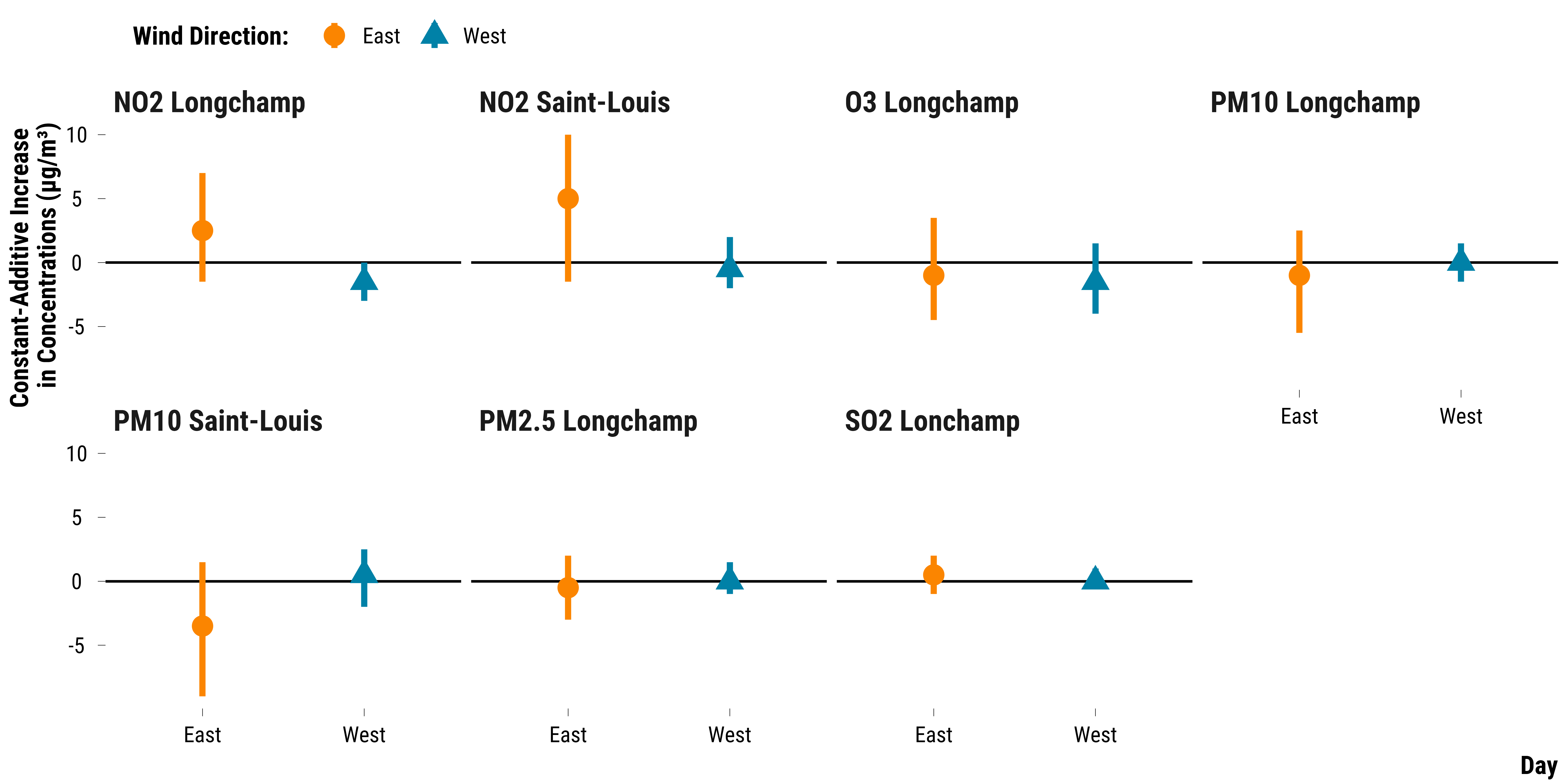
We display below the estimated effects by wind direction:
Please show me the code!
# prepare data on pair differences in concentration and wind direction
data_pair_difference_pollutant_0 <-
  data_pair_difference_pollutant %>%
  filter(time == 0)

data_pair_wd <- data_matched %>%
  select(pair_number, wind_direction_east_west) %>%
  distinct()

data_pair_difference_pollutant_0_wd <-
  left_join(data_pair_difference_pollutant_0, data_pair_wd, by = "pair_number") %>%
  select(-time, -pair_number)


# carry out the wilcox.test
data_rank_ci_wd <- data_pair_difference_pollutant_0_wd %>%
  group_by(pollutant, wind_direction_east_west) %>%
  nest() %>%
  mutate(
    effect = map(data, ~ wilcox.test(.$difference, conf.int = TRUE)$estimate),
    lower_ci = map(data, ~ wilcox.test(.$difference, conf.int = TRUE)$conf.int[1]),
    upper_ci = map(data, ~ wilcox.test(.$difference, conf.int = TRUE)$conf.int[2])
  ) %>%
  unnest(cols = c(effect, lower_ci, upper_ci)) %>%
  select(-data)


# make the graph
graph_wilcoxon_wd <-
  ggplot(
    data_rank_ci_wd,
    aes(
      x = wind_direction_east_west,
      y = effect,
      ymin = lower_ci,
      ymax = upper_ci,
      colour = wind_direction_east_west,
      shape = wind_direction_east_west
    )
  ) +
  geom_hline(yintercept = 0, color = "black") +
  geom_pointrange(position = position_dodge(width = 1), size = 1.2) +
  scale_shape_manual(name = "Wind Direction:", values = c(16, 17)) +
  scale_color_manual(name = "Wind Direction:", values = c(my_orange, my_blue)) +
  facet_wrap(~ pollutant, ncol = 4) +
  guides(fill = FALSE) +
  ylab("Constant-Additive Increase \nin Concentrations (µg/m³)") + xlab("Day") +
  theme_tufte()

# print the graph
graph_wilcoxon_wd
Please show me the code!
# save the graph
ggsave(
  graph_wilcoxon_wd,
  filename = here::here(
    "inputs",
    "3.outputs",
    "2.daily_analysis",
    "2.analysis_pollution",
    "1.cruise_experiment",
    "2.matching_results",
    "graph_wilcoxon_wd.pdf"
  ),
  width = 30,
  height = 15,
  units = "cm",
  device = cairo_pdf
)
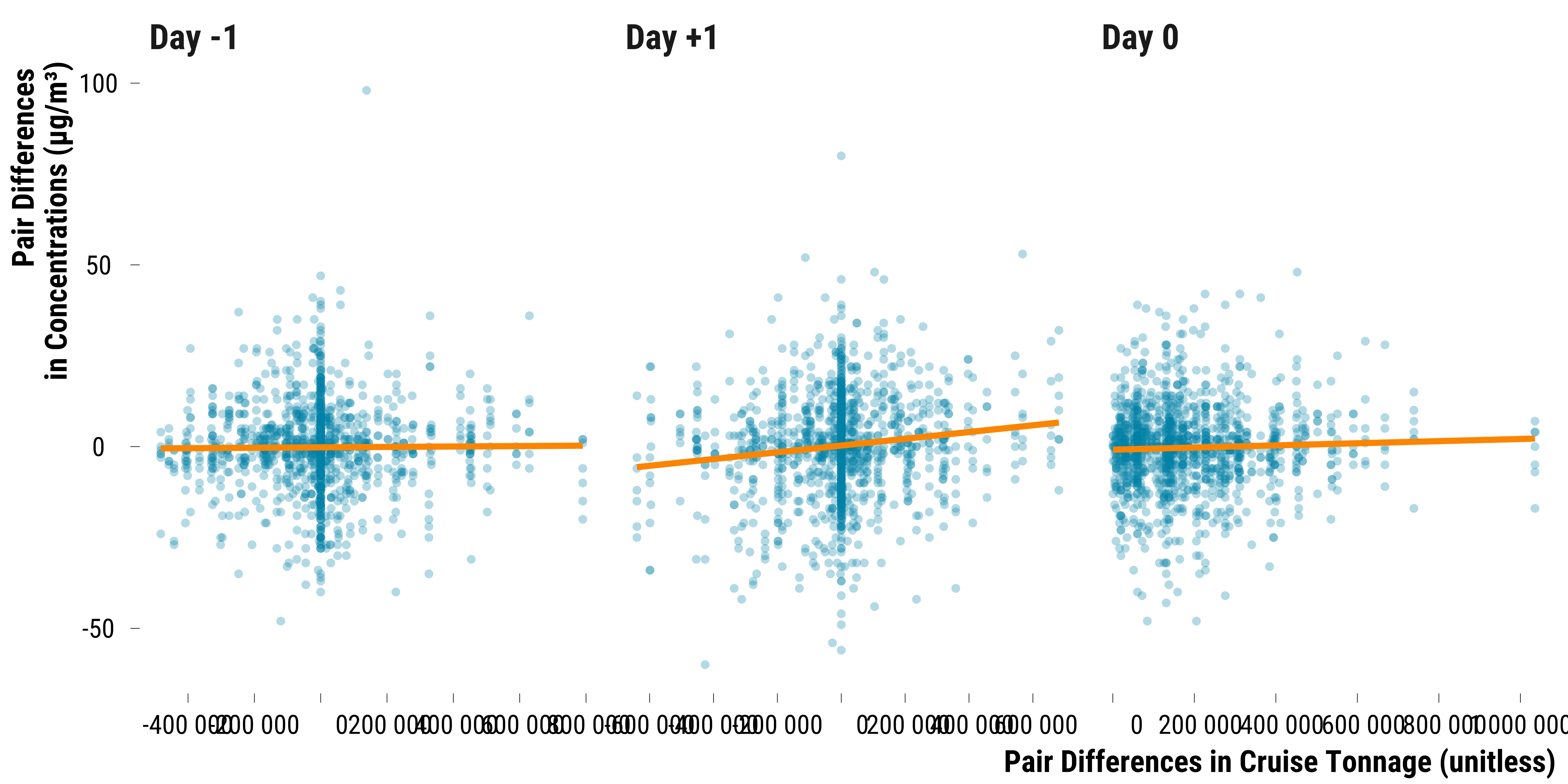
And the relationship between pair differences in pollutant concentrations and the difference in cruise tonnage:
Please show me the code!
# joint concentration differences with tonnage differences
data_pair_difference_pollutant <- data_pair_difference_pollutant %>%
  rename(difference_concentration = difference)

data_matched_wide_tonnage <- data_matched %>%
  mutate(is_treated = ifelse(is_treated == TRUE, "treated", "control")) %>%
  select(is_treated,
         pair_number,
         contains("total_gross_tonnage_cruise")) %>%
  pivot_longer(
    cols = -c(pair_number, is_treated),
    names_to = "variable",
    values_to = "tonnage"
  ) %>%
  mutate(time = 0 %>%
           ifelse(str_detect(variable, "lag_1"), -1, .) %>%
           ifelse(str_detect(variable, "lead_1"), 1, .)) %>%
  mutate(variable = "total_gross_tonnage_cruise") %>%
  select(pair_number, is_treated, variable, time, tonnage) %>%
  pivot_wider(names_from = is_treated, values_from = tonnage)

data_pair_difference_tonnage <- data_matched_wide_tonnage %>%
  mutate(difference_tonnage = treated - control) %>%
  select(-c(treated, control))

data_concentration_tonnage_pair <- left_join(
  data_pair_difference_pollutant,
  data_pair_difference_tonnage,
  by = c("pair_number", "time")
) %>%
  mutate(time = ifelse(time == 1, "+1", time),
         time = paste("Day", time, sep = " "))

# make the graph
graph_concentration_tonnage_pair <- data_concentration_tonnage_pair %>%
  ggplot(., aes(x =  difference_tonnage, y = difference_concentration)) +
  geom_point(shape = 16,
             colour = my_blue,
             alpha = 0.3) +
  geom_smooth(method = "lm",
              se = FALSE,
              colour = my_orange) +
  scale_x_continuous(
    breaks = scales::pretty_breaks(n = 8),
    labels = function(x)
      format(x, big.mark = " ", scientific = FALSE)
  ) +
  facet_wrap(~ time, scales = "free_x") +
  xlab("Pair Differences in Cruise Tonnage (unitless)") + ylab("Pair Differences \nin Concentrations (µg/m³)") +
  theme_tufte()

# print the graph
graph_concentration_tonnage_pair
Please show me the code!
# save the graph
ggsave(
  graph_concentration_tonnage_pair,
  filename = here::here(
    "inputs",
    "3.outputs",
    "2.daily_analysis",
    "2.analysis_pollution",
    "1.cruise_experiment",
    "2.matching_results",
    "graph_concentration_tonnage_pair.pdf"
  ),
  width = 35,
  height = 12,
  units = "cm",
  device = cairo_pdf
)
Alternative Matching Procedure
We implement below a propensity score matching procedure where:
- Each day with an heat wave is matched to the most similar day without heat wave. This is a 1:1 nearest neighbor matching without replacement.
- The distance metric used for the matching is the propensity score which is predicted using a logistic model where we regress the treatment indicator on a set of vessel traffic, weather and calendar variables. We choose a caliper equals to 0.01 of the standard deviation of the propensity scores.
- Once treated and control units are matched, we assess whether covariates balance has improved.
- We finally estimate the treatment effect.
First, we load the matching dataset:
# load matching data
data_matching <-
  readRDS(
    here::here(
      "inputs",
      "1.data",
      "2.daily_data",
      "2.data_for_analysis",
      "1.cruise_experiment",
      "matching_data.rds"
    )
  )


# select relevant covariates
data_matching <- data_matching %>%
  select(
    contains("mean_no2_l"),
    contains("mean_no2_sl"),
    contains("mean_pm10_l"),
    contains("mean_pm10_sl"),
    contains("mean_pm25_l"),
    contains("mean_so2_l"),
    contains("mean_o3_l"),
    is_treated,
    total_gross_tonnage_ferry,
    total_gross_tonnage_other_boat,
    total_gross_tonnage_ferry_lag_1,
    total_gross_tonnage_other_boat_lag_1,
    temperature_average,
    temperature_average_lag_1,
    humidity_average,
    humidity_average_lag_1,
    rainfall_height_dummy,
    rainfall_height_dummy_lag_1,
    wind_direction_east_west,
    wind_direction_east_west_lag_1,
    wind_speed,
    wind_speed_lag_1,
    weekday,
    holidays_dummy,
    bank_day_dummy,
    month,
    year
  ) %>%
  drop_na() %>%
  mutate(year = as.factor(year))
We first match each treated unit to its closest control unit using
the matchit() function and 0.01 caliper:
# match without caliper
matching_ps  <-
  matchit(
    is_treated ~ total_gross_tonnage_ferry + total_gross_tonnage_other_boat +
      total_gross_tonnage_ferry_lag_1 + total_gross_tonnage_other_boat_lag_1 +
      temperature_average + temperature_average_lag_1 +
      humidity_average + humidity_average_lag_1 +
      rainfall_height_dummy + rainfall_height_dummy_lag_1 +
      wind_direction_east_west + wind_direction_east_west_lag_1 +
      wind_speed + wind_speed_lag_1 +
      weekday + holidays_dummy + bank_day_dummy + month * year,
    caliper = 0.01,
    data = data_matching
  )

# display summary of the procedure
matching_ps
A matchit object
- method: 1:1 nearest neighbor matching without replacement
- distance: Propensity score [caliper]
- estimated with logistic regression
- caliper: <distance> (0.003)
- number of obs.: 4014 (original), 1846 (matched)
- target estimand: ATT
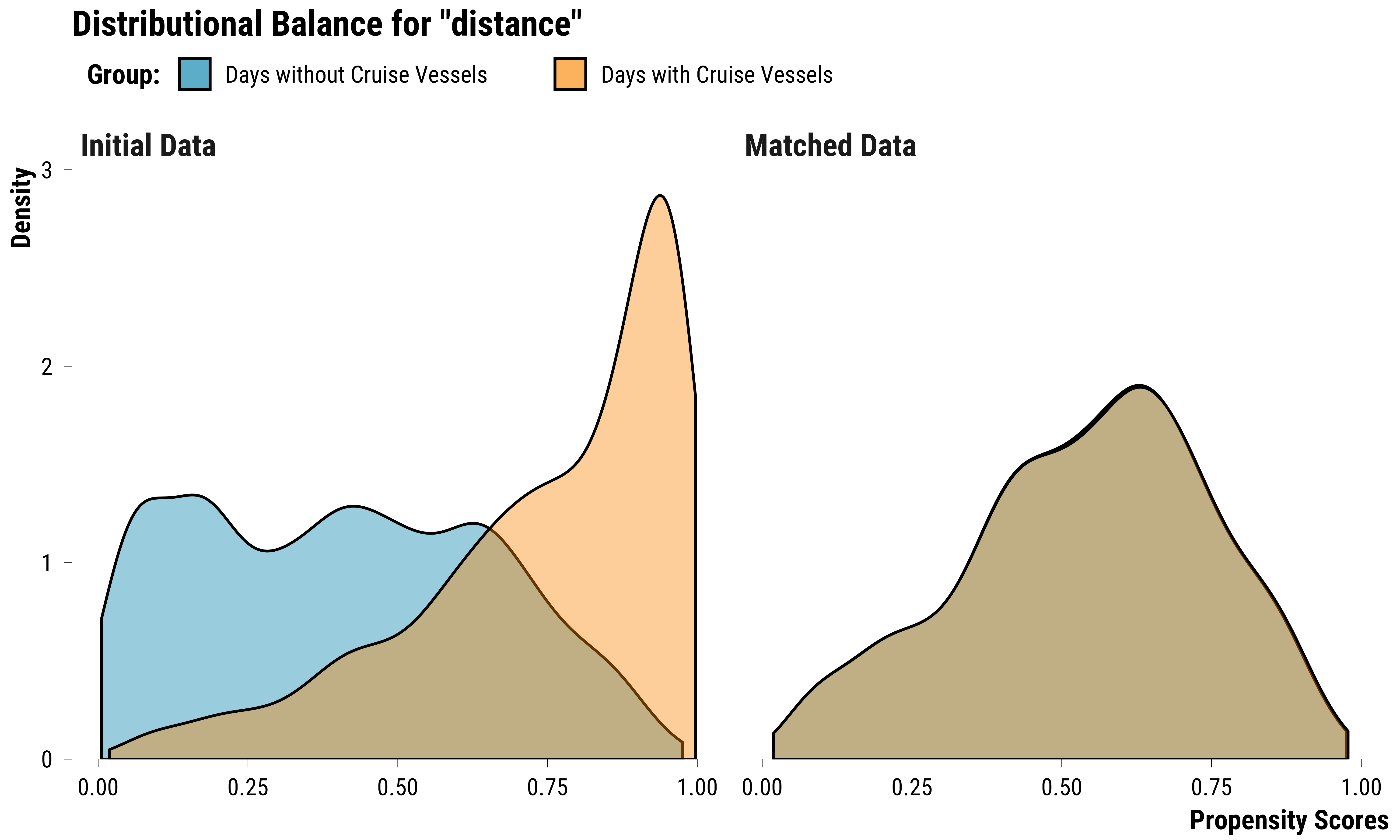
- covariates: total_gross_tonnage_ferry, total_gross_tonnage_other_boat, total_gross_tonnage_ferry_lag_1, total_gross_tonnage_other_boat_lag_1, temperature_average, temperature_average_lag_1, humidity_average, humidity_average_lag_1, rainfall_height_dummy, rainfall_height_dummy_lag_1, wind_direction_east_west, wind_direction_east_west_lag_1, wind_speed, wind_speed_lag_1, weekday, holidays_dummy, bank_day_dummy, month, yearThe output of the matching procedure indicates us the method (1:1 nearest neighbor matching without replacement) and the distance (propensity score) we used. It also tells that out of the 2484 units, 1846 were matched to similar controls. We assess how covariates balance has improved by comparing the distribution of propensity scores before and after matching:
Please show me the code!
# distribution of propensity scores
graph_propensity_score <- bal.plot(
  matching_ps,
  var.name = "distance",
  which = "both",
  sample.names = c("Initial Data", "Matched Data"),
  type = "density") +
  xlab("Propensity Scores") +
  scale_fill_manual(
    name = "Group:",
    values = c(my_blue, my_orange),
    labels = c("Days without Cruise Vessels", "Days with Cruise Vessels")
  ) +
  theme_tufte()

# display the graph
graph_propensity_score
Please show me the code!
# save the graph
ggsave(
  graph_propensity_score,
  filename = here::here(
    "inputs",
    "3.outputs",
    "2.daily_analysis",
    "2.analysis_pollution",
    "1.cruise_experiment",
    "2.matching_results",
    "graph_propensity_score.pdf"
  ),
  width = 16,
  height = 10,
  units = "cm",
  device = cairo_pdf
)
We see on this graph that propensity scores distribution for the two
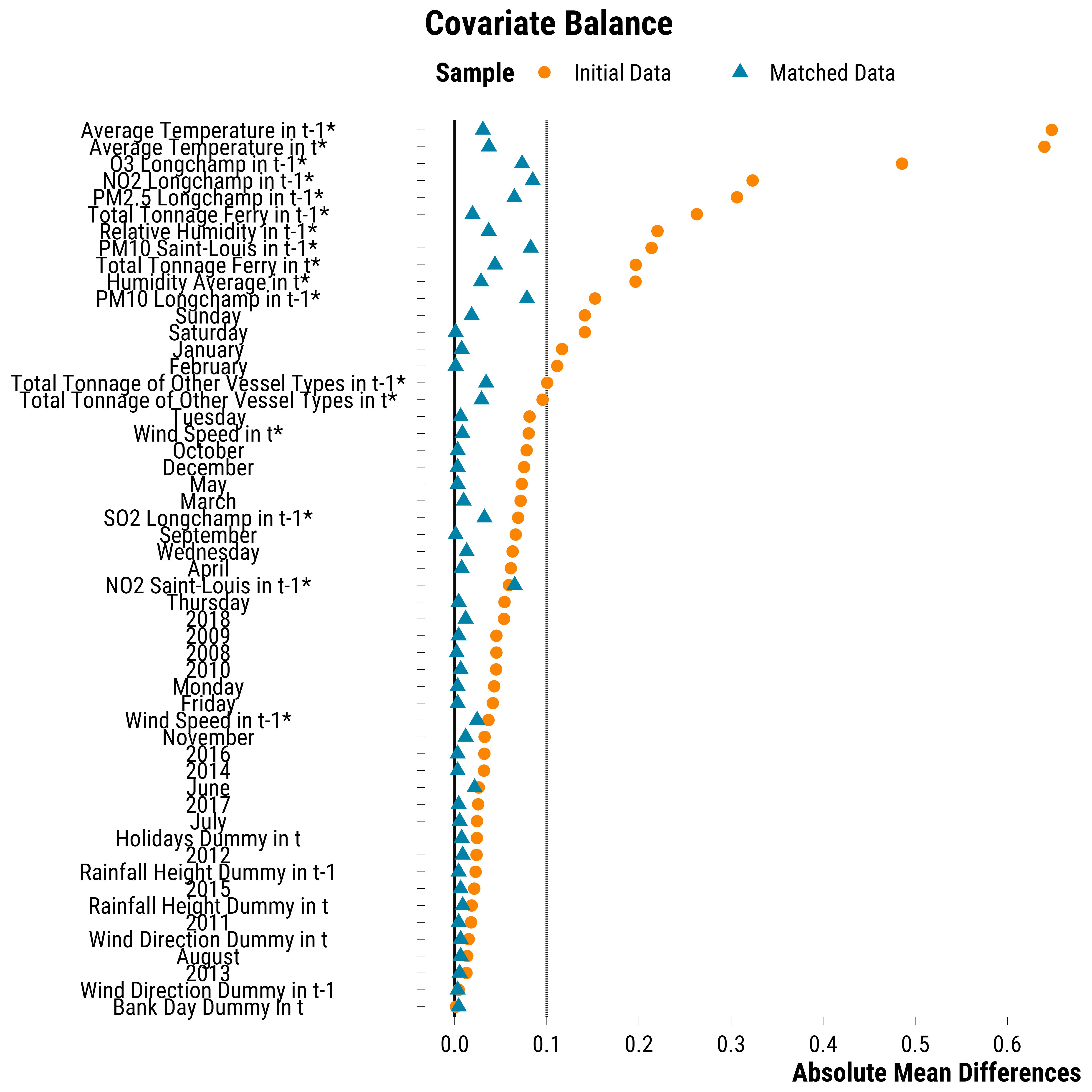
groups perfectly overlap after matching. We can also evaluate the
covariates balance using the love.plot() function from the
cobalt package and the absolute mean difference as the summary
statistic. For binary variables, the absolute difference in proportion
is computed. For continuous covariates, denoted with a star, the
absolute standardized mean difference is computed (the difference is
divided by the standard deviation of the variable for treated units
before matching).
Please show me the code!
# first we nicely label covariates
cov_labels <- c(
  bank_day_dummy = "Bank Day Dummy in t",
  wind_direction_east_west_lag_1_West = "Wind Direction Dummy in t-1",
  year_2013 = "2013",
  month_August = "August" ,
  wind_direction_east_west_West = "Wind Direction Dummy in t",
  year_2011 = "2011",
  rainfall_height_dummy = "Rainfall Height Dummy in t",
  year_2015 = "2015",
  rainfall_height_dummy_lag_1 = "Rainfall Height Dummy in t-1",
  year_2012 = "2012",
  holidays_dummy = "Holidays Dummy in t",
  month_July = "July",
  year_2017 = "2017",
  month_June = "June",
   year_2014 = "2014",
  year_2016 = "2016",
  month_November = "November",
  wind_speed_lag_1 = "Wind Speed in t-1*",
  weekday_Friday = "Friday",
  weekday_Monday = "Monday",
  year_2010 = "2010",
  year_2008 = "2008",
  year_2009 = "2009",
  year_2018 = "2018",
  weekday_Thursday = "Thursday",
  mean_no2_sl_lag_1 = "NO2 Saint-Louis in t-1*",
  month_April = "April",
  weekday_Wednesday = "Wednesday",
  month_September = "September" ,
  mean_so2_l_lag_1 = "SO2 Longchamp in t-1*",
  month_March = "March",
  month_May = "May",
  month_December = "December",
  month_October = "October",
  wind_speed = "Wind Speed in t*",
  weekday_Tuesday = "Tuesday",
  total_gross_tonnage_other_boat = "Total Tonnage of Other Vessel Types in t*",
  total_gross_tonnage_other_boat_lag_1 = "Total Tonnage of Other Vessel Types in t-1*",
  month_February = "February",
  month_January = "January",
  weekday_Saturday = "Saturday",
  weekday_Sunday = "Sunday",
  mean_pm10_l_lag_1 = "PM10 Longchamp in t-1*",
  humidity_average = "Humidity Average in t*",
  total_gross_tonnage_ferry = "Total Tonnage Ferry in t*",
  mean_pm10_sl_lag_1 = "PM10 Saint-Louis in t-1*",
  humidity_average = "Relative Humidity in t*",
  mean_pm10_sl_lag_1 = "PM10 Saint-Louis in t-1*",
  humidity_average_lag_1 = "Relative Humidity in t-1*",
  total_gross_tonnage_ferry_lag_1 = "Total Tonnage Ferry in t-1*",
  mean_pm25_l_lag_1 = "PM2.5 Longchamp in t-1*",
  mean_no2_l_lag_1 = "NO2 Longchamp in t-1*",
  mean_o3_l_lag_1 = "O3 Longchamp in t-1*",
  temperature_average = "Average Temperature in t*",
  temperature_average_lag_1 = "Average Temperature in t-1*"
)


# make the love plot
graph_love_plot_ps <- love.plot(
  is_treated ~ total_gross_tonnage_ferry + total_gross_tonnage_other_boat +
    total_gross_tonnage_ferry_lag_1 + total_gross_tonnage_other_boat_lag_1 +
    mean_no2_l_lag_1 + mean_no2_sl_lag_1 + mean_pm10_l_lag_1 + mean_pm10_sl_lag_1 +
    mean_pm25_l_lag_1 + mean_so2_l_lag_1 + mean_o3_l_lag_1 +
    temperature_average + temperature_average_lag_1 +
    humidity_average + humidity_average_lag_1 +
    rainfall_height_dummy + rainfall_height_dummy_lag_1 +
    wind_direction_east_west + wind_direction_east_west_lag_1 +
    wind_speed + wind_speed_lag_1 +
    weekday + holidays_dummy + bank_day_dummy + month + year,
  data = data_matching,
  weights = matching_ps,
  drop.distance = TRUE,
  abs = TRUE,
  var.order = "unadjusted",
  binary = "raw",
  s.d.denom = "treated",
  thresholds = c(m = .1),
  var.names = cov_labels,
  sample.names = c("Initial Data", "Matched Data"),
  shapes = c("circle", "triangle"),
  colors = c(my_orange, my_blue),
  #stars = "std"
) +
  scale_x_continuous(breaks = scales::pretty_breaks(n = 10)) +
  xlab("Absolute Mean Differences") +
  theme_tufte()

# display the graph
graph_love_plot_ps
Please show me the code!
# save the graph
ggsave(
  graph_love_plot_ps + labs(title = NULL),
  filename = here::here(
    "inputs",
    "3.outputs",
    "2.daily_analysis",
    "2.analysis_pollution",
    "1.cruise_experiment",
    "2.matching_results",
    "graph_love_plot_ps.pdf"
  ),
  width = 20,
  height = 15,
  units = "cm",
  device = cairo_pdf
)
We display below the evolution of the average of standardized mean differences for continuous covariates:
Please show me the code!
| Sample | Average of Standardized Mean Differences | Std. Deviation |
|---|---|---|
| Initial Data | 0.24 | 0.19 |
| Matched Data | 0.05 | 0.02 |
We also display below the evolution of the difference in proportions for binary covariates:
Please show me the code!
| Sample | Average of Proportion Differences | Std. Deviation |
|---|---|---|
| Initial Data | 0.05 | 0.04 |
| Matched Data | 0.01 | 0.00 |
Overall, for both types of covariates, the balance has clearly improved after matching. We can also as the overall balance using the randomization inference approach proposed by Zach Branson (2021). We retrieve the matched dataset:
# we retrieve the matched data
data_ps <- match.data(matching_ps)
And implement the balance check:
# we select covariates
data_covs <- data_ps %>%
  select(
    is_treated:year,
    subclass,
    contains("lag_1")
  )

# recode some variables
data_covs <- data_covs %>%
  mutate(is_treated = ifelse(is_treated == TRUE, 1, 0)) %>%
  mutate_at(
    vars(wind_direction_east_west , wind_direction_east_west_lag_1),
    ~ ifelse(. == "West", 1, 0)
  ) %>%
  fastDummies::dummy_cols(., select_columns = c("year", "month", "weekday")) %>%
  select(-c("year", "month", "weekday"))

# format data for asIfRandPlot() function
subclass <- as.numeric(data_covs$subclass)
is_treated <- data_covs$is_treated

data_covs <- data_covs %>%
  select(-subclass,-is_treated) %>%
  select(-year_2018, - month_December, -weekday_Sunday)

# run balance check
asIfRandPlot(
  X.matched = data_covs,
  indicator.matched = is_treated,
  assignment = c("complete", "blocked"),
  subclass = subclass,
  perms = 1000
)

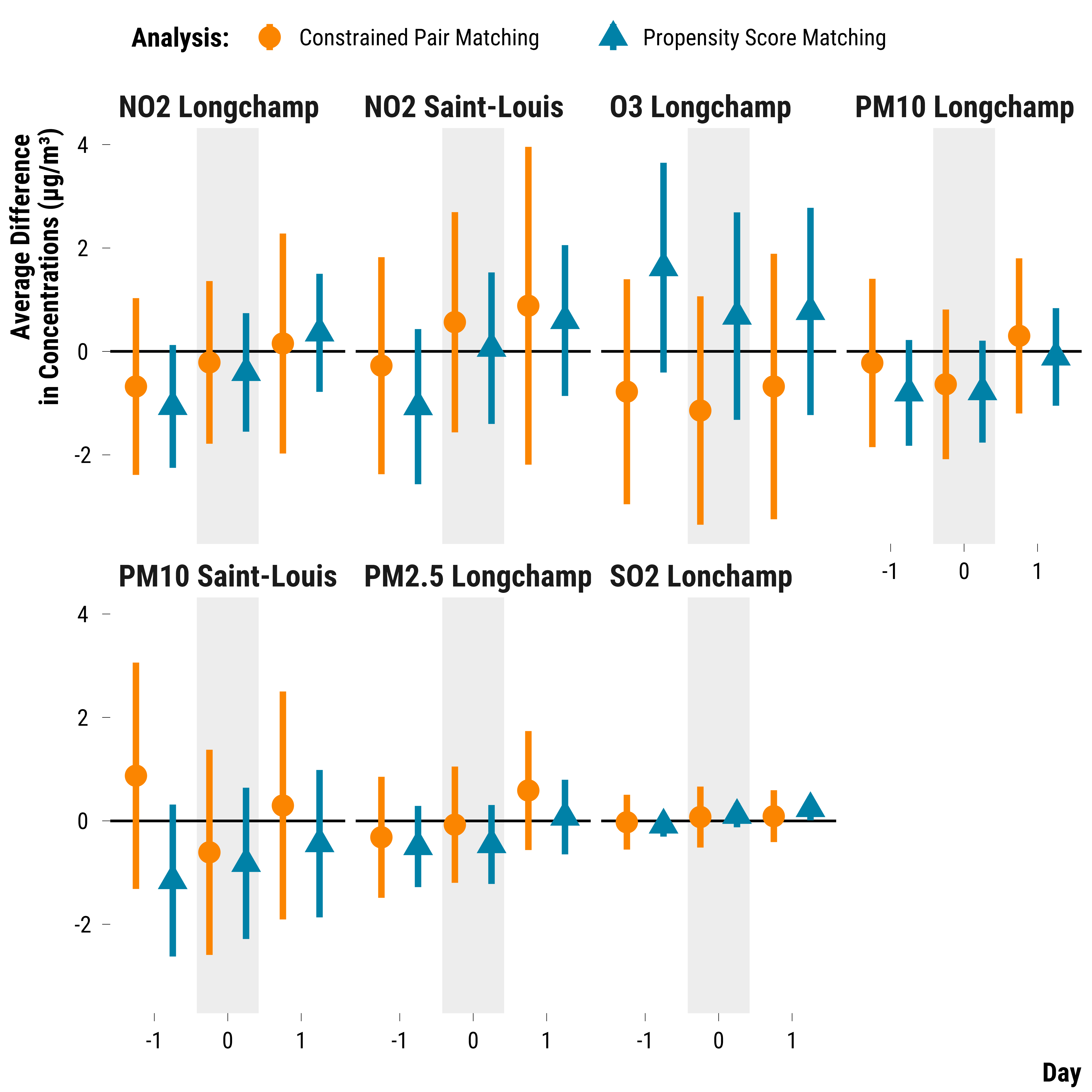
We finally move to the analysis of the matched dataset using a simple regression model where we regress the concentration of an air pollutant on the treatment indicator.
Please show me the code!
function_ps_analysis <- function(data) {

  # we fit the regression model
  model_ps <- lm(concentration ~ is_treated,
                 data = data,
                 weights = weights)

  # retrieve the estimate and 95% ci
  results_ps <- tidy(coeftest(model_ps,
                              vcov. = vcovCL,
                              cluster = ~ subclass),
                     conf.int = TRUE) %>%
    filter(term == "is_treatedTRUE") %>%
    select(term, estimate, conf.low, conf.high)

  # return output
  return(results_ps)
}


# reshape in long according to pollutants
data_ps_analysis <- data_ps %>%
  pivot_longer(cols = c(contains("no2"), contains("o3"), contains("pm10"), contains("pm25"), contains("so2")), names_to = "variable", values_to = "concentration") %>%
  mutate(pollutant = NA %>%
           ifelse(str_detect(variable, "no2_l"), "NO2 Longchamp",.) %>%
           ifelse(str_detect(variable, "no2_sl"), "NO2 Saint-Louis",.) %>%
           ifelse(str_detect(variable, "o3"), "O3 Longchamp",.) %>%
           ifelse(str_detect(variable, "pm10_l"), "PM10 Longchamp",.) %>%
           ifelse(str_detect(variable, "pm10_sl"), "PM10 Saint-Louis",.) %>%
           ifelse(str_detect(variable, "pm25"), "PM2.5 Longchamp",.) %>%
           ifelse(str_detect(variable, "so2"), "SO2 Lonchamp",.)) %>%
  mutate(time = 0 %>%
           ifelse(str_detect(variable, "lag_1"), -1, .) %>%
           ifelse(str_detect(variable, "lead_1"), 1, .)) %>%
  select(-variable)

# we nest the data by pollutant and time
data_ps_analysis <- data_ps_analysis %>%
  group_by(pollutant, time) %>%
  nest()

# we run the analysis
data_ps_analysis <- data_ps_analysis %>%
  mutate(result = map(data, ~ function_ps_analysis(.))) %>%
  select(-data) %>%
  unnest() %>%
  select(-term) %>%
  rename("mean_difference" = "estimate", "ci_lower_95" = "conf.low", "ci_upper_95" = "conf.high") %>%
  mutate(analysis = "Propensity Score Matching")

# we combine the results with the ones
# obtained with neyman's approach
data_neyman <- data_neyman %>%
  mutate(analysis = "Constrained Pair Matching")

data_neyman_ps <- bind_rows(data_neyman, data_ps_analysis)

# create an indicator to alternate shading of confidence intervals
data_neyman_ps <- data_neyman_ps %>%
  arrange(pollutant, time) %>%
  mutate(stripe = ifelse((time %% 2) == 0, "Grey", "White")) %>%
  ungroup()

# make the graph
graph_ps_analysis <-
  ggplot(
    data_neyman_ps,
    aes(
      x = as.factor(time),
      y = mean_difference,
      ymin = ci_lower_95,
      ymax = ci_upper_95,
      colour = analysis,
      shape = analysis
    )
  ) +
  geom_rect(
    aes(fill = stripe),
    xmin = as.numeric(as.factor(data_neyman_ps$time)) - 0.42,
    xmax = as.numeric(as.factor(data_neyman_ps$time)) + 0.42,
    ymin = -Inf,
    ymax = Inf,
    color = NA,
    alpha = 0.4
  ) +
  geom_hline(yintercept = 0, color = "black") +
  geom_pointrange(position = position_dodge(width = 1), size = 1.2) +
  scale_shape_manual(name = "Analysis:", values = c(16, 17)) +
  scale_color_manual(name = "Analysis:", values = c(my_orange, my_blue)) +
  facet_wrap( ~ pollutant, ncol = 4) +
  scale_fill_manual(values = c('grey90', "white")) +
  guides(fill = FALSE) +
  ylab("Average Difference \nin Concentrations (µg/m³)") + xlab("Day") +
  theme_tufte()

# display the graph
graph_ps_analysis
Please show me the code!
# save the graph
ggsave(
  graph_ps_analysis + labs(title = NULL),
  filename = here::here(
    "inputs",
    "3.outputs",
    "2.daily_analysis",
    "2.analysis_pollution",
    "1.cruise_experiment",
    "2.matching_results",
    "graph_ps_analysis.pdf"
  ),
  width = 30,
  height = 15,
  units = "cm",
  device = cairo_pdf
)