In this document
Should you have any questions, need help to reproduce the analysis or find coding errors, please do not hesitate to contact us at leo.zabrocki@gmail.com and marion.leroutier@hhs.se.
Required Packages
We load the following packages:
# load required packages
library(knitr) # for creating the R Markdown document
library(here) # for files paths organization
library(tidyverse) # for data manipulation and visualization
library(broom) # for cleaning regression outputs
library(kableExtra) # for table formatting
library(Cairo) # for printing custom police of graphs
We also load our custom ggplot2 theme for graphs:
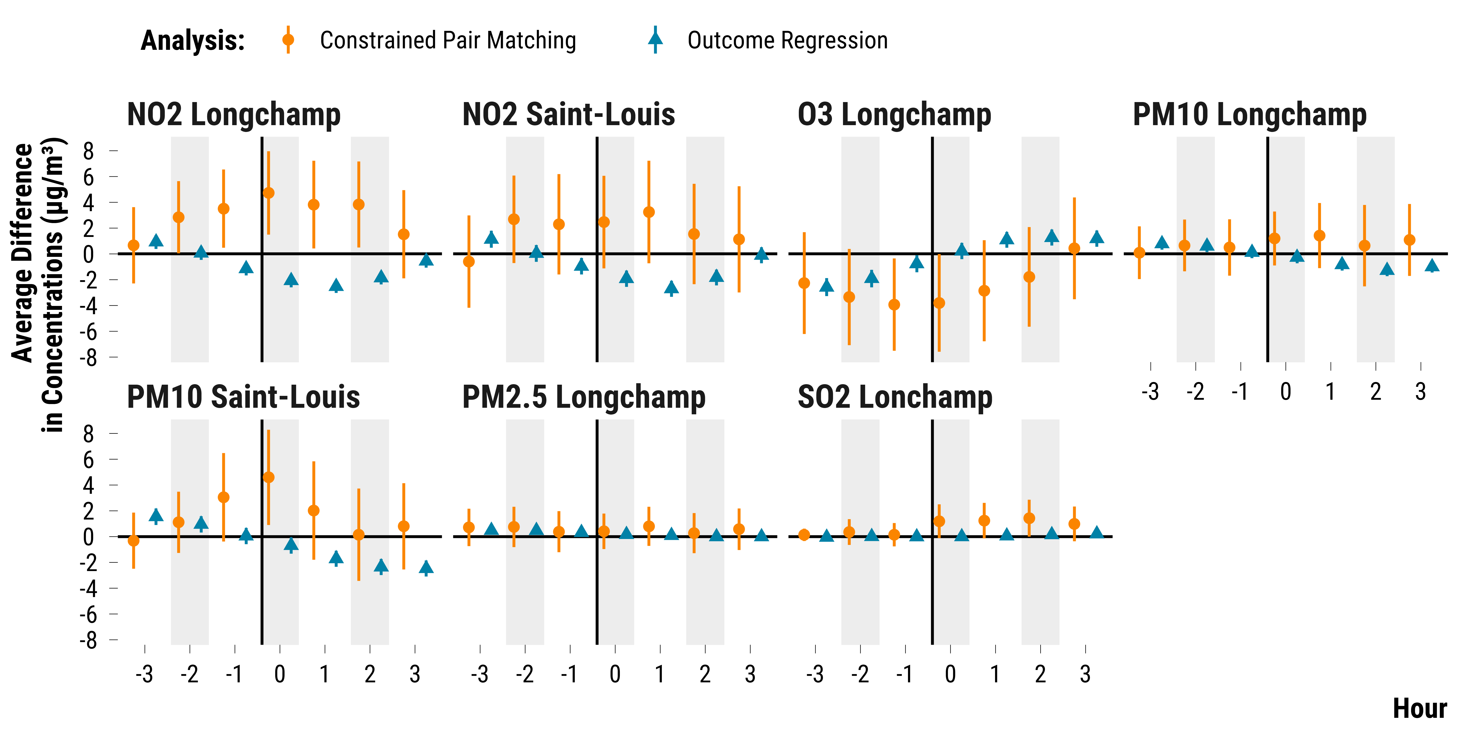
Finally, we ran a simple time-stratified regression model on the
matching data to see how the results differ with those found in our
matched data analysis. We only adjust for calendar indicator and weather
covariates measured at time t. Again, we ran this procedure on an Amazon
Web Services virtual computer (EC2 t3.2xlarge). The code we used is in
the script script_aws_regression_matching_data.R located in
the 1.experiment_entry_cruise/script_aws folder. It
takes several minutes to run.
We load the outputs of the regression model and plot the 95% confidence intervals:
Please show me the code!
# load regression outputs
data_reg_analysis <- readRDS(
  here::here(
    "inputs",
    "1.data",
    "1.hourly_data",
    "2.data_for_analysis",
    "1.matched_data",
    "data_matching_regression.rds"
  )
) %>%
  # compute 95% confidence intervals using the standard error
  mutate(ci_lower_95 = estimate - 1.96 * std.error,
         ci_upper_95 = estimate + 1.96 * std.error) %>%
  select(-std.error) %>%
  mutate(analysis = "Outcome Regression") %>%
  rename(mean_difference = estimate)

data_neyman <- readRDS(
  here::here(
    "inputs",
    "1.data",
    "1.hourly_data",
    "2.data_for_analysis",
    "1.matched_data",
    "data_neyman.rds"
  )
)

data_neyman <- data_neyman %>%
  mutate(analysis = "Constrained Pair Matching")

data_neyman_reg <- bind_rows(data_neyman, data_reg_analysis)

# make the graph

# create an indicator to alternate shading of confidence intervals
data_neyman_reg <- data_neyman_reg %>%
  arrange(pollutant, time) %>%
  mutate(stripe = ifelse((time %% 2) == 0, "Grey", "White")) %>%
  ungroup()

# make the graph
graph_reg_analysis <-
  ggplot(
    data_neyman_reg,
    aes(
      x = as.factor(time),
      y = mean_difference,
      ymin = ci_lower_95,
      ymax = ci_upper_95,
      colour = analysis,
      shape = analysis
    )
  ) +
  geom_rect(
    aes(fill = stripe),
    xmin = as.numeric(as.factor(data_neyman_reg$time)) - 0.42,
    xmax = as.numeric(as.factor(data_neyman_reg$time)) + 0.42,
    ymin = -Inf,
    ymax = Inf,
    color = NA,
    alpha = 0.4
  ) +
  geom_hline(yintercept = 0, color = "black") +
  geom_vline(xintercept = c(3.6), color = "black") +
  geom_pointrange(position = position_dodge(width = 1)) +
  scale_shape_manual(name = "Analysis:", values = c(16, 17)) +
  scale_color_manual(name = "Analysis:", values = c(my_orange, my_blue)) +
  scale_y_continuous(breaks = scales::pretty_breaks(n = 10)) +
  facet_wrap( ~ pollutant, ncol = 4) +
  scale_fill_manual(values = c('grey90', "white")) +
  guides(fill = FALSE) +
  ylab("Average Difference \nin Concentrations (µg/m³)") + xlab("Hour") +
  theme_tufte()

# display the graph
graph_reg_analysis

Please show me the code!
# save the graph
ggsave(
  graph_reg_analysis + labs(title = NULL),
  filename = here::here(
    "inputs",
    "3.outputs",
    "1.hourly_analysis",
    "2.experiment_cruise",
    "2.matching_results",
    "graph_matching_regression.pdf"
  ),
  width = 30,
  height = 15,
  units = "cm",
  device = cairo_pdf
)
And we display below the point estimates with the 95% confidence intervals:
Please show me the code!
data_reg_analysis %>%
  select(pollutant, time, mean_difference, ci_lower_95, ci_upper_95) %>%
  mutate_at(vars(mean_difference:ci_upper_95), ~ round(., 1)) %>%
  rename(
    "Pollutant" = pollutant,
    "Time" = time,
    "Point Estimate" = mean_difference,
    "Lower Bound of the 95% Confidence Interval" = ci_lower_95,
    "Upper Bound of the 95% Confidence Interval" = ci_upper_95
  ) %>%
  rmarkdown::paged_table(.)