In this document, we take great care providing all steps and R codes required to check whether our matching procedure allowed to improve covariates balance. We compare days where:
- treated units are days with positive cruise traffic in t.
- control units are days without cruise traffic in t.
We adjust for calendar calendar indicator and weather confounding factors.
Should you have any questions, need help to reproduce the analysis or find coding errors, please do not hesitate to contact us at leo.zabrocki@gmail.com and marion.leroutier@hhs.se.
Required Packages
We load the following packages:
# load required packages
library(knitr) # for creating the R Markdown document
library(here) # for files paths organization
library(tidyverse) # for data manipulation and visualization
library(dtplyr) # to speed up to dplyr
library(randChecks) # for randomization check
library(ggridges) # for ridge density plots
library(Cairo) # for printing custom police of graphs
library(patchwork) # combining plots
library(kableExtra) # for table formatting
We finally load our custom ggplot2 theme for graphs:
Preparing the Data
We load the initial and matched data and bind them together:
# load matching data
data_matching <-
  readRDS(
    here::here(
      "inputs",
      "1.data",
      "2.daily_data",
      "2.data_for_analysis",
      "1.cruise_experiment",
      "matching_data.rds"
    )
  ) %>%
  mutate(dataset = "Initial Data")

# load matched data
data_matched <-
  readRDS(
    here::here(
      "inputs",
      "1.data",
      "2.daily_data",
      "2.data_for_analysis",
      "1.cruise_experiment",
      "matched_data.rds"
    )
  ) %>%
  mutate(dataset = "Matched Data")

# bind the two datasets
data <- bind_rows(data_matching, data_matched)
We change labels of the is_treated variable :
data <- data %>%
  mutate(is_treated = ifelse(is_treated == "TRUE", "True", "False"))
Love Plots
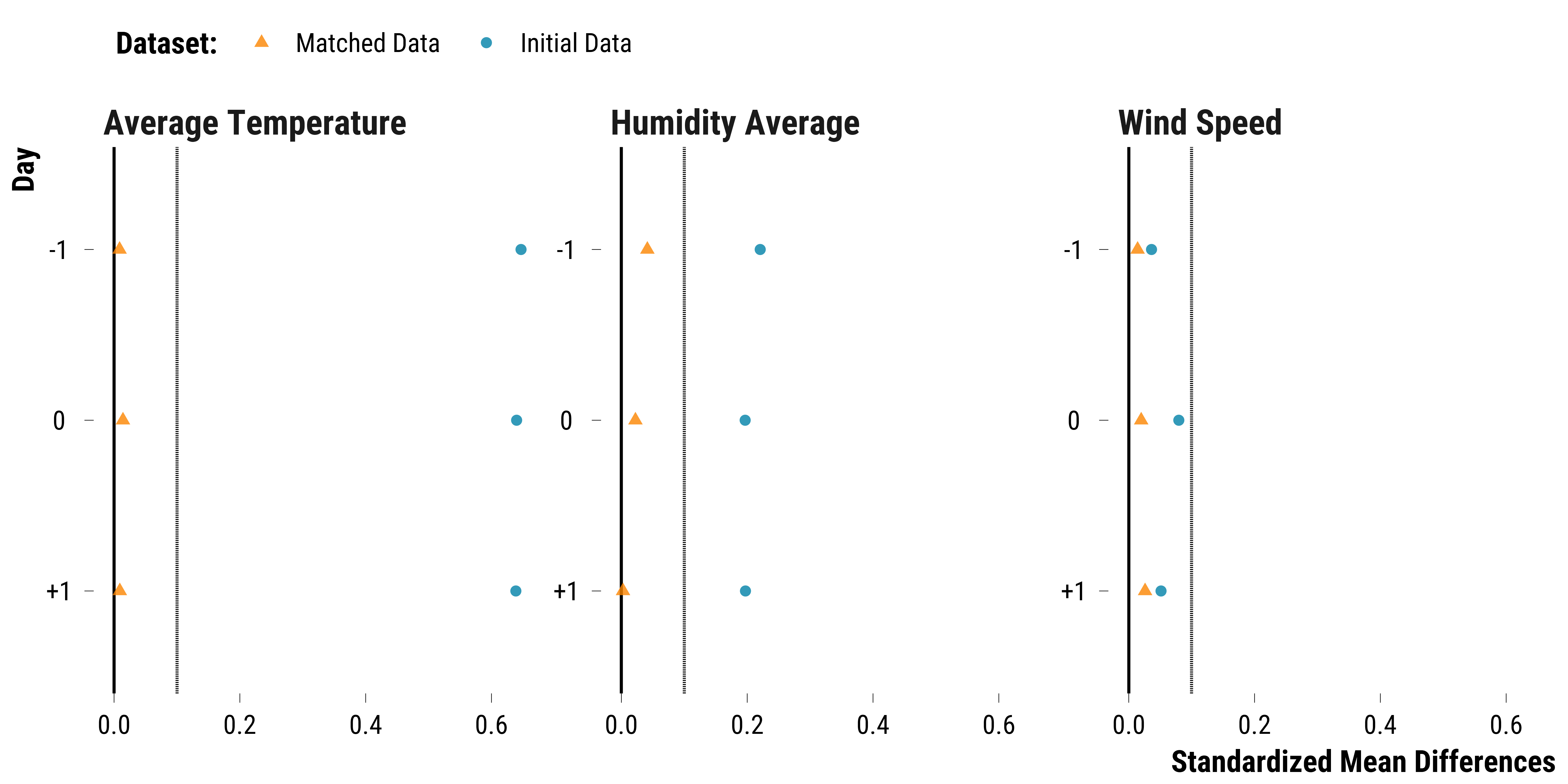
Continuous Weather Covariates
Please show me the code!
# compute figures for the love plot
data_weather_continuous <- data %>%
  dplyr::select(
    dataset,
    is_treated,
    contains("temperature"),
    contains("humidity"),
    contains("wind_speed")
  ) %>%
  pivot_longer(
    cols = -c(is_treated, dataset),
    names_to = "variable",
    values_to = "values"
  ) %>%
  mutate(
    weather_variable = NA %>%
      ifelse(
        str_detect(variable, "temperature_average"),
        "Average Temperature",
        .
      ) %>%
      ifelse(
        str_detect(variable, "humidity_average"),
        "Humidity Average",
        .
      ) %>%
      ifelse(str_detect(variable, "wind_speed"), "Wind Speed", .)
  ) %>%
  mutate(time = "0" %>%
           ifelse(str_detect(variable, "lag_1"), "-1", .) %>%
           ifelse(str_detect(variable, "lead_1"), "+1", .)) %>%
  mutate(time = fct_relevel(time, "-1", "0", "+1")) %>%
  dplyr::select(dataset, is_treated, weather_variable, time, values)

data_abs_difference_continuous_weather <-
  data_weather_continuous %>%
  group_by(dataset, weather_variable, time, is_treated) %>%
  summarise(mean_values = mean(values, na.rm = TRUE)) %>%
  summarise(abs_difference = abs(mean_values[2] - mean_values[1]))

data_sd_weather_continuous <-  data_weather_continuous %>%
  filter(dataset == "Initial Data" & is_treated == "True") %>%
  group_by(weather_variable, time, is_treated) %>%
  summarise(sd_treatment = sd(values, na.rm = TRUE)) %>%
  ungroup() %>%
  select(weather_variable, time, sd_treatment)

data_love_continuous_weather <-
  left_join(
    data_abs_difference_continuous_weather,
    data_sd_weather_continuous,
    by = c("weather_variable", "time")
  ) %>%
  mutate(standardized_difference = abs_difference / sd_treatment) %>%
  select(-c(abs_difference, sd_treatment))

# make the graph
graph_love_plot_continuous_weather <-
  ggplot(
    data_love_continuous_weather,
    aes(
      y = fct_rev(time),
      x = standardized_difference,
      colour = fct_rev(dataset),
      shape = fct_rev(dataset)
    )
  ) +
  geom_vline(xintercept = 0) +
  geom_vline(xintercept = 0.1,
             color = "black",
             linetype = "dashed") +
  geom_point(size = 2, alpha = 0.8) +
  scale_colour_manual(name = "Dataset:", values = c(my_orange, my_blue)) +
  scale_shape_manual(name = "Dataset:", values = c(17, 16)) +
  facet_wrap( ~ weather_variable, scales = "free_y") +
  xlab("Standardized Mean Differences") +
  ylab("Day") +
  theme_tufte()

# plot the graph
graph_love_plot_continuous_weather
Please show me the code!
# save the graph
ggsave(
  graph_love_plot_continuous_weather,
  filename = here::here(
    "inputs",
    "3.outputs",
    "2.daily_analysis",
    "2.analysis_pollution",
    "1.cruise_experiment",
    "1.checking_matching_procedure",
    "graph_love_plot_continuous_weather.pdf"
  ),
  width = 20,
  height = 10,
  units = "cm",
  device = cairo_pdf
)
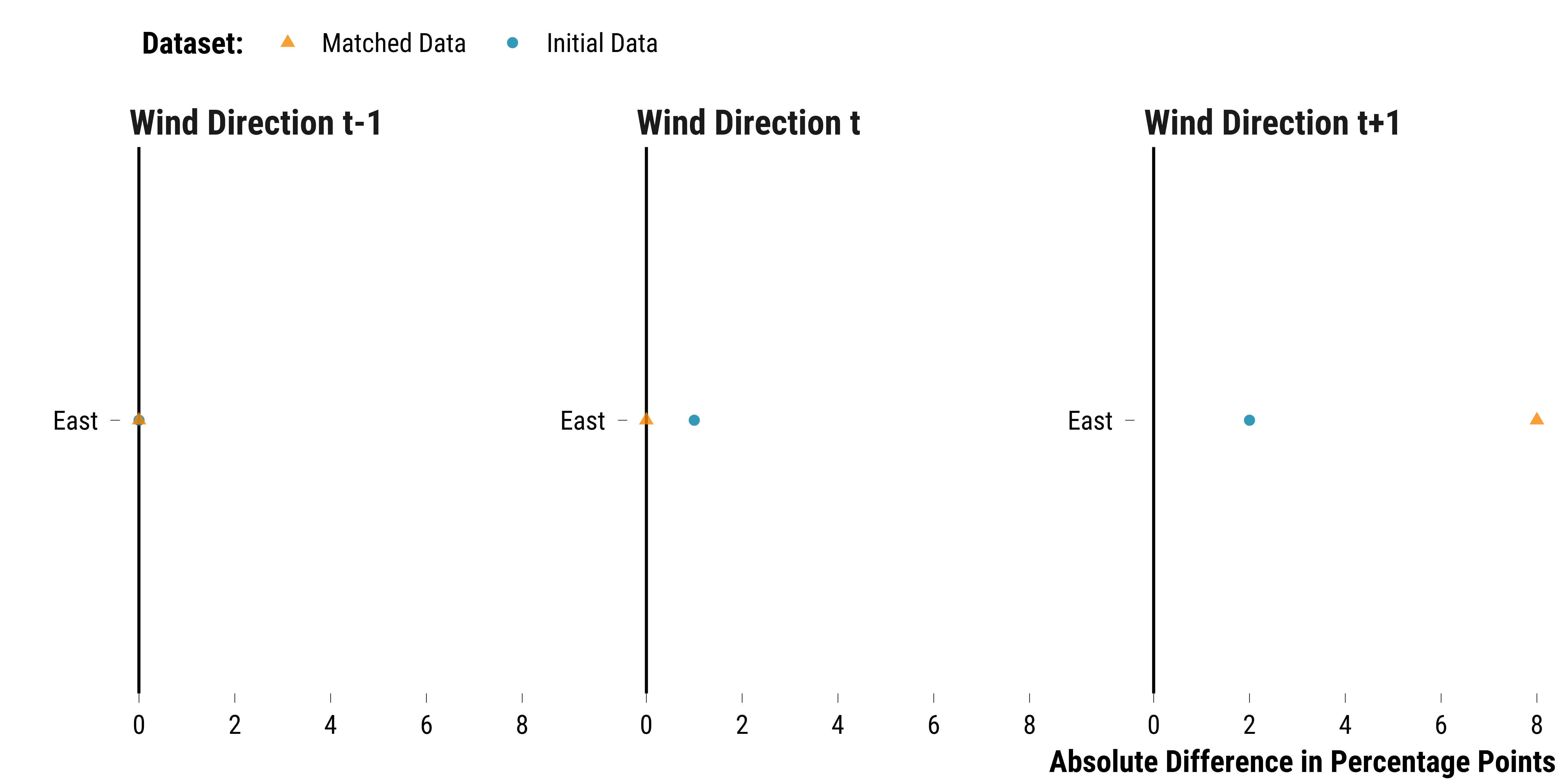
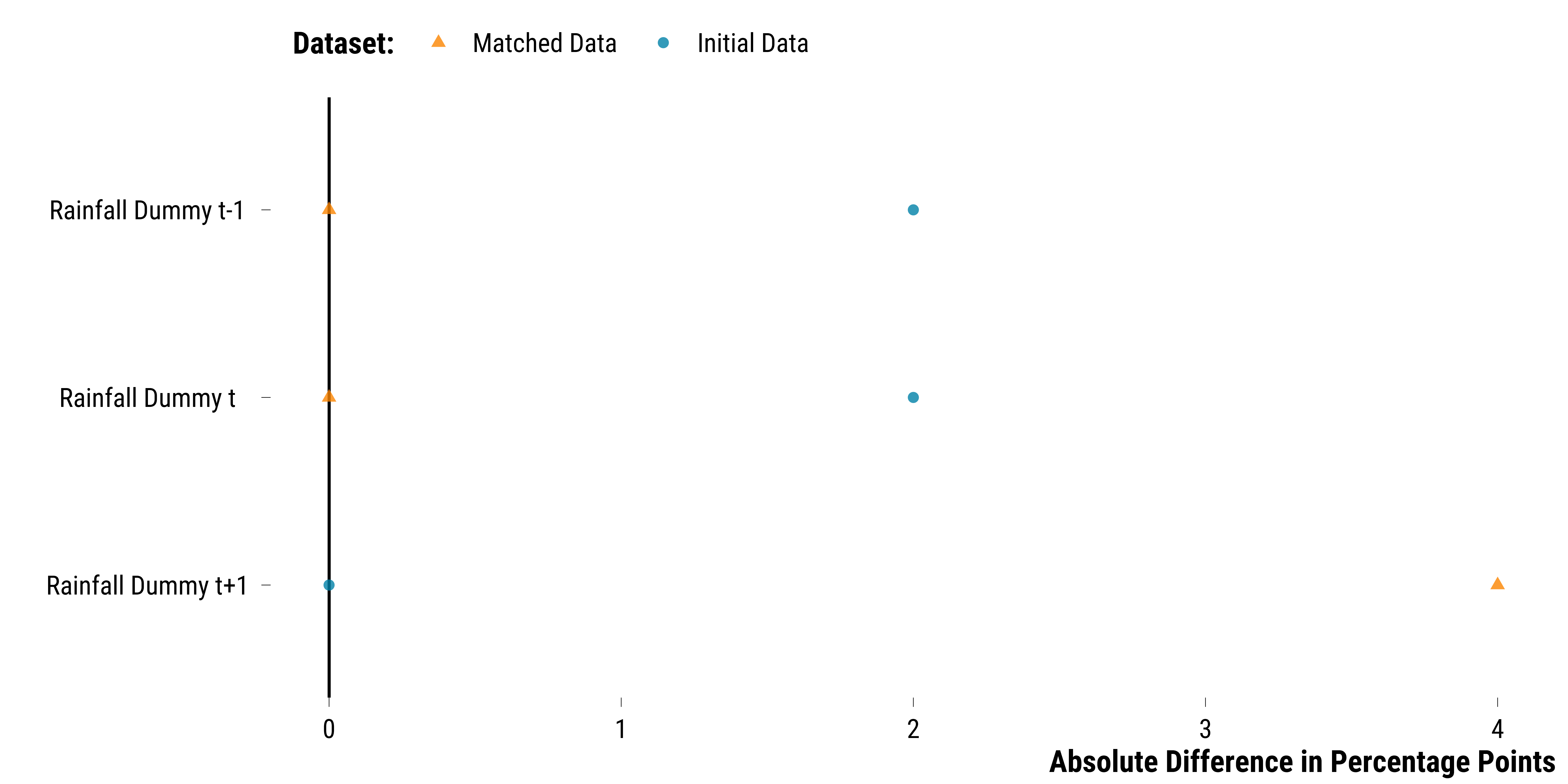
Categorical Weather Covariates
Please show me the code!
# compute figures for the love plot
data_weather_categorical <- data %>%
  select(
    dataset,
    is_treated,
    contains("rainfall_height_dummy"),
    contains("wind_direction_east_west")
  ) %>%
  mutate_at(vars(contains("rainfall")), ~ ifelse(. == 1, "True", "False")) %>%
  mutate_all( ~ as.character(.)) %>%
  pivot_longer(
    cols = -c(dataset, is_treated),
    names_to = "variable",
    values_to = "values"
  ) %>%
  # group by is_treated, variable and values
  group_by(dataset, is_treated, variable, values) %>%
  # compute the number of observations
  summarise(n = n()) %>%
  # compute the proportion
  mutate(freq = round(n / sum(n) * 100, 0)) %>%
  ungroup() %>%
  mutate(
    weather_variable = NA %>%
      ifelse(str_detect(variable, "wind"), "Wind Direction", .) %>%
      ifelse(str_detect(variable, "rainfall"), "Rainfall Dummy", .)
  ) %>%
  mutate(time = "t" %>%
           ifelse(str_detect(variable, "lag_1"), "t-1", .) %>%
           ifelse(str_detect(variable, "lead_1"), "t+1", .)) %>%
  filter(!is.na(time)) %>%
  mutate(variable = paste(weather_variable, time, sep = " ")) %>%
  select(dataset, is_treated, weather_variable, variable, values, freq) %>%
  pivot_wider(names_from = is_treated, values_from = freq) %>%
  mutate(abs_difference = abs(`True` - `False`)) %>%
  filter(values != "False" & values != "West")

# create the figure for wind direction
graph_love_plot_wind_direction <- data_weather_categorical %>%
  filter(weather_variable == "Wind Direction") %>%
  mutate(variable = fct_relevel(
    variable,
    "Wind Direction t-1",
    "Wind Direction t",
    "Wind Direction t+1"
  )) %>%
  ggplot(.,
         aes(
           y = fct_rev(values),
           x = abs_difference,
           colour = fct_rev(dataset),
           shape = fct_rev(dataset)
         )) +
  geom_vline(xintercept = 0) +
  geom_point(size = 2, alpha = 0.8) +
  scale_colour_manual(name = "Dataset:", values = c(my_orange, my_blue)) +
  scale_shape_manual(name = "Dataset:", values = c(17, 16)) +
  facet_wrap( ~ variable, scales = "free_y", ncol = 3) +
  xlab("Absolute Difference in Percentage Points") +
  ylab("") +
  theme_tufte()

# print the figure for wind direction
graph_love_plot_wind_direction
Please show me the code!
# save the figure for wind direction
ggsave(
  graph_love_plot_wind_direction,
  filename = here::here(
    "inputs",
    "3.outputs",
    "2.daily_analysis",
    "2.analysis_pollution",
    "1.cruise_experiment",
    "1.checking_matching_procedure",
    "graph_love_plot_wind_direction.pdf"
  ),
  width = 20,
  height = 10,
  units = "cm",
  device = cairo_pdf
)

# create the figure for rainfall dummy
graph_love_plot_rainfall <- data_weather_categorical %>%
  filter(weather_variable == "Rainfall Dummy") %>%
  mutate(variable = fct_relevel(
    variable,
    "Rainfall Dummy t-1",
    "Rainfall Dummy t",
    "Rainfall Dummy t+1"
  )) %>%
  ggplot(.,
         aes(
           y = fct_rev(variable),
           x = abs_difference,
           colour = fct_rev(dataset),
           shape = fct_rev(dataset)
         )) +
  geom_vline(xintercept = 0) +
  geom_point(size = 2, alpha = 0.8) +
  scale_colour_manual(name = "Dataset:", values = c(my_orange, my_blue)) +
  scale_shape_manual(name = "Dataset:", values = c(17, 16)) +
  xlab("Absolute Difference in Percentage Points") +
  ylab("") +
  theme_tufte()

# print the figure for rainfall dummy
graph_love_plot_rainfall
Please show me the code!
# save the figure for rainfall dummy
ggsave(
  graph_love_plot_rainfall,
  filename = here::here(
    "inputs",
    "3.outputs",
    "2.daily_analysis",
    "2.analysis_pollution",
    "1.cruise_experiment",
    "1.checking_matching_procedure",
    "graph_love_plot_rainfall.pdf"
  ),
  width = 20,
  height = 10,
  units = "cm",
  device = cairo_pdf
)
Pollutants
Please show me the code!
# compute figures for the love plot
data_pollutants <- data %>%
  select(
    dataset,
    is_treated,
    contains("no2"),
    contains("o3"),
    contains("pm10"),
    contains("pm25"),
    contains("so2")
  ) %>%
  pivot_longer(
    cols = -c(dataset, is_treated),
    names_to = "variable",
    values_to = "values"
  ) %>%
  mutate(
    pollutant = NA %>%
      ifelse(str_detect(variable, "no2_l"), "NO2 Longchamp", .) %>%
      ifelse(str_detect(variable, "no2_sl"), "NO2 Saint-Louis", .) %>%
      ifelse(str_detect(variable, "o3"), "O3 Lonchamp", .) %>%
      ifelse(str_detect(variable, "pm10_l"), "PM10 Longchamp", .) %>%
      ifelse(str_detect(variable, "pm10_sl"), "PM10 Saint-Louis", .) %>%
      ifelse(str_detect(variable, "pm25"), "PM2.5 Longchamp", .) %>%
      ifelse(str_detect(variable, "so2"), "SO2 Longchamp", .)
  ) %>%
  mutate(time = NA %>%
           ifelse(str_detect(variable, "lag_1"), "-1", .)) %>%
  filter(!is.na(time)) %>%
  select(dataset, is_treated, pollutant, time, values)

data_abs_difference_pollutants <- data_pollutants %>%
  group_by(dataset, pollutant, time, is_treated) %>%
  summarise(mean_values = mean(values, na.rm = TRUE)) %>%
  summarise(abs_difference = abs(mean_values[2] - mean_values[1]))

data_sd_pollutants <-  data_pollutants %>%
  filter(dataset == "Initial Data" & is_treated == "True") %>%
  group_by(pollutant, time, is_treated) %>%
  summarise(sd_treatment = sd(values, na.rm = TRUE)) %>%
  ungroup() %>%
  select(pollutant, time, sd_treatment)

data_love_pollutants <-
  left_join(
    data_abs_difference_pollutants,
    data_sd_pollutants,
    by = c("pollutant", "time")
  ) %>%
  mutate(standardized_difference = abs_difference / sd_treatment) %>%
  select(-c(abs_difference, sd_treatment))

# create the graph
graph_love_plot_pollutants <-
  ggplot(
    data_love_pollutants,
    aes(
      y = fct_rev(time),
      x = standardized_difference,
      colour = fct_rev(dataset),
      shape = fct_rev(dataset)
    )
  ) +
  geom_vline(xintercept = 0) +
  geom_vline(xintercept = 0.1,
             color = "black",
             linetype = "dashed") +
  geom_point(size = 2, alpha = 0.8) +
  scale_colour_manual(name = "Dataset:", values = c(my_orange, my_blue)) +
  scale_shape_manual(name = "Dataset:", values = c(17, 16)) +
  facet_wrap( ~ pollutant, ncol = 4) +
  xlab("Standardized Mean Differences") +
  ylab("Day") +
  theme_tufte()
# print the graph
graph_love_plot_pollutants

Please show me the code!
# save the graph
ggsave(
  graph_love_plot_pollutants,
  filename = here::here(
    "inputs",
    "3.outputs",
    "2.daily_analysis",
    "2.analysis_pollution",
    "1.cruise_experiment",
    "1.checking_matching_procedure",
    "graph_love_plot_pollutants.pdf"
  ),
  width = 20,
  height = 10,
  units = "cm",
  device = cairo_pdf
)
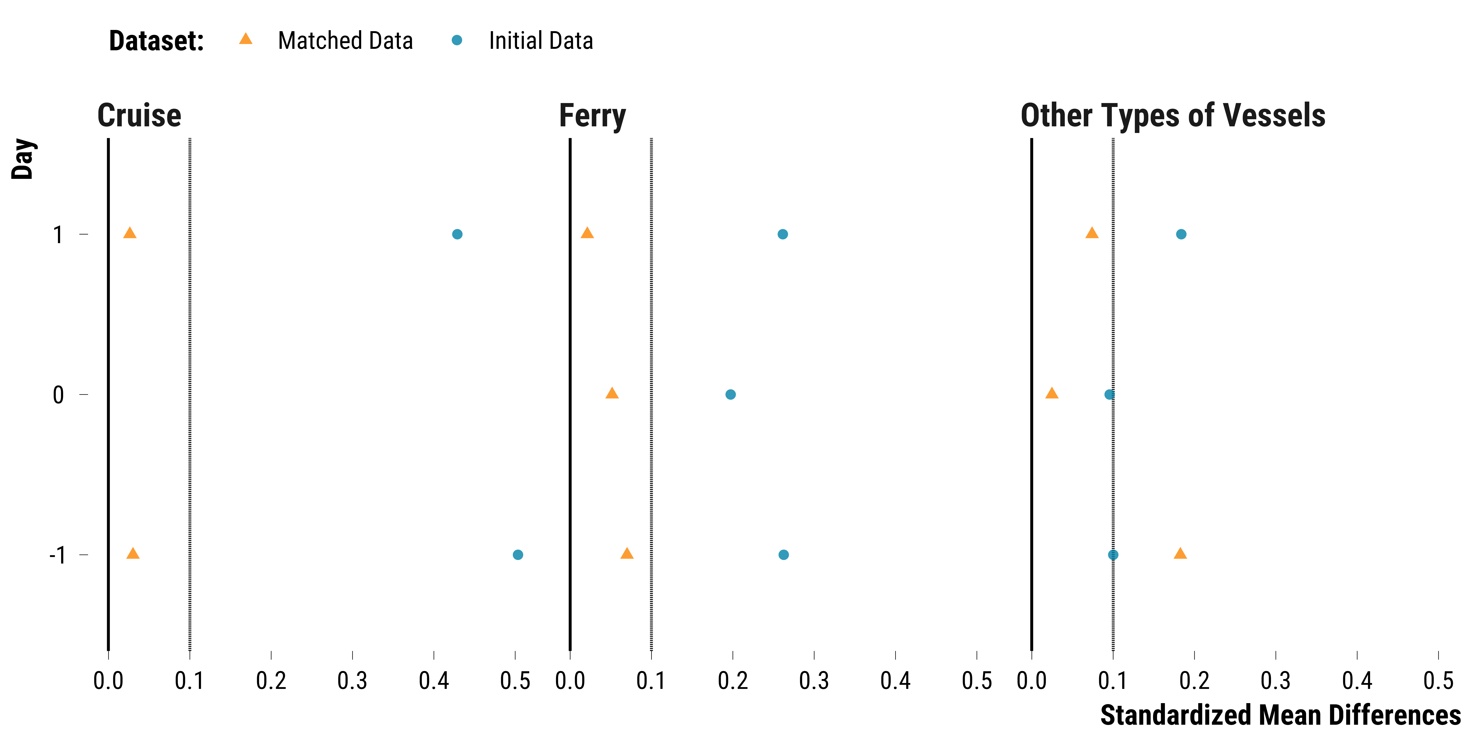
Vessels Traffic
Please show me the code!
# compute figures for the love plot
data_tonnage <-  data %>%
  # select relevant variables
  select(
    dataset,
    is_treated,
    contains("total_gross_tonnage_cruise"),
    contains("total_gross_tonnage_ferry"),
    contains("total_gross_tonnage_other_boat")
  ) %>%
  # transform data in long format
  pivot_longer(
    cols = -c(dataset, is_treated),
    names_to = "variable",
    values_to = "tonnage"
  ) %>%
  # create vessel type variable
  mutate(
    vessel_type = NA %>%
      ifelse(str_detect(variable, "cruise"), "Cruise", .) %>%
      ifelse(str_detect(variable, "ferry"), "Ferry", .) %>%
      ifelse(str_detect(variable, "other_boat"), "Other Types of Vessels", .)
  ) %>%
  mutate(time = 0 %>%
           ifelse(str_detect(variable, "lag_1"), "-1", .) %>%
           ifelse(str_detect(variable, "lead_1"), "1", .)) %>%
  filter(variable != "total_gross_tonnage_cruise") %>%
  select(dataset, vessel_type, is_treated, time, tonnage)

data_abs_difference_tonnage <- data_tonnage %>%
  group_by(dataset, vessel_type, time, is_treated) %>%
  summarise(mean_tonnage = mean(tonnage, na.rm = TRUE)) %>%
  summarise(abs_difference = abs(mean_tonnage[2] - mean_tonnage[1]))

data_sd_tonnage <-  data_tonnage %>%
  filter(dataset == "Initial Data" & is_treated == "True") %>%
  group_by(vessel_type, time, is_treated) %>%
  summarise(sd_treatment = sd(tonnage, na.rm = TRUE)) %>%
  ungroup() %>%
  select(vessel_type, time, sd_treatment)

data_love_tonnage <-
  left_join(data_abs_difference_tonnage,
            data_sd_tonnage,
            by = c("vessel_type", "time")) %>%
  mutate(standardized_difference = abs_difference / sd_treatment) %>%
  select(-c(abs_difference, sd_treatment)) %>%
  filter(!(vessel_type == "Cruise" & time == 0))

# create the graph
graph_love_plot_tonnage <-
  ggplot(
    data_love_tonnage,
    aes(
      x = standardized_difference,
      y = as.factor(time),
      colour = fct_rev(dataset),
      shape = fct_rev(dataset)
    )
  ) +
  geom_vline(xintercept = 0) +
  geom_vline(xintercept = 0.1,
             color = "black",
             linetype = "dashed") +
  geom_point(size = 2, alpha = 0.8) +
  scale_colour_manual(name = "Dataset:", values = c(my_orange, my_blue)) +
  scale_shape_manual(name = "Dataset:", values = c(17, 16)) +  facet_wrap( ~ vessel_type) +
  xlab("Standardized Mean Differences") +
  ylab("Day") +
  theme_tufte()
# print the graph
graph_love_plot_tonnage
Please show me the code!
# save the graph
ggsave(
  graph_love_plot_tonnage,
  filename = here::here(
    "inputs",
    "3.outputs",
    "2.daily_analysis",
    "2.analysis_pollution",
    "1.cruise_experiment",
    "1.checking_matching_procedure",
    "graph_love_plot_tonnage.pdf"
  ),
  width = 20,
  height = 10,
  units = "cm",
  device = cairo_pdf
)
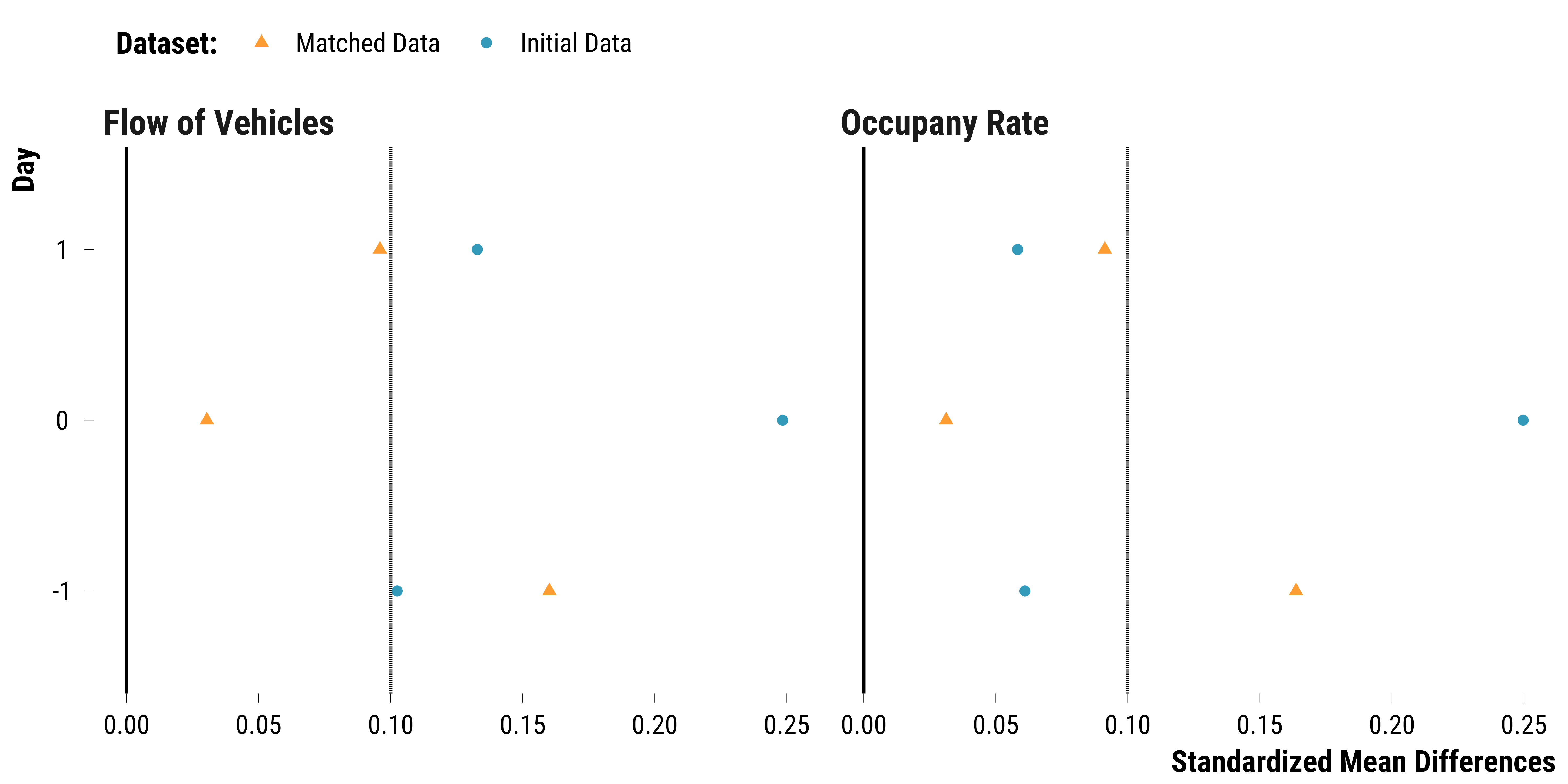
Road Traffic
Please show me the code!
# compute figures for the love plot
data_road <-  data %>%
  # select relevant variables
  select(dataset, is_treated, contains("road_traffic_flow_all"), contains("road_occupancy_rate")) %>%
  # transform data in long format
  pivot_longer(
    cols = -c(dataset, is_treated),
    names_to = "road_traffic",
    values_to = "value"
  ) %>%
  mutate(time = 0 %>%
           ifelse(str_detect(road_traffic, "lag_1"),-1, .) %>%
           ifelse(str_detect(road_traffic, "lead_1"), 1, .)) %>%
  mutate(road_traffic = ifelse(str_detect(road_traffic, "road_traffic_flow_all"), "Flow of Vehicles", "Occupany Rate")) %>%
  select(dataset, road_traffic, is_treated, time, value)

data_abs_difference_road <- data_road %>%
  group_by(dataset, road_traffic, time, is_treated) %>%
  summarise(mean_value = mean(value, na.rm = TRUE)) %>%
  summarise(abs_difference = abs(mean_value[2] - mean_value[1]))

data_sd_tonnage <-  data_road %>%
  filter(dataset == "Initial Data" & is_treated == "True") %>%
  group_by(road_traffic, time, is_treated) %>%
  summarise(sd_treatment = sd(value, na.rm = TRUE)) %>%
  ungroup() %>%
  select(road_traffic, time, sd_treatment)

data_love_road <-
  left_join(data_abs_difference_road,
            data_sd_tonnage,
            by = c("road_traffic", "time")) %>%
  mutate(standardized_difference = abs_difference / sd_treatment) %>%
  select(-c(abs_difference, sd_treatment))


# create the graph
graph_love_plot_road <-
  ggplot(
    data_love_road,
    aes(
      x = standardized_difference,
      y = as.factor(time),
      colour = fct_rev(dataset),
      shape = fct_rev(dataset)
    )
  ) +
  geom_vline(xintercept = 0) +
  geom_vline(xintercept = 0.1,
             color = "black",
             linetype = "dashed") +
  geom_point(size = 2, alpha = 0.8) +
  scale_colour_manual(name = "Dataset:", values = c(my_orange, my_blue)) +
  scale_shape_manual(name = "Dataset:", values = c(17, 16)) +
  facet_wrap(~ road_traffic) +
  xlab("Standardized Mean Differences") +
  ylab("Day") +
  theme_tufte()

# print the graph
graph_love_plot_road
Please show me the code!
# save the graph
ggsave(
  graph_love_plot_road,
  filename = here::here(
    "inputs",
    "3.outputs",
    "2.daily_analysis",
    "2.analysis_pollution",
    "1.cruise_experiment",
    "1.checking_matching_procedure",
    "graph_love_plot_road.pdf"
  ),
  width = 20,
  height = 10,
  units = "cm",
  device = cairo_pdf
)
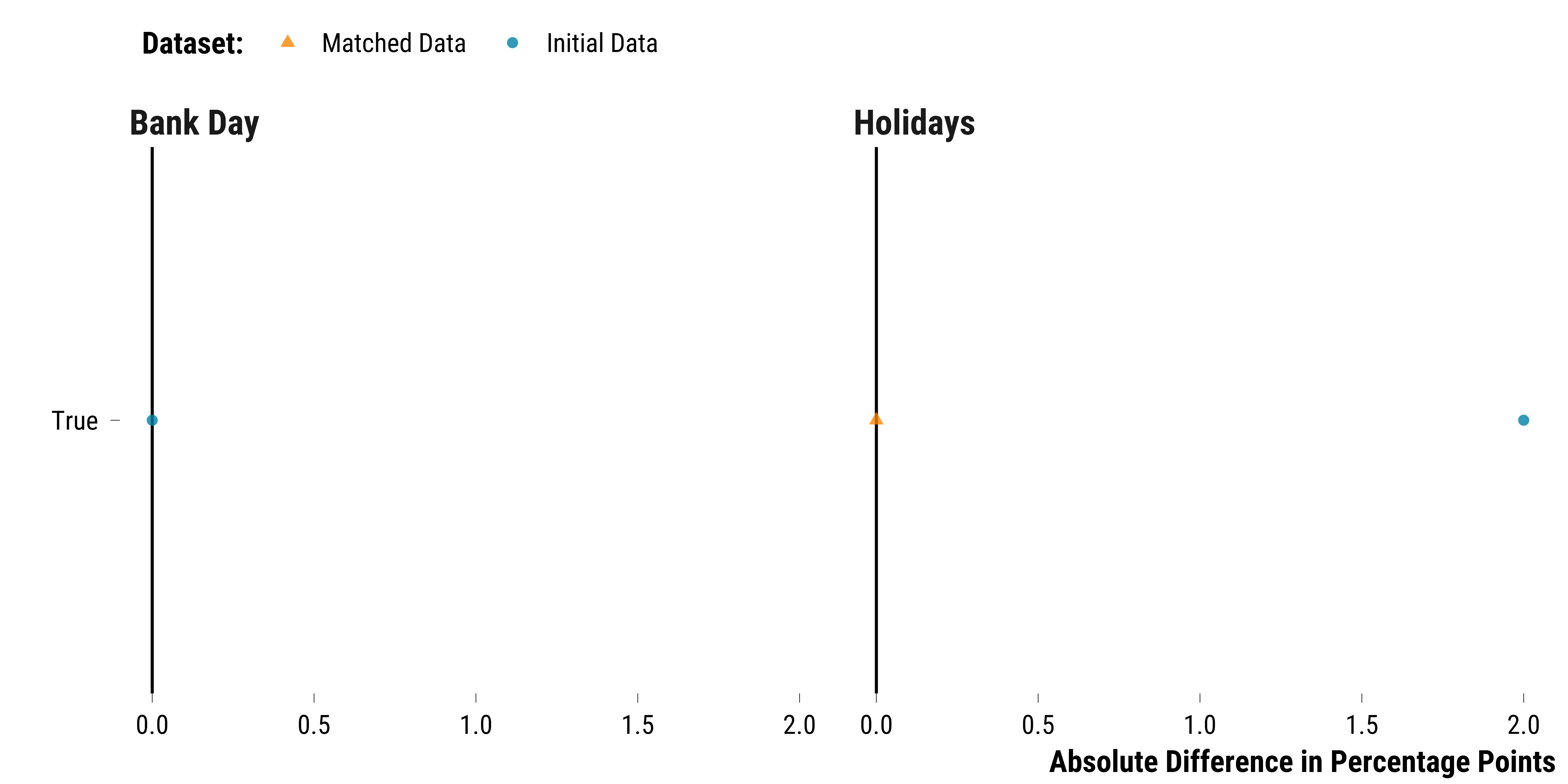
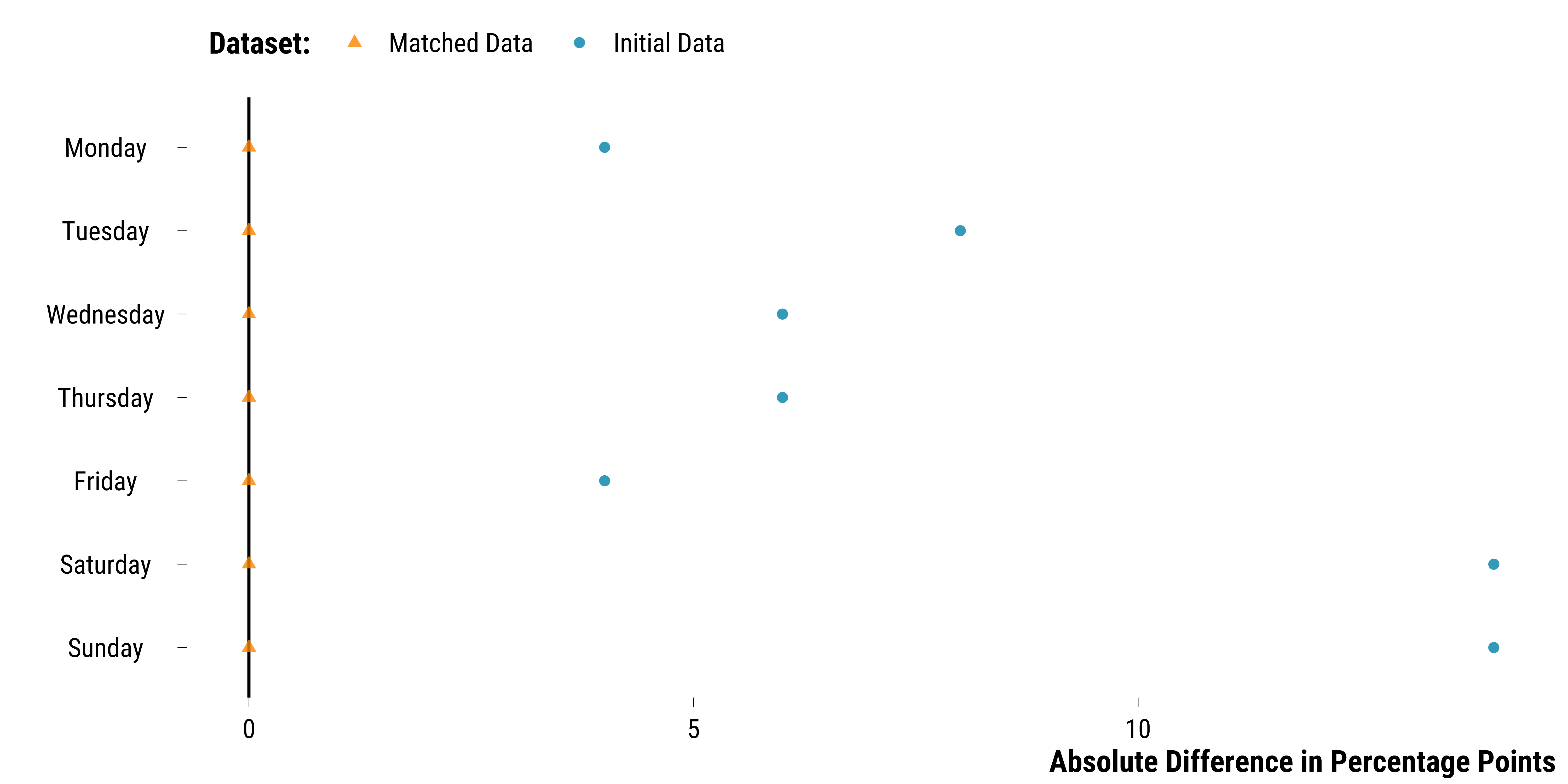
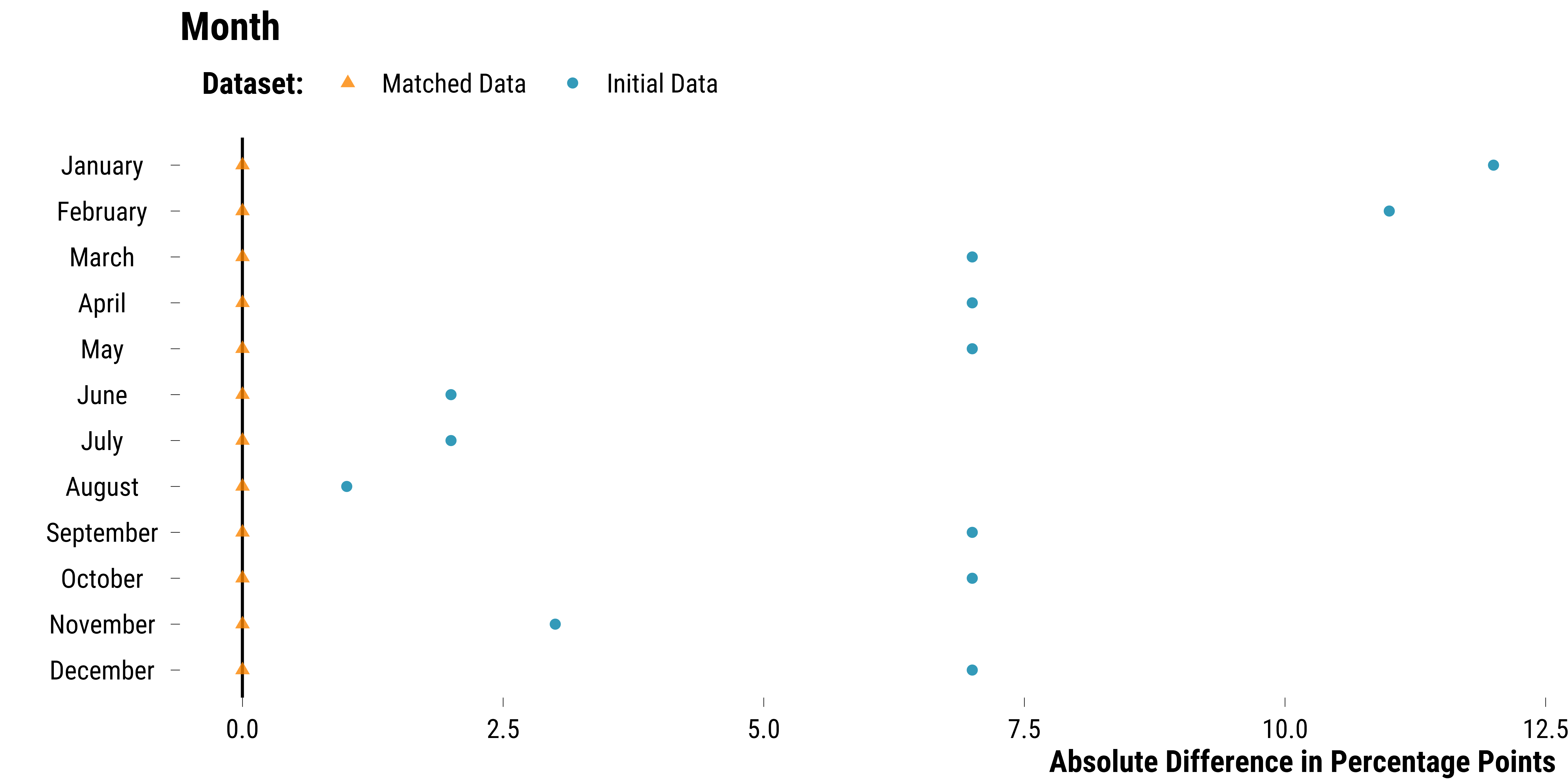
Calendar Indicators
Create the relevant data:
Please show me the code!
# compute figures for the love plot
data_calendar <- data %>%
  mutate(weekday = lubridate::wday(date, abbr = FALSE, label = TRUE)) %>%
  select(dataset,
         is_treated,
         weekday,
         holidays_dummy,
         bank_day_dummy,
         month,
         year) %>%
  mutate_at(vars(holidays_dummy, bank_day_dummy),
            ~ ifelse(. == 1, "True", "False")) %>%
  mutate_all( ~ as.character(.)) %>%
  pivot_longer(
    cols = -c(dataset, is_treated),
    names_to = "variable",
    values_to = "values"
  ) %>%
  # group by is_treated, variable and values
  group_by(dataset, is_treated, variable, values) %>%
  # compute the number of observations
  summarise(n = n()) %>%
  # compute the proportion
  mutate(freq = round(n / sum(n) * 100, 0)) %>%
  ungroup() %>%
  mutate(
    calendar_variable = NA %>%
      ifelse(str_detect(variable, "weekday"), "Day of the Week", .) %>%
      ifelse(str_detect(variable, "holidays_dummy"), "Holidays", .) %>%
      ifelse(str_detect(variable, "bank_day_dummy"), "Bank Day", .) %>%
      ifelse(str_detect(variable, "month"), "Month", .) %>%
      ifelse(str_detect(variable, "year"), "Year", .)
  ) %>%
  select(dataset, is_treated, calendar_variable, values, freq) %>%
  pivot_wider(names_from = is_treated, values_from = freq) %>%
  mutate(abs_difference = abs(`True` - `False`)) %>%
  filter(values != "False")
Plot for bank days and holidays:
Please show me the code!
# graph for bank days and holidays
graph_love_plot_bank_holidays <- data_calendar %>%
  filter(calendar_variable %in% c("Bank Day", "Holidays")) %>%
  ggplot(.,
         aes(
           y = values,
           x = abs_difference,
           colour = fct_rev(dataset),
           shape = fct_rev(dataset)
         )) +
  geom_vline(xintercept = 0) +
  geom_point(size = 2, alpha = 0.8) +
  scale_colour_manual(name = "Dataset:", values = c(my_orange, my_blue)) +
  scale_shape_manual(name = "Dataset:", values = c(17, 16)) +
  facet_wrap(~ calendar_variable) +
  xlab("Absolute Difference in Percentage Points") +
  ylab("") +
  theme_tufte()
# print the plot
graph_love_plot_bank_holidays
Please show me the code!
# save the plot
ggsave(
  graph_love_plot_bank_holidays,
  filename = here::here(
    "inputs",
    "3.outputs",
    "2.daily_analysis",
    "2.analysis_pollution",
    "1.cruise_experiment",
    "1.checking_matching_procedure",
    "graph_love_plot_bank_holidays.pdf"
  ),
  width = 20,
  height = 10,
  units = "cm",
  device = cairo_pdf
)
Plot for days of the week:
Please show me the code!
# graph for weekdays
graph_love_plot_weekday <- data_calendar %>%
  filter(calendar_variable == "Day of the Week") %>%
  mutate(
    values = fct_relevel(
      values,
      "Monday",
      "Tuesday",
      "Wednesday",
      "Thursday",
      "Friday",
      "Saturday",
      "Sunday"
    )
  ) %>%
  ggplot(., aes(
    y = fct_rev(values),
    x = abs_difference,
    colour = fct_rev(dataset),
    shape = fct_rev(dataset)
  )) +
  geom_vline(xintercept = 0) +
  geom_point(size = 2, alpha = 0.8) +
  scale_colour_manual(name = "Dataset:", values = c(my_orange, my_blue)) +
  scale_shape_manual(name = "Dataset:", values = c(17, 16)) +
  xlab("Absolute Difference in Percentage Points") +
  ylab("") +
  theme_tufte() +
  theme(
    legend.position = "top",
    legend.justification = "left",
    legend.direction = "horizontal"
  )

# print the plot
graph_love_plot_weekday
Please show me the code!
# save the plot
ggsave(
  graph_love_plot_weekday,
  filename = here::here(
    "inputs",
    "3.outputs",
    "2.daily_analysis",
    "2.analysis_pollution",
    "1.cruise_experiment",
    "1.checking_matching_procedure",
    "graph_love_plot_weekday.pdf"
  ),
  width = 20,
  height = 10,
  units = "cm",
  device = cairo_pdf
)
Plot for months:
Please show me the code!
# graph for month
graph_love_plot_month <- data_calendar %>%
  filter(calendar_variable == "Month") %>%
  mutate(
    values = fct_relevel(
      values,
      "January",
      "February",
      "March",
      "April",
      "May",
      "June",
      "July",
      "August",
      "September",
      "October",
      "November",
      "December"
    )
  ) %>%
  ggplot(., aes(
    y = fct_rev(values),
    x = abs_difference,
    colour = fct_rev(dataset),
    shape = fct_rev(dataset)
  )) +
  geom_vline(xintercept = 0) +
  geom_point(size = 2, alpha = 0.8) +
  scale_colour_manual(name = "Dataset:", values = c(my_orange, my_blue)) +
  scale_shape_manual(name = "Dataset:", values = c(17, 16)) +
  ggtitle("Month") +
  xlab("Absolute Difference in Percentage Points") +
  ylab("") +
  theme_tufte() +
  theme(
    legend.position = "top",
    legend.justification = "left",
    legend.direction = "horizontal"
  )

# print the plot
graph_love_plot_month
Please show me the code!
# save the plot
ggsave(
  graph_love_plot_month,
  filename = here::here(
    "inputs",
    "3.outputs",
    "2.daily_analysis",
    "2.analysis_pollution",
    "1.cruise_experiment",
    "1.checking_matching_procedure",
    "graph_love_plot_month.pdf"
  ),
  width = 20,
  height = 10,
  units = "cm",
  device = cairo_pdf
)
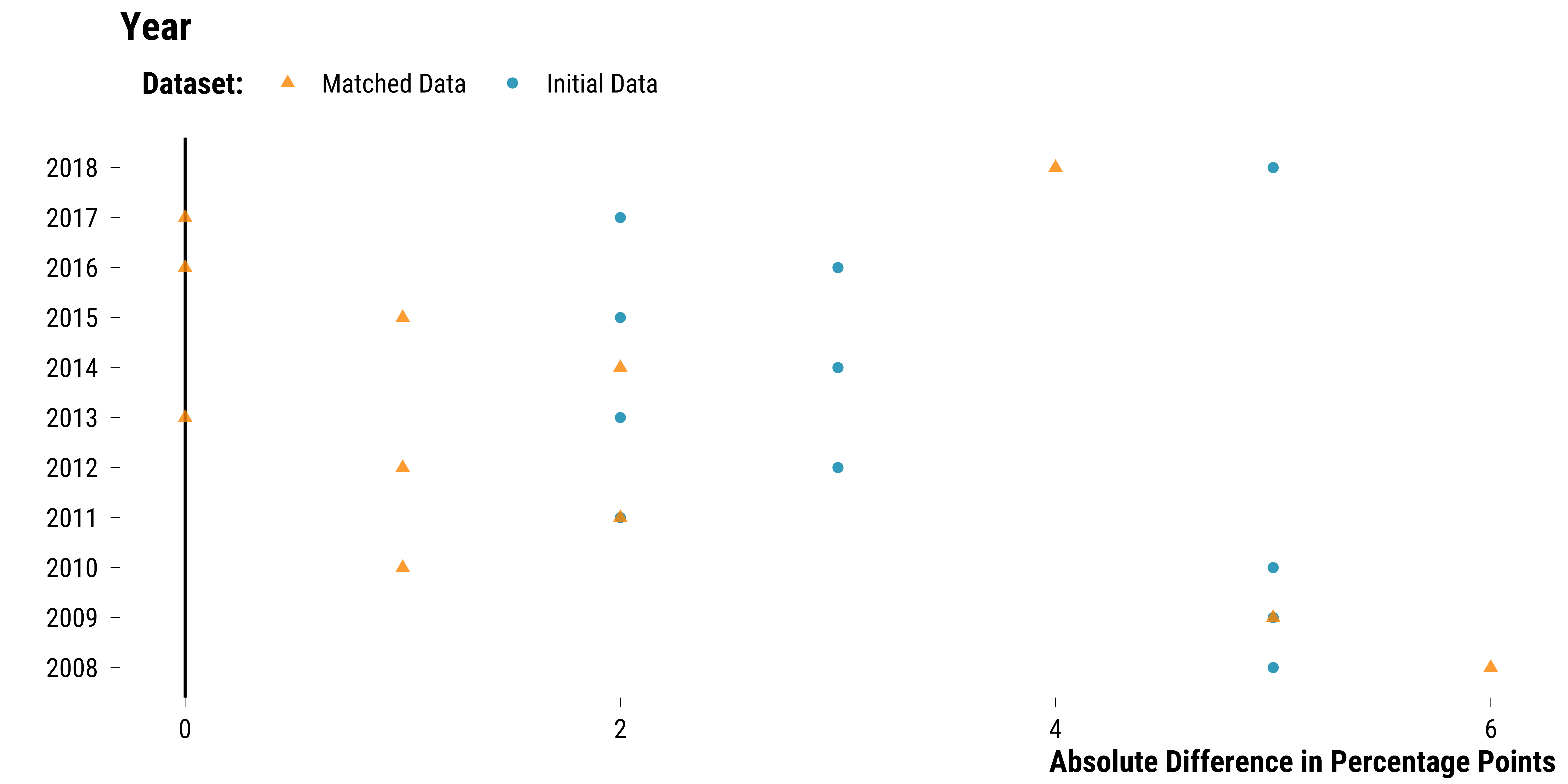
Plot for years:
Please show me the code!
# graph for year
graph_love_plot_year <- data_calendar %>%
  filter(calendar_variable == "Year") %>%
  ggplot(., aes(
    y = as.factor(as.numeric(values)),
    x = abs_difference,
    colour = fct_rev(dataset),
    shape = fct_rev(dataset)
  )) +
  geom_vline(xintercept = 0) +
  geom_point(size = 2, alpha = 0.8) +
  scale_colour_manual(name = "Dataset:", values = c(my_orange, my_blue)) +
  scale_shape_manual(name = "Dataset:", values = c(17, 16)) +
  ggtitle("Year") +
  xlab("Absolute Difference in Percentage Points") +
  ylab("") +
  theme_tufte() +
  theme(
    legend.position = "top",
    legend.justification = "left",
    legend.direction = "horizontal"
  )

# print the graph
graph_love_plot_year
Please show me the code!
# save the plot
ggsave(
  graph_love_plot_year,
  filename = here::here(
    "inputs",
    "3.outputs",
    "2.daily_analysis",
    "2.analysis_pollution",
    "1.cruise_experiment",
    "1.checking_matching_procedure",
    "graph_love_plot_year.pdf"
  ),
  width = 20,
  height = 10,
  units = "cm",
  device = cairo_pdf
)
Overall Balance Improvement
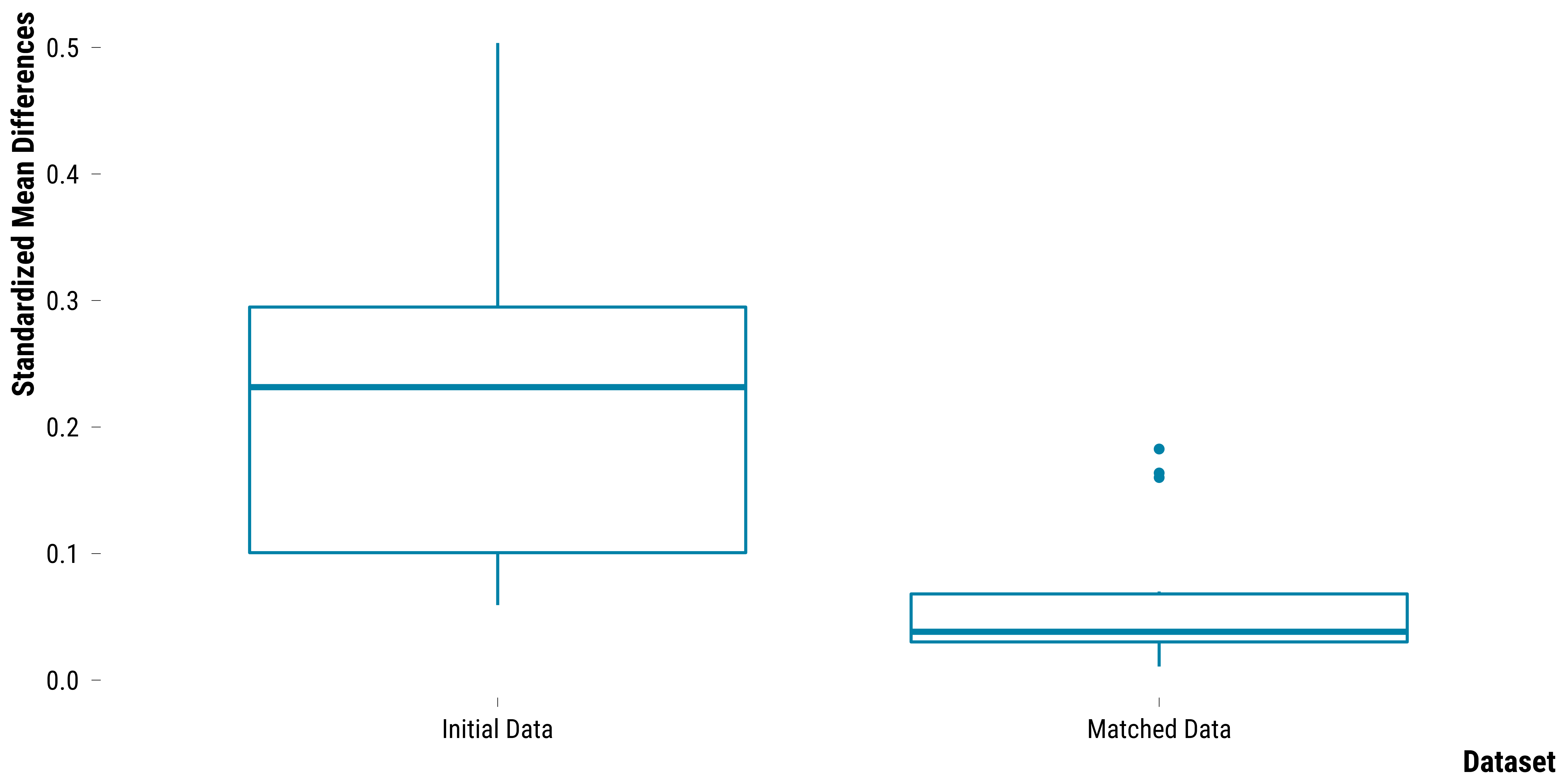
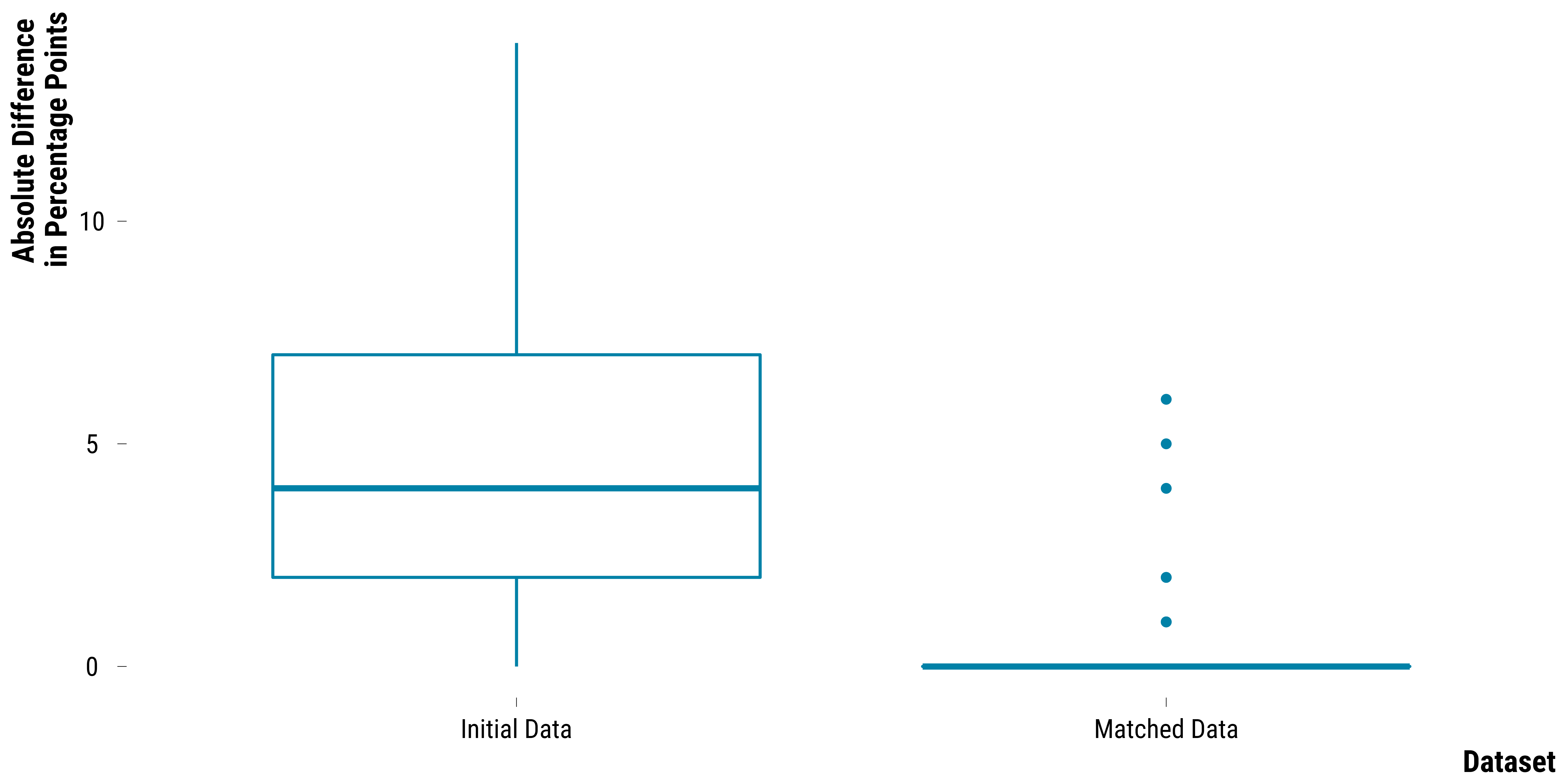
We plot the distribution of standardized mean differences for continuous covariates or the absolute percentage points differences for categorical covariates between treated and control units before and after matching.
Continuous Covariates
Please show me the code!
# we select the dataset indicator and the standardized difference
data_love_tonnage <- data_love_tonnage %>%
  ungroup() %>%
  filter(time < 0) %>%
  select(dataset, standardized_difference)

data_love_pollutants <- data_love_pollutants %>%
  ungroup() %>%
  filter(time < 0) %>%
  select(dataset, standardized_difference)

data_love_continuous_weather <- data_love_continuous_weather %>%
  ungroup() %>%
  filter(time <= 0) %>%
  select(dataset, standardized_difference)

data_love_road <- data_love_road %>%
  ungroup() %>%
  filter(time <= 0) %>%
  select(dataset, standardized_difference)

data_continuous_love <-
  bind_rows(data_love_tonnage, data_love_pollutants) %>%
  bind_rows(., data_love_continuous_weather) %>%
  bind_rows(., data_love_road)

# create the graph
graph_boxplot_continuous_balance_improvement <-
  ggplot(data_continuous_love,
         aes(x = dataset, y = standardized_difference)) +
  geom_boxplot(colour = my_blue) +
  scale_y_continuous(breaks = scales::pretty_breaks(n = 5)) +
  xlab("Dataset") +
  ylab("Standardized Mean Differences") +
  theme_tufte()
# print the graph
graph_boxplot_continuous_balance_improvement
Please show me the code!
# save the graph
ggsave(
  graph_boxplot_continuous_balance_improvement,
  filename = here::here(
    "inputs",
    "3.outputs",
    "2.daily_analysis",
    "2.analysis_pollution",
    "1.cruise_experiment",
    "1.checking_matching_procedure",
    "graph_boxplot_continuous_balance_improvement.pdf"
  ),
  width = 20,
  height = 10,
  units = "cm",
  device = cairo_pdf
)
Categorical Covariates
Please show me the code!
# we select the dataset indicator and the standardized difference
data_calendar <- data_calendar %>%
  ungroup() %>%
  select(dataset, abs_difference)

data_weather_categorical <- data_weather_categorical %>%
  ungroup() %>%
  filter(
    variable %in% c(
      "Rainfall Dummy t",
      "Rainfall Dummy t-1",
      "Wind Direction t",
      "Wind Direction t-1"
    )
  ) %>%
  select(dataset, abs_difference)

data_categorical_love <-
  bind_rows(data_calendar, data_weather_categorical)

# create the graph
graph_boxplot_categorical_balance_improvement <-
  ggplot(data_categorical_love, aes(x = dataset, y = abs_difference)) +
  geom_boxplot(colour = my_blue) +
  scale_y_continuous(breaks = scales::pretty_breaks(n = 5)) +
  xlab("Dataset") +
  ylab("Absolute Difference \nin Percentage Points") +
  theme_tufte()

# print the graph
graph_boxplot_categorical_balance_improvement
Please show me the code!
# save the graph
ggsave(
  graph_boxplot_categorical_balance_improvement,
  filename = here::here(
    "inputs",
    "3.outputs",
    "2.daily_analysis",
    "2.analysis_pollution",
    "1.cruise_experiment",
    "1.checking_matching_procedure",
    "graph_boxplot_categorical_balance_improvement.pdf"
  ),
  width = 20,
  height = 10,
  units = "cm",
  device = cairo_pdf
)
We combine the two previous plots in a single figure:
Please show me the code!
# combine plots
graph_overall_balance <-
  graph_boxplot_continuous_balance_improvement + graph_boxplot_categorical_balance_improvement +
  plot_annotation(tag_levels = 'A') &
  theme(plot.tag = element_text(size = 30, face = "bold"))

# save the plot
ggsave(
  graph_overall_balance,
  filename = here::here(
    "inputs",
    "3.outputs",
    "2.daily_analysis",
    "2.analysis_pollution",
    "1.cruise_experiment",
    "1.checking_matching_procedure",
    "graph_overall_balance.pdf"
  ),
  width = 20,
  height = 10,
  units = "cm",
  device = cairo_pdf
)
And we compute the overall figures for imbalance before and after matching:
Please show me the code!
# compute average imbalance before and after matching
data_categorical_love <- data_categorical_love %>%
  mutate(Type = "Categorical (Difference in Percentage Points)") %>%
  rename(standardized_difference = abs_difference)

data_continuous_love %>%
  mutate(Type = "Continuous (Standardized Difference)") %>%
  bind_rows(data_categorical_love) %>%
  group_by(Type, dataset) %>%
  summarise("Mean Imbalance" = round(mean(standardized_difference), 2)) %>%
  rename(Dataset = dataset) %>%
  knitr::kable(., align = c("l", "l", "c")) %>%
  kable_styling(position = "center")
| Type | Dataset | Mean Imbalance |
|---|---|---|
| Categorical (Difference in Percentage Points) | Initial Data | 4.81 |
| Categorical (Difference in Percentage Points) | Matched Data | 0.63 |
| Continuous (Standardized Difference) | Initial Data | 0.22 |
| Continuous (Standardized Difference) | Matched Data | 0.07 |
Randomization Check for Covariate Balance
Finally, we implement the procedure of Zach Branson (2021) to carry out a randomization check to test whether daily observations are as-if randomized according to observed covariates.
# we select covariates
data_covs <- data_matched %>%
  select(
    pair_number,
    is_treated,
    year,
    month,
    weekday,
    holidays_dummy,
    bank_day_dummy,
    total_gross_tonnage_ferry:total_gross_tonnage_other_boat,
    temperature_average:wind_speed,
    wind_direction_east_west,
    holidays_dummy_lag_1,
    bank_day_dummy_lag_1,
    total_gross_tonnage_cruise_lag_1:total_gross_tonnage_other_boat_lag_1,
    temperature_average_lag_1:wind_speed_lag_1,
    wind_direction_east_west_lag_1,
    mean_no2_l_lag_1:mean_o3_l_lag_1
  )

# recode some variables
data_covs <- data_covs %>%
  mutate(is_treated = ifelse(is_treated == TRUE, 1, 0)) %>%
  mutate_at(
    vars(wind_direction_east_west , wind_direction_east_west_lag_1),
    ~ ifelse(. == "West", 1, 0)
  ) %>%
  fastDummies::dummy_cols(., select_columns = c("year", "month", "weekday")) %>%
  select(-c("year", "month", "weekday"))

# format data for asIfRandPlot() function
pair_number <- as.numeric(data_covs$pair_number)
is_treated <- data_covs$is_treated

data_covs <- data_covs %>%
  select(-pair_number,-is_treated) %>%
  select(-year_2018, - month_December, -weekday_Sunday, -bank_day_dummy, - bank_day_dummy_lag_1)

# run balance check
asIfRandPlot(
  X.matched = data_covs,
  indicator.matched = is_treated,
  assignment = c("complete", "blocked"),
  subclass = pair_number,
  perms = 1000
)
